import pandas as pd
import matplotlib.pyplot as plt
import matplotlib.ticker as tickerAbout the Data
Note
This week we’re exploring data from the FBI Crime Data API! Specifically, we’re looking at agency-level data across all 50 states in the USA. This dataset provides details on law enforcement agencies that have submitted data to the FBI’s Uniform Crime Reporting (UCR) Program and are displayed on the Crime Data Explorer (CDE).
The Open Data Portal of Istituto Nazionale di Geofisica e Vulcanologia (INGV) gives public access to data resulting from institutional research activities in the fields of Seismology, Volcanology, and Environment.
1 Initializing
1.1 Load libraries
1.2 Set theme
plt.style.use('~/Documents/GitHub/tidytuesday/posts/2025-02-18/rb-style.mplstyle')1.3 Load this week’s data
agencies = pd.read_csv('https://raw.githubusercontent.com/rfordatascience/tidytuesday/main/data/2025/2025-02-18/agencies.csv')2 Time to plot!
2.1 Before
data2plot = (
    agencies.groupby("state").size().reset_index(name="n").sort_values(by="n").tail(10)
)

fig, ax = plt.subplots()
fig.set_figwidth(5)
fig.set_figheight(3)

ax.set_axisbelow(True)
ax.grid(True, axis="x", which="major", linestyle="-", linewidth=0.7, color="#d3daed")


ax.barh(data2plot["state"], data2plot["n"], color="#495373")

# Apply the formatter to the y-axis
ax.xaxis.set_major_formatter(ticker.StrMethodFormatter("{x:,.0f}"))

ax.set_title("Number of agencies by state")
ax.set_xlabel("Counts (n)")

plt.tight_layout()
plt.show()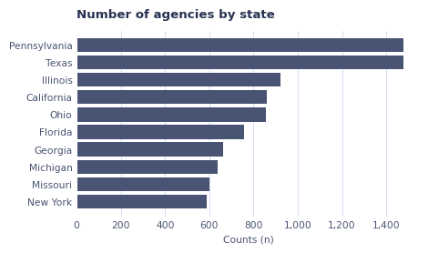
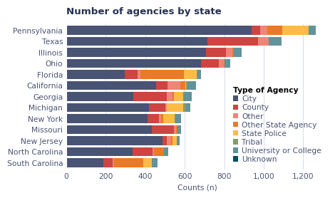
2.2 After
plt.style.use("~/Documents/GitHub/tidytuesday/posts/2025-02-18/rb-style.mplstyle")

data2plot = (
    agencies.groupby(["state", "agency_type"])
    .size()
    .reset_index(name="n")
    .sort_values(by="n")
)

# Pivot wider to make the stacked byplot
data2plot_wide = data2plot.pivot_table(
    index="state", columns="agency_type", values="n", fill_value=0
)

# Sorting and filtering
data2plot_wide["total_agencies"] = data2plot_wide.sum(axis=1)
data2plot_wide_sorted = data2plot_wide.sort_values(by="total_agencies", ascending=True)
data2plot_wide_sorted = data2plot_wide_sorted.query("total_agencies > 450")
data2plot_wide_sorted.drop(columns="total_agencies", inplace=True)

# Start plotting ------------------------------------------------------------------------
fig, ax = plt.subplots()

# Color palette
color_map = [
    "#495373",
    "#ce4441",
    "#ee8577",
    "#eb7926",
    "#ffbb44",
    "#859b6c",
    "#62929a",
    "#004f63",
    "#122451",
]

# Geom
data2plot_wide_sorted.plot(
    kind="barh", stacked=True, figsize=(5, 3), ax=ax, width=0.8, color=color_map
)

# Add grid
ax.set_axisbelow(True)
ax.grid(True, axis="x", which="major", linestyle="-", linewidth=0.7, color="#d3daed")

# Format x axis (add comma)
ax.xaxis.set_major_formatter(ticker.StrMethodFormatter("{x:,.0f}"))

# Labels
ax.set_title("Number of agencies by state")
ax.set_xlabel("Counts (n)")
ax.set_ylabel("")

# Legend
plt.legend(
    title="Type of Agency", title_fontproperties={"weight": "bold"}, alignment="left"
)

# Plot & Pray
plt.tight_layout()
plt.show()