tuesdata <- tidytuesdayR::tt_load(2025, week = 20)
water_quality <- tuesdata$water_quality
weather <- tuesdata$weatherLoading data and libraries
library(tidyverse)
library(glue)
library(scales)
library(showtext)
library(ggtext)

font_add_google("Ubuntu", "Ubuntu", regular.wt = 300, bold.wt = 700)
showtext_auto()
showtext_opts(dpi = 300)
Data analysis
water_quality <- water_quality |>
   mutate(date_m = month(date), date_y = year(date)) |>
   mutate(month_year = str_c(date_m,'-',date_y))
Q1
Is there a correlation between enterococci_cfu_100ml and water_temperature_c?
water_quality |>
  ggplot(aes(x = enterococci_cfu_100ml, y = water_temperature_c)) +
  geom_point()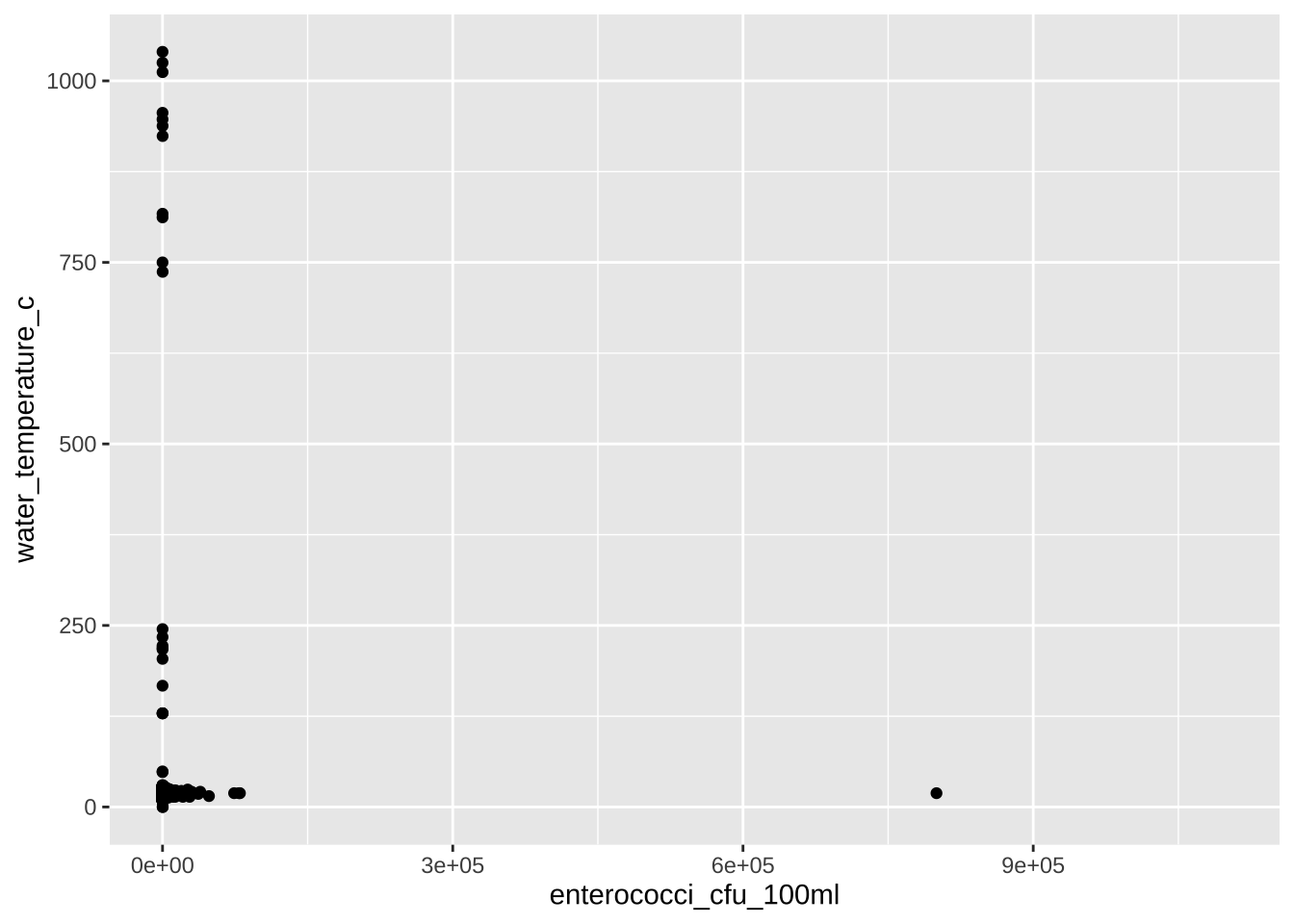
water_quality |>
  filter(water_temperature_c < 100) |>
  ggplot(aes(x = water_temperature_c)) +
  geom_histogram()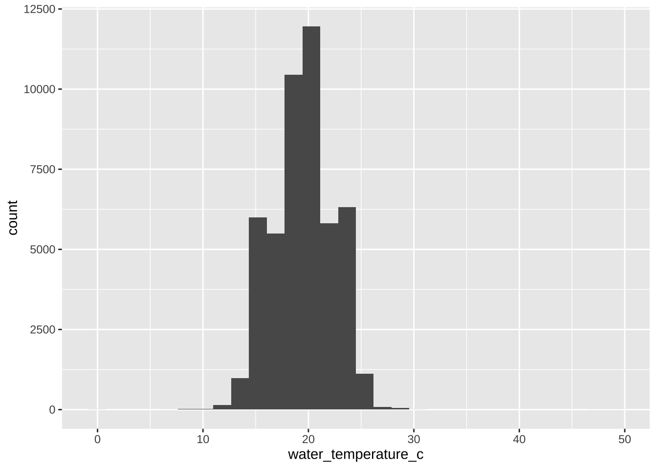
water_quality |>
  filter(enterococci_cfu_100ml < 10000) |>
  ggplot(aes(x = log10(enterococci_cfu_100ml + 1))) +
  geom_histogram()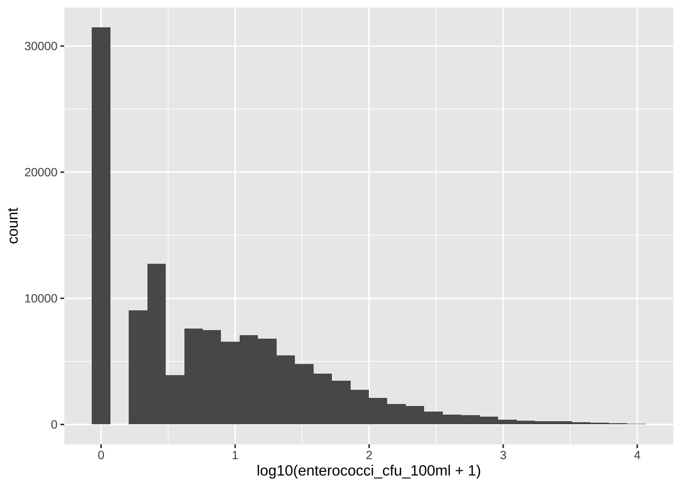
water_quality |>
  filter(water_temperature_c < 40, water_temperature_c > 0) |>
  filter(enterococci_cfu_100ml < 10000) |>
  ggplot(aes(x = water_temperature_c, y = enterococci_cfu_100ml))  +
  geom_point()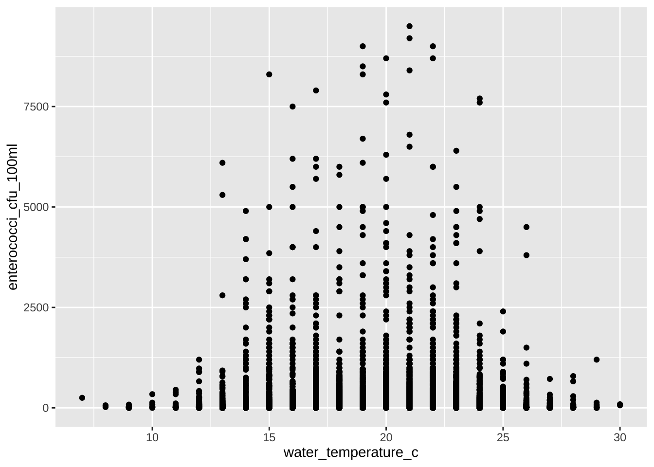
A Well, not that simple.
Q2
Time series, how sparce?
n_swim_sites <- water_quality |> distinct(swim_site) |> nrow()

# by day
n_dates <- water_quality |> distinct(date) |> nrow()
data_sparcity <- (water_quality |> distinct(swim_site, date) |> nrow()) / (n_dates * n_swim_sites)
print(glue('Data sparcity by day: {percent(data_sparcity)}'))
Data sparcity by day: 30%# by month
n_months <- water_quality |> distinct(month_year) |> nrow()
data_sparcity <- (water_quality |> distinct(swim_site, month_year) |> nrow()) / (n_months * n_swim_sites)
print(glue('Data sparcity by before: {percent(data_sparcity)}'))Data sparcity by before: 81%Smoothing data
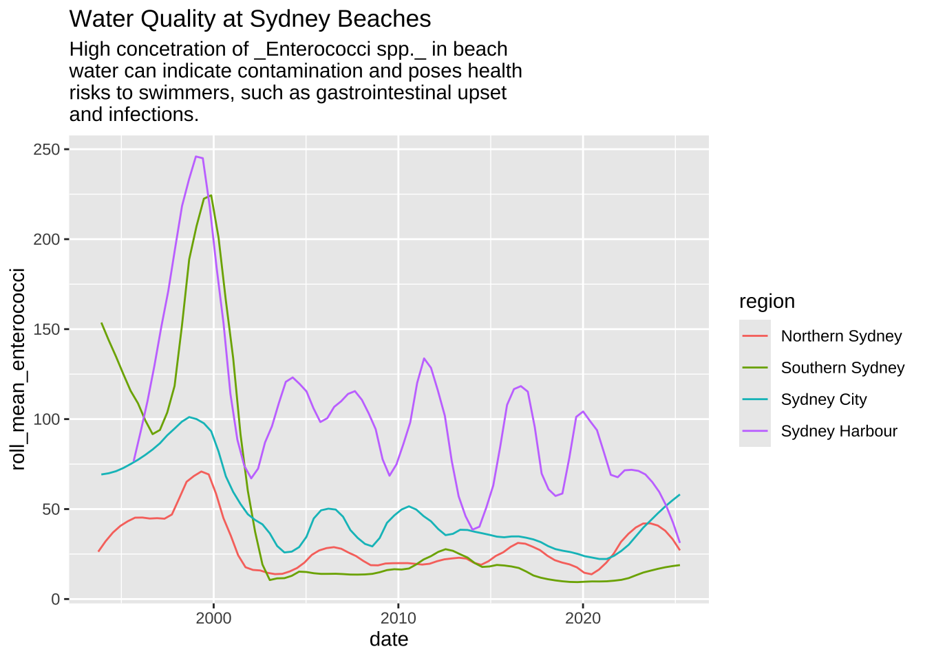
To work with so many data points, data can be very noise. So I’m adding a rolling mean of three months.
data2plot <-
  water_quality |>
  group_by(region) |>
  filter(n() >= 99) |>
  ungroup() |>
  filter(enterococci_cfu_100ml < 10000) |>
  group_by(region, date_m, date_y) |>
  summarize(mean_enterococci = mean(enterococci_cfu_100ml)) |>
  ungroup() |>
  mutate(date = as.Date(str_c(date_y, '-', date_m, '-', '01'))) |>
  group_by(region) |>
  arrange(region, date) |>
  mutate(
    roll_mean_enterococci = zoo::rollmeanr(mean_enterococci, k = 12, fill = NA) # k=3 for 3 periods
  ) |>
  ungroup() |>
  filter(!is.na(roll_mean_enterococci))
Plot
Before
data2plot |>
  filter(region != 'Western Sydney') |>
  ggplot(aes(x = date, y = roll_mean_enterococci)) +
  geom_smooth(aes(color = region), linewidth = 0.5, se = FALSE, span = .2) +
  labs(
    title = 'Water Quality at Sydney Beaches',
    subtitle = str_wrap(
      width = 50,
      'High concetration of _Enterococci spp._ in beach water can indicate contamination and poses health risks to swimmers, such as gastrointestinal upset and infections.'
    )
) 
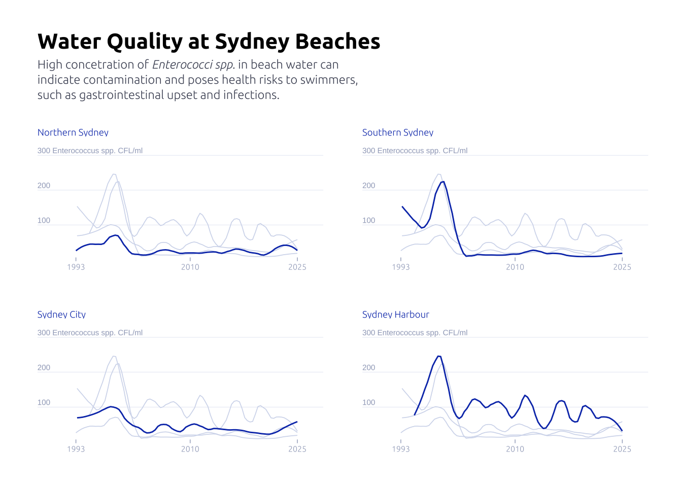
After
axis_text <-
  tibble(y = c(100, 200, 300)) |>
  mutate(
    label = if_else(
      y == max(y),
      str_c(y, ' Enterococcus spp. CFL/ml'),
      str_c(y)
    )
  ) |>
  mutate(date = data2plot$date |> min())

data2plot |>
  filter(region != 'Western Sydney') |>
  ggplot(aes(x = date, y = roll_mean_enterococci)) +

  geom_text(
    data = axis_text,
    aes(y = y, label = label, x = date - 2000),
    size = 2,
    color = '#9fa8c2',
    hjust = 0,
    vjust = -0.4
  ) +

  geom_smooth(aes(color = region), linewidth = 0.5, se = FALSE, span = .2) +
  guides(color = 'none') +
  facet_wrap(~region, ncol = 2, scales = 'free_x') +
  gghighlight::gghighlight(
    roll_mean_enterococci >= 0,
    keep_scales = TRUE,
    use_direct_label = FALSE,
    unhighlighted_params = list(
      alpha = 0.75,
      linewidth = 0.3,
      color = '#d3daed'
    )
  ) +

  theme_minimal() +
  labs(
    x = NULL,
    y = NULL,
    title = 'Water Quality at Sydney Beaches',
    subtitle = str_wrap(
      width = 60,
      'High concetration of _Enterococci spp._ in beach water can indicate contamination and poses health risks to swimmers, such as gastrointestinal upset and infections.'
    ) |> str_replace_all('\n','<br>')
  ) +

  theme(
    panel.grid.major.x = element_blank(),
    panel.grid.major.y = element_line(
      linewidth = .1,
      color = '#d3daed'
    ),
    panel.grid.minor = element_blank(),
    axis.ticks.x = element_line(color = '#9fa8c2', linewidth = .25),
    text = element_text(family = "Ubuntu"),
    axis.text = element_text(color = '#9fa8c2', hjust = .5, size = 6),
    axis.text.y = element_blank(),
    plot.title = element_text(family = 'Ubuntu', face = 'bold', size = 16),
    plot.subtitle = element_markdown(
      family = 'Ubuntu',
      size = 9,
      color = '#4a5063',
      margin = margin(0, 0, 20, 0),
      lineheight = 1.25,
    ),
    panel.spacing = unit(2, "lines"),
    strip.placement = "outside",
    strip.text = element_text(
      # hjust = -0.11,
      color = '#0d3bb8',
      hjust = 0,
      size = 7,
      margin = margin(0, 0.5, 0, 0)
    ),
    strip.background = element_blank(),
    plot.margin = margin(25, 25, 25, 25)
  ) +
  scale_y_continuous(expand = c(0, 0, 0, 0)) +
  scale_x_date(
    expand = c(0, 0, 0.1, 0),
    label = year,
    breaks = c(
      data2plot$date |> min(),
      as.Date('2010-01-01'),
      data2plot$date |> max()
    )
  ) +
  scale_color_manual(values = c('#0d3bb8', '#0d3bb8', '#0d3bb8', '#0d3bb8'))