library(tidyverse)
library(glue)
library(scales)
library(showtext)
library(ggtext)
library(shadowtext)

font_add_google("Ubuntu", "Ubuntu", regular.wt = 400, bold.wt = 700)
showtext_auto()
showtext_opts(dpi = 300)About the Data
This week we’re exploring monsters from the Dungeons & Dragons System Reference Document! After the popularity of our Dungeons and Dragons Spells (2024), we thought it might be fun to explore the freely available monsters from the 2024 update.
Every monster is a font of adventure. In this bestiary of Dungeons & Dragons monsters, you’ll discover the weird, the whimsical, the majestic, and the macabre. Choose your favorites, and make them part of your D&D play.
1 Initializing
1.1 Load libraries
1.2 Set theme
theme_set(
    theme_minimal() +
    theme(
    # axis.line.x.bottom = element_line(color = '#474747', linewidth = .3),
    # axis.ticks.x= element_line(color = '#474747', linewidth = .3),
    # axis.line.y.left = element_line(color = '#474747', linewidth = .3),
    # axis.ticks.y= element_line(color = '#474747', linewidth = .3),
    # # panel.grid = element_line(linewidth = .3, color = 'grey90'),
    panel.grid.major = element_blank(),
    panel.grid.minor = element_blank(),
    axis.ticks.length = unit(-0.15, "cm"),
    plot.background = element_blank(),
    plot.title.position = "plot",
    plot.title = element_text(family = "Ubuntu", size = 18, face = 'bold'),
    plot.caption = element_text(size = 8, color = 'grey60',margin = margin(20,0,0,0)),
    plot.subtitle = element_text(size = 9,lineheight = 1.15, margin = margin(5,0,15,0)),
    axis.title.x = element_markdown(family = "Ubuntu", hjust = .5, size = 8, color = "grey40"),
    axis.title.y = element_markdown(family = "Ubuntu", hjust = .5, size = 8, color = "grey40"),
    axis.text = element_text(family = "Ubuntu", hjust = .5, size = 8, color = "grey40"),
    legend.position = "top",
    text = element_text(family = "Ubuntu"),
    plot.margin = margin(25, 25, 25, 25))
)
1.3 Load this week’s data
tuesdata <- tidytuesdayR::tt_load(2025, week = 21)
monsters <- tuesdata$monsters
2 Data analysis
How many types are there?
monsters |> count(type)# A tibble: 16 × 2
type n
<chr> <int>
1 Aberration 9
2 Beast 84
3 Celestial 13
4 Construct 10
5 Dragon 45
6 Elemental 17
7 Fey 15
8 Fiend 29
9 Giant 10
10 Humanoid 26
11 Monstrosity 37
12 Ooze 4
13 Plant 6
14 Swarm of Tiny Beasts 6
15 Swarm of Tiny Undead 1
16 Undead 18How many alignment are there?
monsters |> count(alignment) # A tibble: 10 × 2
alignment n
<chr> <int>
1 Chaotic Evil 45
2 Chaotic Good 11
3 Chaotic Neutral 7
4 Lawful Evil 35
5 Lawful Good 20
6 Lawful Neutral 3
7 Neutral 50
8 Neutral Evil 28
9 Neutral Good 6
10 Unaligned 1253 Transform Data for Plotting
3.1 Mean Stats by Type
And filter low count (<10) types
data2plot <-
  monsters |>
  select(alignment, type, str, dex, con, int, wis, cha) |>
  filter(alignment != "Unaligned") |>
  mutate(
    alignment = if_else(
      alignment == 'Neutral',
      true = 'Neutral Neutral',
      false = alignment
    )
  ) |>
  group_by(type) |>
  filter(n() > 10) |>
  summarize(across(where(is.numeric), mean, na.rm = TRUE)) |>
  ungroup()
3.2 Transform axis
Thank you Gemini
# Function to calculate (x,y) coordinates for radar chart axes
# for a single set of data values (e.g., one row from your summary)
calculate_radar_coordinates <- function(scaled_data_values) {
  # scaled_data_values: A numeric vector of already scaled values,
  # one for each axis. The length of this vector determines N.

  N <- length(scaled_data_values)
  if (N < 1) {
    stop("scaled_data_values must have at least one value.")
  }

  # Calculate angles for each axis (starting upwards, clockwise)
  # Angles are in radians
  angles <- pi / 2 - ((0:(N - 1)) * (2 * pi / N))
  # (0:(N-1)) is used because R is 1-indexed, but it's often easier
  # to think of the first axis as index 0 for angle calculation.
  # (j-1) in the formula becomes 0 for the first axis, 1 for the second, etc.

  # Calculate Cartesian coordinates
  x_coords <- scaled_data_values * cos(angles)
  y_coords <- scaled_data_values * sin(angles)

  # Return as a data frame or list
  return(data.frame(
    axis_index = 1:N,
    angle_rad = angles,
    angle_deg = angles * 180 / pi, # For easier understanding
    scaled_radius = scaled_data_values,
    x = x_coords,
    y = y_coords
  ))
}

data2plot2 <-
  data2plot |>
  rowwise() |>
  mutate(
    radar_coords = list(calculate_radar_coordinates(c_across(where(
      is.numeric
    ))))
  ) |>
  ungroup() |>
  unnest(radar_coords) |>
  mutate(
    attr = case_when(
      axis_index == 1 ~ 'str',
      axis_index == 2 ~ 'dex',
      axis_index == 3 ~ 'con',
      axis_index == 4 ~ 'int',
      axis_index == 5 ~ 'wis',
      axis_index == 6 ~ 'cha',
    )
  ) |>
  select(-c(str, dex, con, int, wis, cha)) |>
  mutate(x = round(x, digits = 3)) |>
  mutate(y = round(y, digits = 3)) |>
  left_join(
    data2plot |>
      pivot_longer(cols = -type, names_to = 'attr', values_to = 'original'),
    by = c('type','attr')
  ) # Add back original value
# separate(col = alignment, into = c('chaotic_lawful', 'good_evil'), sep = ' ', remove = FALSE) |>
# mutate(chaotic_lawful = factor(chaotic_lawful, levels = c("Chaotic","Neutral","Lawful"))) |>
# mutate(good_evil = factor(good_evil, levels = c("Evil","Neutral","Good")))
4 Time to plot!
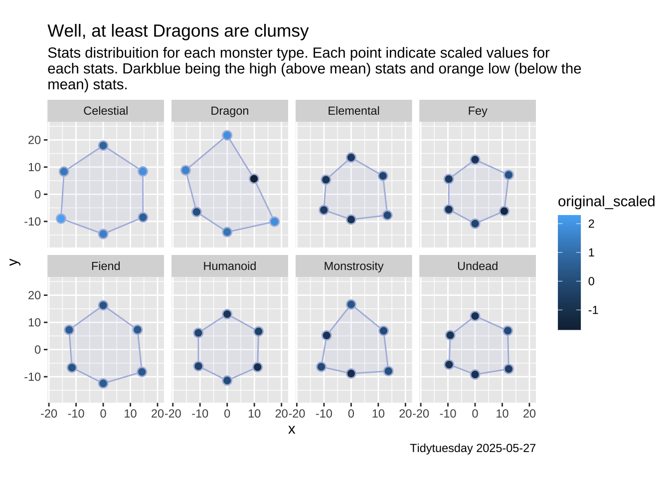
4.1 Before
data2plot2 |>
  group_by(attr) |>
  mutate(original_scaled = scale(original)) |>
  ungroup() |>
  ggplot(aes(x = x, y = y)) +
  geom_polygon(
    aes(group = type),
    fill = "#aebae0",
    color = '#aebae0',
    alpha = .1
  ) +
  geom_point(color = '#aebae0', size = 3) +
  geom_point(aes(color = original_scaled), size = 2) +
  facet_wrap(~type, ncol = 4) +
  theme_gray() +
  coord_fixed(ratio = 1, expand = TRUE) +
  scale_y_continuous(expand = c(0, 5, 0, 5)) +
  scale_x_continuous(expand = c(0, 5, 0, 5)) +
  labs(
    title = 'Well, at least Dragons are clumsy',
    subtitle = str_wrap('Stats distribuition for each monster type. Each point indicate scaled values for each stats. Darkblue being the high (above mean) stats and orange low (below the mean) stats.', width = 80),
    caption = 'Tidytuesday 2025-05-27'
  )
4.2 After
# Create my own axis (crying)
circle_data <- tibble(
  x_center = c(0, 0, 0, 0),
  y_center = c(0, 0, 0, 0),
  radius = c(5, 10, 15, 20)
)


data2plot2 |>
  group_by(attr) |>
  mutate(original_scaled = scale(original)) |>
  ungroup() |>
  ggplot(aes(x = x, y = y)) +
  geom_polygon(
    aes(group = type),
    fill = "#aebae0",
    color = '#aebae0',
    alpha = .2
  ) +
  ggforce::geom_circle(
    aes(x0 = x_center, y0 = y_center, r = radius),
    data = circle_data,
    fill = "transparent",
    color = '#ced5ea',
    linewidth = .25,
    inherit.aes = FALSE
  ) +
  shadowtext::geom_shadowtext(
    data = subset(data2plot2 |> distinct(type)),
    aes(label = type),
    x = 0,
    y = 0,
    family = 'Ubuntu',
    bg.color = "white", # Border
    bg.r = 0.2,
    color = '#47506e',
    size = 3
  ) +
  geom_point(color = '#aebae0', size = 3) +
  geom_point(aes(color = original_scaled), size = 2) +
  geom_text(
    data = data2plot2 |> mutate(y = if_else(y > 0, y + 4, y - 4)),
    aes(label = attr),
    family = "Ubuntu",
    size = 2.5,
    color = "#aebae0"
  ) +
  facet_wrap(~type, ncol = 4) +
  theme_void() +
  coord_fixed(ratio = 1, expand = TRUE) +
  scale_y_continuous(expand = c(0, 5, 0, 5)) +
  scale_x_continuous(expand = c(0, 5, 0, 5)) +
  scale_color_gradientn(colours = MetBrewer::MetPalettes$Hiroshige[[1]]) +
  theme(
    strip.background = element_blank(),
    strip.text = element_blank(),
    text = element_text(family = "Ubuntu"),
    plot.title.position = "plot",
    plot.title = element_text(family = "Ubuntu", size = 14, face = 'bold'),
    plot.caption = element_text(
      size = 8,
      color = 'grey60',
      margin = margin(20, 0, 0, 0)
    ),
    plot.subtitle = element_text(
      size = 9,
      lineheight = 1.15,
      margin = margin(5, 0, 15, 0)
    )
  ) +
  guides(color = 'none', fill = 'none') +
  labs(
    title = 'Well, at least Dragons are clumsy',
    subtitle = str_wrap('This chart displays the stats distribution for each monster type. Point colors correspond to scaled stat values, where dark blue signifies higher values (above the mean) and orange signifies lower values (below the mean)', width = 80),
    caption = 'Tidytuesday 2025-05-27'
  )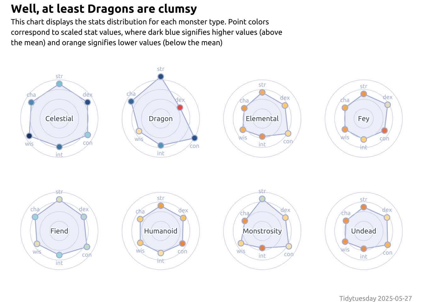
Note
Be aware that radar charts are not really that useful. A better vizualization could be done with bar chart, but I never done a radar before, so I gave it a try (and probably my last, lol)