library(tidyverse)
library(glue)
library(scales)
library(showtext)
library(ggtext)
library(shadowtext)

font_add_google("Ubuntu", "Ubuntu", regular.wt = 400, bold.wt = 700)
showtext_auto()
showtext_opts(dpi = 300)About the Data
Note
This week we’re exploring Web APIs! The lead volunteer for TidyTuesday (Jon Harmon) is writing a book about working with Web APIs with R as well as a series of R packages to make it easier to create API-wrapping R packages. On Thursday, 2025-06-19, Jon will present a talk on this package ecosystem at the Ghana R Conference 2025. While working on the packages and the talk, Jon explored a list of APIs from the website APIs.guru. That dataset is provided here.
[APIs.guru’s] goal is to create a machine-readable Wikipedia for Web APIs in the OpenAPI Specification format.
1 Initializing
1.1 Load libraries
1.2 Set theme
is_the_new_black <- "#374571"
theme_set(
  theme_minimal() +
    theme(
      # axis.line.x.bottom = element_line(color = '#474747', linewidth = .3),
      # axis.ticks.x= element_line(color = '#474747', linewidth = .3),
      # axis.line.y.left = element_line(color = '#474747', linewidth = .3),
      # axis.ticks.y= element_line(color = '#474747', linewidth = .3),
      # # panel.grid = element_line(linewidth = .3, color = 'grey90'),
      panel.grid.major = element_blank(),
      panel.grid.minor = element_blank(),
      axis.ticks.length = unit(-0.15, "cm"),
      plot.background = element_blank(),
      # plot.title.position = "plot",
      plot.title = element_text(family = "Ubuntu", size = 18, face = 'bold'),
      plot.caption = element_text(
        size = 8,
        color = '#aebae0',
        margin = margin(20, 0, 0, 0),
        hjust = 0
      ),
      plot.subtitle = element_text(
        size = 9,
        lineheight = 1.15,
        margin = margin(5, 0, 15, 0)
      ),
      axis.title.x = element_markdown(
        family = "Ubuntu",
        hjust = .5,
        size = 8,
        color = "#374571"
      ),
      axis.title.y = element_markdown(
        family = "Ubuntu",
        hjust = .5,
        size = 8,
        color = "#374571"
      ),
      axis.text = element_text(
        family = "Ubuntu",
        hjust = .5,
        size = 8,
        color = "#374571"
      ),
      legend.position = "top",
      text = element_text(family = "Ubuntu", color = "#374571"),
      plot.margin = margin(25, 25, 25, 25)
    )
)
1.3 Load this week’s data
api_categories <-readr::read_csv('https://raw.githubusercontent.com/rfordatascience/tidytuesday/main/data/2025/2025-06-17/api_categories.csv')
api_info <- readr::read_csv('https://raw.githubusercontent.com/rfordatascience/tidytuesday/main/data/2025/2025-06-17/api_info.csv')
api_logos <- readr::read_csv('https://raw.githubusercontent.com/rfordatascience/tidytuesday/main/data/2025/2025-06-17/api_logos.csv')
api_origins <- readr::read_csv('https://raw.githubusercontent.com/rfordatascience/tidytuesday/main/data/2025/2025-06-17/api_origins.csv')
apisguru_apis <- readr::read_csv('https://raw.githubusercontent.com/rfordatascience/tidytuesday/main/data/2025/2025-06-17/apisguru_apis.csv')
2 Data analysis
How many API format are there?
api_origins |> distinct(name, .keep_all = TRUE) |> count(format, sort = TRUE)# A tibble: 7 × 2
format n
<chr> <int>
1 swagger 1057
2 openapi 919
3 <NA> 272
4 google 258
5 postman 15
6 wadl 5
7 apiBlueprint 3So many NA, why?
api_origins |> filter(format |> is.na()) |> mutate(is_aws = str_detect(name, 'aws'))# A tibble: 272 × 5
name format url version is_aws
<chr> <chr> <chr> <chr> <lgl>
1 amazonaws.com:AWSMigrationHub <NA> https://raw.gith… <NA> TRUE
2 amazonaws.com:accessanalyzer <NA> https://raw.gith… <NA> TRUE
3 amazonaws.com:acm <NA> https://raw.gith… <NA> TRUE
4 amazonaws.com:acm-pca <NA> https://raw.gith… <NA> TRUE
5 amazonaws.com:alexaforbusiness <NA> https://raw.gith… <NA> TRUE
6 amazonaws.com:amp <NA> https://raw.gith… <NA> TRUE
7 amazonaws.com:amplify <NA> https://raw.gith… <NA> TRUE
8 amazonaws.com:amplifybackend <NA> https://raw.gith… <NA> TRUE
9 amazonaws.com:apigateway <NA> https://raw.gith… <NA> TRUE
10 amazonaws.com:apigatewaymanagementapi <NA> https://raw.gith… <NA> TRUE
# ℹ 262 more rowsMost of them are AWS. Let’s add it as a format.
Count how many categories are there
api_categories |> count(name, sort = TRUE) |> filter(n > 1)# A tibble: 426 × 2
name n
<chr> <int>
1 threatjammer.com 8
2 neutrinoapi.net 5
3 beanstream.com 3
4 edrv.io 3
5 googleapis.com:my-business 3
6 slack.com:openai 3
7 spectrocoin.com 3
8 stackexchange.com 3
9 who-hosts-this.com 3
10 amentum.space:aviation_radiation 2
# ℹ 416 more rowsapi_categories |> count(apisguru_category, sort = TRUE)# A tibble: 42 × 2
apisguru_category n
<chr> <int>
1 cloud 955
2 media 340
3 open_data 318
4 analytics 284
5 developer_tools 168
6 ecommerce 78
7 financial 72
8 messaging 62
9 entertainment 61
10 telecom 60
# ℹ 32 more rowsOne name can have multiple categories. In fact, 416 of 2,331 (17%) have more than one category. Let’s let it repeat.
3 Transform Data for Plotting
4 Time to plot!
4.1 Before
data2plot |>
  ggplot(aes(x = n, y = format)) +
  geom_col(aes(fill = apisguru_category), position = 'stack')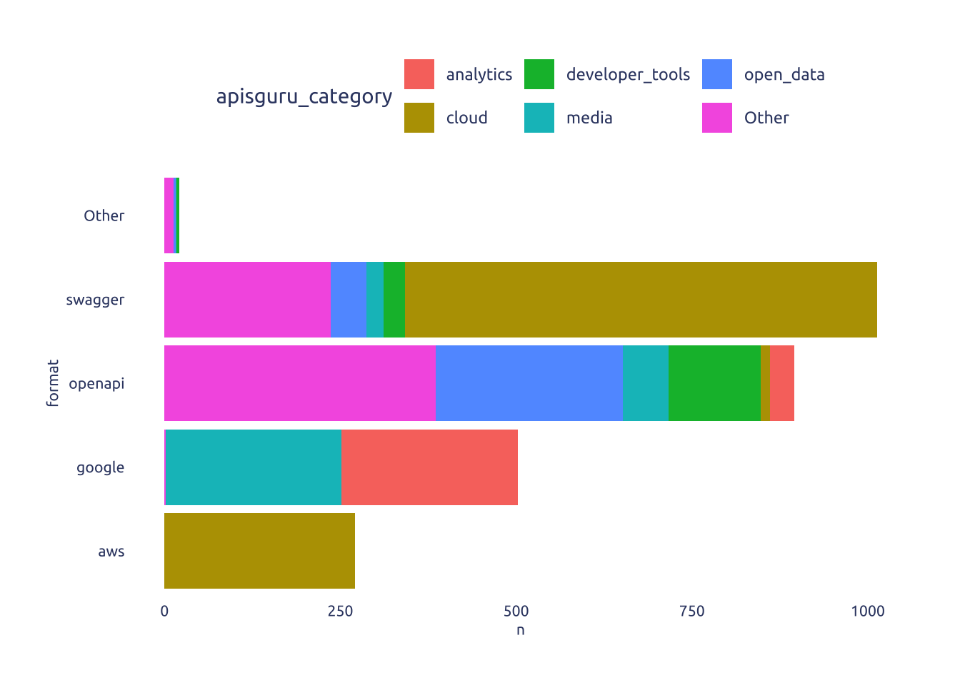
my_order <-
data2plot |>
group_by(format) |>
summarise(n = sum(n)) |>
ungroup() |>
arrange(desc(n)) |>
pull(format) |>
as.character()
pretty_format_label <- c(
'aws' = 'AWS ',
'swagger' = 'Swagger ',
'google' = 'Google ',
'openapi' = 'OpenAPI ',
'Other' = 'Other '
)
data2plot2 <-
data2plot |>
group_by(format) |>
mutate(cumsum = cumsum(n)) |>
ungroup()
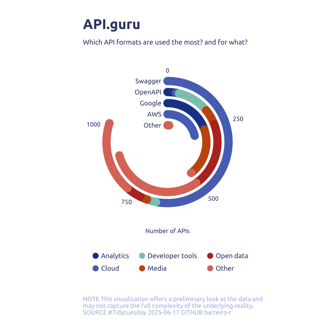
data2plot2 |>
ggplot(aes(x = n, y = factor(format, levels = rev(my_order)))) +
geom_segment(
aes(
x = cumsum - n,
xend = cumsum,
color = str_to_sentence(apisguru_category) |> str_replace_all('_', ' ')
),
linewidth = 5,
lineend = 'round',
key_glyph = 'point'
) +
geom_text(
data = tibble(format = my_order, n = 0),
aes(label = pretty_format_label[format]),
hjust = 1,
family = 'Ubuntu',
size = 3,
color = is_the_new_black
) +
MetBrewer::scale_color_met_d('Nizami', direction = -1) +
scale_x_continuous(expand = c(0, 0, 0, 0)) +
guides(color = guide_legend(override.aes = list(size = 3))) +
coord_radial(start = 0, end = 1.6 * pi, theta = 'x', inner.radius = .15) +
theme(
axis.text.y = element_blank(),
legend.position = 'bottom',
legend.key.size = unit(0, 'line'),
legend.key.spacing.y = unit(-.45, 'line'),
legend.text = element_text(margin = margin(l = -0.15, unit = "cm"))
) +
labs(
x = 'Number of APIs',
y = NULL,
color = NULL,
title = "API.guru",
subtitle = "Which API formats are used the most? and for what?",
caption = str_wrap(
"NOTE This visualization offers a preliminary look at the data and may not capture the full complexity of the underlying reality. SOURCE #Tidytuesday 2025-06-17 GITHUB barreiro-r",
width = 65
) |>
str_replace_all("@", "\n")
)
Note
I tryed to use ggforce::zoom_panel() and {ggmagnify} but both didn’t work.