library(tidyverse)
library(glue)
library(scales)
library(showtext)
library(ggtext)
library(shadowtext)
library(maps)

font_add_google("Ubuntu", "Ubuntu", regular.wt = 400, bold.wt = 700)
showtext_auto()
showtext_opts(dpi = 300)About the Data
Note
This week we are exploring measles and rubella cases across the world. This data was downloaded from the World Health Organisation Provisional monthly measles and rubella data on 2025-06-12.
Please note that all data contained within is provisional. The number of cases of measles and rubella officially reported by a WHO Member State is only available by July of each year (through the joint WHO UNICEF annual data collection exercise). If any numbers from this provisional data are quoted, they should be properly sourced with a date (i.e. “provisional data based on monthly data reported to WHO (Geneva) as of June 2025”). For official data from 1980, please visit our website: https://immunizationdata.who.int/global/wiise-detail-page/measles-reported-cases-and-incidence
1 Initializing
1.1 Load libraries
1.2 Set theme
cool_gray0 <- "#323955"
cool_gray1 <- "#5a6695"
cool_gray2 <- "#7e89bb"
cool_gray3 <- "#a4aee2"
cool_gray4 <- "#cbd5ff"
cool_gray5 <- "#e7efff"

theme_set(
  theme_minimal() +
    theme(
      # axis.line.x.bottom = element_line(color = '#474747', linewidth = .3),
      # axis.ticks.x= element_line(color = '#474747', linewidth = .3),
      # axis.line.y.left = element_line(color = '#474747', linewidth = .3),
      # axis.ticks.y= element_line(color = '#474747', linewidth = .3),
      # # panel.grid = element_line(linewidth = .3, color = 'grey90'),
      panel.grid.major = element_blank(),
      panel.grid.minor = element_blank(),
      axis.ticks.length = unit(-0.15, "cm"),
      plot.background = element_blank(),
      plot.title.position = "plot",
      plot.title = element_text(family = "Ubuntu", size = 18, face = 'bold'),
      plot.caption = element_text(
        size = 8,
        color = cool_gray4,
        margin = margin(20, 0, 0, 0),
        hjust = 0
      ),
      plot.subtitle = element_text(
        size = 9,
        lineheight = 1.15,
        margin = margin(5, 0, 15, 0)
      ),
      axis.title.x = element_markdown(
        family = "Ubuntu",
        hjust = .5,
        size = 8,
        color = cool_gray1
      ),
      axis.title.y = element_markdown(
        family = "Ubuntu",
        hjust = .5,
        size = 8,
        color = cool_gray1
      ),
      axis.text = element_text(
        family = "Ubuntu",
        hjust = .5,
        size = 8,
        color = cool_gray1
      ),
      legend.position = "top",
      text = element_text(family = "Ubuntu", color = cool_gray1),
      plot.margin = margin(25, 25, 25, 25)
    )
)
1.3 Load this week’s data
cases_month <- readr::read_csv('https://raw.githubusercontent.com/rfordatascience/tidytuesday/main/data/2025/2025-06-24/cases_month.csv')
cases_year <- readr::read_csv('https://raw.githubusercontent.com/rfordatascience/tidytuesday/main/data/2025/2025-06-24/cases_year.csv')
2 Data analysis
How many country and years?
n_years <- cases_year |> distinct(year) |> nrow()
n_countries <- cases_year |> distinct(country) |> nrow()
n_countries_year <- cases_year |> distinct(year, country) |> nrow()

print(glue('There are {n_countries} countries in {n_years} years.'))
There are 194 countries in 14 years.print(glue('There are {n_countries_year} countries in {n_years} years.'))There are 2382 countries in 14 years.print(glue('It was expected {n_countries} * {n_years} ({comma(n_countries * n_years)}) records and found {comma(n_countries_year)} ({percent(n_countries_year / (n_countries * n_years))}).'))It was expected 194 * 14 (2,716) records and found 2,382 (88%).Seasonality
cases_month |>
  filter(region == 'EUR') |>
  group_by(year, month) |>
  summarize(
    mean_melases = mean(measles_total, na.rm = TRUE),
    sd = sd(measles_total, na.rm = TRUE)
  ) |>
  ggplot(aes(x = month, y = mean_melases, color = year)) +
  geom_point() +
  geom_line(aes(group = year))
Cases by year
cases_year |>
  group_by(year) |>
  summarize(
    sum_cases = sum(measles_total, na.rm = TRUE),
  ) |>
  ggplot(aes(x = year, y = sum_cases)) +
  geom_point(color = cool_gray0) +
  geom_text(aes(label = year)) +
  geom_line(color = cool_gray0)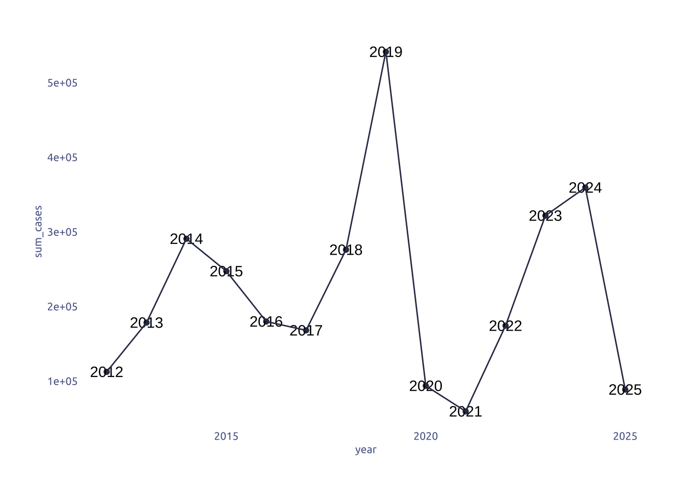
Global Trends
world <- map_data("world") |>
  left_join(read_csv('region2iso3.csv'), by = 'region')

world_plot_data <-
  world |>
  left_join(
    cases_year |>
      select(iso3, measles_total, year),
    by = 'iso3'
  )
ggplot() +
  geom_polygon(data = world_plot_data, aes(x = long, y = lat, group = group, fill = measles_total)) +
  coord_fixed(1.2) +
  facet_wrap(~year)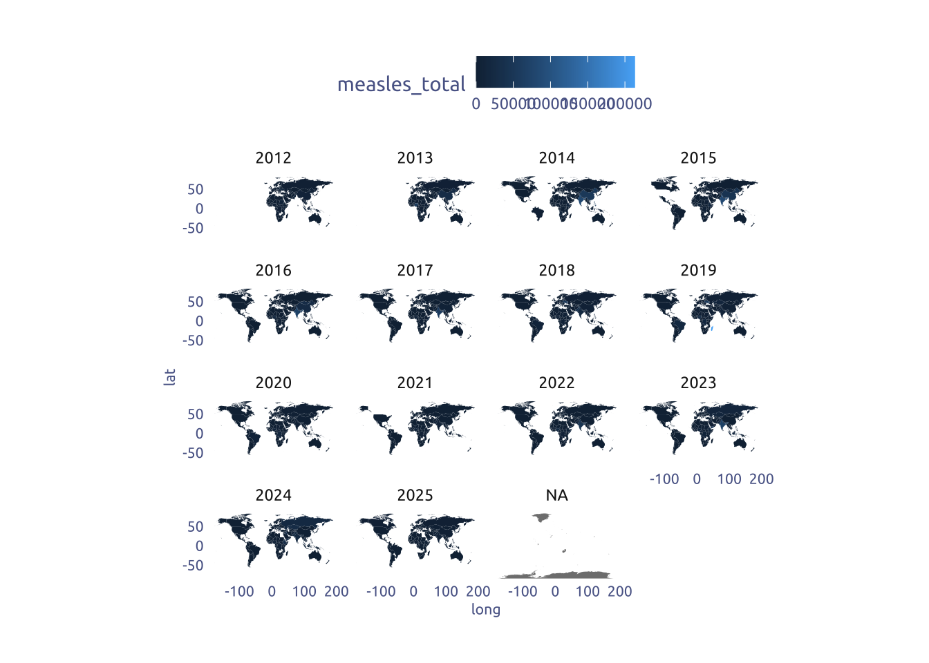
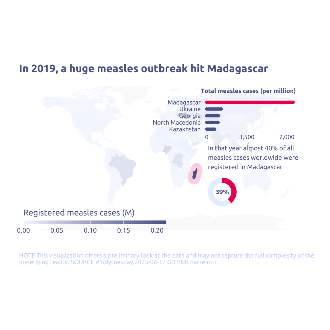
What happend in Madagascar in 2019?
cases_year |>
  filter(year == 2019) |>
  mutate(is_madagascar = country == 'Madagascar') |>
  group_by(is_madagascar) |>
  summarise(sum_measles = sum(measles_total))
# A tibble: 2 × 2
is_madagascar sum_measles
<lgl> <dbl>
1 FALSE 328110
2 TRUE 2132913 Transform Data for Plotting
cases_data <-
  cases_year |>
  filter(year == 2019) |>
  mutate(is_madagascar = country == 'Madagascar') |>
  mutate(measles_by_1m = measles_total / total_population * 10^6) |>
  select(iso3, country, is_madagascar, measles_total, measles_by_1m) |>
  arrange(-measles_by_1m)

map_data <-
  world |> left_join(cases_data, by = 'iso3')
4 Time to plot!
4.1 Before
map_data |>
  ggplot() +
  geom_polygon(aes(x = long, y = lat, group = group, fill = measles_total)) +
  coord_fixed(1.2) +
  theme_grey()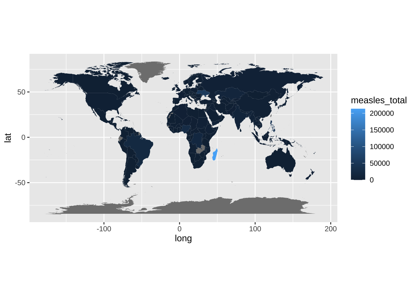
# Circular Plot
data2plot <-
  cases_data |>
  group_by(is_madagascar) |>
  summarise(total = sum(measles_total))

p_circular <-
  data2plot |>
  ggplot(aes(y = total)) +
  geom_col(aes(x = 1, fill = is_madagascar)) +
  annotate(
    geom = 'text',
    x = -1,
    y = 0,
    label = percent(
      data2plot |> filter(is_madagascar) |> pull(total) / sum(data2plot$total)
    ),
    family = 'Ubuntu',
    size = 3,
    color = cool_gray1,
    vjust = .5,
    fontface = 'bold'
  ) +
  coord_radial(theta = 'y', expand = FALSE) +
  scale_fill_manual(values = c(`TRUE` = "#F01B5B", `FALSE` = cool_gray5)) +
  theme(
    # Remove axis text
    axis.text = element_blank(),
    axis.title.x = element_blank(),
    axis.title.y = element_blank(),
    legend.position = 'bottom',
    plot.margin = margin(0, 0, 0, 0)
  ) +
  guides(fill = 'none')

# Top bar plots
p_bars <-
  cases_data |>
  slice_max(measles_by_1m, n = 5) |>
  ggplot(aes(x = measles_by_1m, y = reorder(country, measles_by_1m))) +
  geom_segment(
    aes(x = 0, xend = measles_by_1m, color = is_madagascar),
    lineend = 'round',
    linewidth = 2,
    show.legend = FALSE
  ) +
  scale_x_continuous(label = comma, breaks = c(0, 3500, 7000)) +
  scale_color_manual(values = c(`TRUE` = "#F01B5B", `FALSE` = cool_gray1)) +
  labs(x = NULL, y = NULL, title = "Total measles cases (per million)") +
  theme(plot.title = element_text(size = 8), plot.margin = margin(0, 0, 0, 0))


map_data |>
  ggplot() +
  geom_polygon(data = subset(map_data, is_madagascar), aes(
    x = long,
    y = lat,
  ), color = '#FFD8E4', fill = NA, linewidth = 6) +
  geom_polygon(aes(
    x = long,
    y = lat,
    group = group,
    fill = measles_total / 1000000
  )) +
  coord_fixed(1.2) +
  scale_fill_gradient(
    low = '#F5F8FF',
    high = cool_gray1,
    na.value = 'grey98',
    breaks = pretty_breaks(n = 4)
  ) +
  theme(
    plot.title = element_text(size = 14),
    legend.title.position = 'top',
    legend.position = c(0, 0),
    legend.justification = c(0, 0),
    legend.direction = 'horizontal',
    # Remove axis text
    axis.text = element_blank(),
    axis.title.x = element_blank(),
    axis.title.y = element_blank(),
  ) +
  annotation_custom(
    xmin = 60,
    xmax = 110,
    ymin = 0,
    ymax = -80,
    grob = ggplotGrob(p_circular)
  ) +
  annotation_custom(
    xmin = 55,
    xmax = 190,
    ymin = 25,
    ymax = 80,
    grob = ggplotGrob(p_bars)
  ) +
  annotate(
    geom = 'text',
    x = 65,
    y = 0,
    label = str_wrap(
      "In that year almost 40% of all measles cases worldwide were registered in Madagascar",
      width = 30
    ),
    hjust = 0,
    family = 'Ubuntu',
    size = 3,
    color = cool_gray1
  ) +
  labs(
    title = "In 2019, a huge measles outbreak hit Madagascar",
    fill = "Registered measles cases (M)",
    y = NULL,
    caption = str_wrap(
      "NOTE This visualization offers a preliminary look at the data and may not capture the full complexity of the underlying reality. SOURCE #Tidytuesday 2025-06-17 GITHUB barreiro-r",
      width = 110,
    ) |>
      str_replace_all("@", "\n")
  ) +
  guides(
    fill = guide_colorbar(
      barwidth = 13,
      barheight = .3,
      title.position = 'top'
    )
  )