library(tidyverse)
library(glue)
library(scales)
library(showtext)
library(ggtext)
library(shadowtext)
library(maps)
library(ggpattern)
library(ggrepel)
library(patchwork)

font_add_google("Ubuntu", "Ubuntu", regular.wt = 400, bold.wt = 700)
showtext_auto()
showtext_opts(dpi = 300)
Tip
About the Data
Note
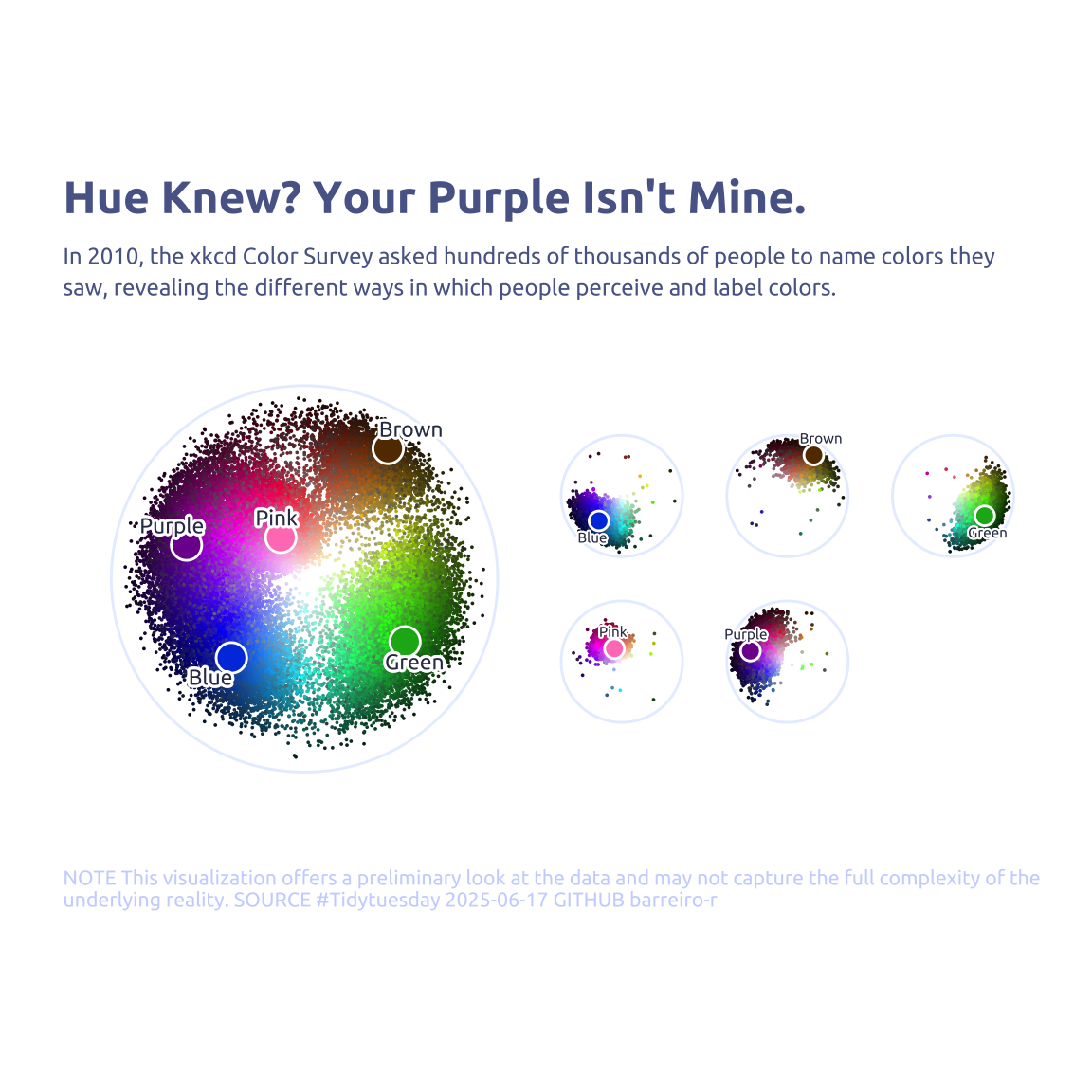
In 2010, the xkcd Color Survey asked hundreds of thousands of people to name colors they saw, revealing the different ways in which people perceive and label colors.
Color is a really fascinating topic, especially since we’re taught so many different and often contradictory ideas about rainbows, different primary colors, and frequencies of light.
1 Initializing
1.1 Load libraries
1.2 Set theme
cool_gray0 <- "#323955"
cool_gray1 <- "#5a6695"
cool_gray2 <- "#7e89bb"
cool_gray3 <- "#a4aee2"
cool_gray4 <- "#cbd5ff"
cool_gray5 <- "#e7efff"

cool_red0 <- "#A31C44"
cool_red1 <- "#F01B5B"
cool_red2 <- "#F43E75"
cool_red3 <- "#E891AB"
cool_red4 <- "#FAC3D3"
cool_red5 <- "#FCE0E8"

theme_set(
  theme_minimal() +
    theme(
      # axis.line.x.bottom = element_line(color = '#474747', linewidth = .3),
      # axis.ticks.x= element_line(color = '#474747', linewidth = .3),
      # axis.line.y.left = element_line(color = '#474747', linewidth = .3),
      # axis.ticks.y= element_line(color = '#474747', linewidth = .3),
      # # panel.grid = element_line(linewidth = .3, color = 'grey90'),
      panel.grid.major = element_blank(),
      panel.grid.minor = element_blank(),
      axis.ticks.length = unit(-0.15, "cm"),
      plot.background = element_blank(),
      plot.title.position = "plot",
      plot.title = element_text(family = "Ubuntu", size = 18, face = 'bold'),
      plot.caption = element_text(
        size = 8,
        color = cool_gray4,
        margin = margin(20, 0, 0, 0),
        hjust = 0
      ),
      plot.subtitle = element_text(
        size = 9,
        lineheight = 1.15,
        margin = margin(5, 0, 15, 0)
      ),
      axis.title.x = element_markdown(
        family = "Ubuntu",
        hjust = .5,
        size = 8,
        color = cool_gray1
      ),
      axis.title.y = element_markdown(
        family = "Ubuntu",
        hjust = .5,
        size = 8,
        color = cool_gray1
      ),
      axis.text = element_text(
        family = "Ubuntu",
        hjust = .5,
        size = 8,
        color = cool_gray1
      ),
      legend.position = "top",
      text = element_text(family = "Ubuntu", color = cool_gray1),
      plot.margin = margin(25, 25, 25, 25)
    )
)
1.3 Load this week’s data
answers <- readr::read_csv('https://raw.githubusercontent.com/rfordatascience/tidytuesday/main/data/2025/2025-07-08/answers.csv')
color_ranks <- readr::read_csv('https://raw.githubusercontent.com/rfordatascience/tidytuesday/main/data/2025/2025-07-08/color_ranks.csv')
users <- readr::read_csv('https://raw.githubusercontent.com/rfordatascience/tidytuesday/main/data/2025/2025-07-08/users.csv')
2 Data analysis
How many anwsers by user?
answers |> count(user_id, sort = TRUE, name = "answers") |> count(answers, sort = TRUE)# A tibble: 183 × 2
answers n
<int> <int>
1 1 17141
2 2 16036
3 3 14144
4 4 12141
5 5 10126
6 6 8234
7 7 6853
8 8 5709
9 9 4724
10 10 3927
# ℹ 173 more rowsVery sparse.
How often the same color was classified?
answers |> count(hex, sort = TRUE, name = "answers") |> count(answers, sort = TRUE)# A tibble: 5 × 2
answers n
<int> <int>
1 1 965244
2 2 44042
3 3 1566
4 4 45
5 5 13 Transform Data for Plotting
library(plotwidgets)
data2plot <-
  answers |>
  filter(user_id %in% (users |> filter(spam_prob < 0.001) |> pull(user_id))) |>
  left_join(
    color_ranks |>
      rename(rank_hex = hex) |>
      rowwise() |>
      mutate(hsl_rank = list(col2hsl(rank_hex))) |>
      ungroup(),
    by = 'rank'
  ) |>
  rowwise() |>
  mutate(hsl = list(col2hsl(hex))) |>
  ungroup()


data2plot <-
  data2plot |>
  hoist(hsl, h = 1, s = 2, l = 3) |>
  hoist(hsl_rank, h_rank = 1, s_rank = 2, l_rank = 3)


data2plot2 <-
  color_ranks |>
  rowwise() |>
  mutate(hsl_rank = list(col2hsl(hex))) |>
  ungroup() |>
  hoist(hsl_rank, h = 1, s = 2, l = 3) |>
  filter(rank %in% data2plot$rank)
4 Time to plot!
4.1 Before
# Main
p1 <-
  data2plot |>
  left_join(users, by = 'user_id') |>
  filter(colorblind == 0) |>
  filter(spam_prob < 0.001) |>
  ggplot(aes(x = h, y = -l)) +
  annotate(geom = 'segment', x = 0, xend = Inf, y = 0, color = cool_gray5) +
  geom_point(aes(color = hex), size = 0.001) +
  geom_point(data = data2plot2, aes(color = 'white'), size = 5.5) +
  geom_point(data = data2plot2, aes(color = hex), size = 4.5) +
  geom_text_repel(
    data = data2plot2,
    aes(label = str_to_sentence(color)),
    family = "Ubuntu",
    color = cool_gray0,
    size = 3,
    nudge_x = 5,
    nudge_y = .1,
    direction = "y",
    hjust = "center",
    bg.color = 'white',
    segment.size = 0,
    bg.r = 0.2
  ) +
  scale_color_identity() +
  scale_y_continuous(limits = c(-1, 0)) +
  coord_polar() +
  labs(
    title = "Hue Knew? Your Purple Isn't Mine.",
    subtitle = str_wrap(
      "In 2010, the xkcd Color Survey asked hundreds of thousands of people to name colors they saw, revealing the different ways in which people perceive and label colors.",
      width = 90
    ),
    pattern_spacing = NULL,
    y = NULL,
    x = NULL,
    caption = str_wrap(
      "NOTE This visualization offers a preliminary look at the data and may not capture the full complexity of the underlying reality. SOURCE #Tidytuesday 2025-06-17 GITHUB barreiro-r",
      width = 110,
    ) |>
      str_replace_all("@", "\n")
  ) +
  theme(
    axis.text.x = element_blank(),
    axis.text.y = element_blank(),
    axis.title.x = element_blank(),
    axis.title.y = element_blank(),
    plot.margin = margin(0, 0, 0, 0)
  )

# Faceted (copied only because of laziness)
p2 <- data2plot |>
  left_join(users, by = 'user_id') |>
  filter(colorblind == 0) |>
  filter(spam_prob < 0.001) |>
  ggplot(aes(x = h, y = -l)) +
  annotate(geom = 'segment', x = 0, xend = Inf, y = 0, color = cool_gray5) +
  geom_point(aes(color = hex), size = 0.001) +
  geom_point(data = data2plot2, aes(color = 'white'), size = 3.5) +
  geom_point(data = data2plot2, aes(color = hex), size = 2.5) +
  geom_text_repel(
    data = data2plot2,
    aes(label = str_to_sentence(color)),
    family = "Ubuntu",
    color = cool_gray0,
    size = 2,
    nudge_x = 5,
    nudge_y = .1,
    direction = "y",
    hjust = "center",
    bg.color = 'white',
    segment.size = 0,
    bg.r = 0.2
  ) +
  scale_color_identity() +
  scale_y_continuous(limits = c(-1, 0)) +
  coord_polar() +
  facet_wrap(~color, nrow = 2) +
  theme(
    axis.text.x = element_blank(),
    axis.text.y = element_blank(),
    axis.title.x = element_blank(),
    axis.title.y = element_blank(),
    strip.text = element_blank(),
    plot.margin = margin(0, 0, 0, 0)
  )

# Plot both
p1 + p2