library(tidyverse)
library(glue)
library(scales)
library(showtext)
library(ggtext)
library(shadowtext)
library(maps)
library(ggpattern)
library(ggrepel)
library(patchwork)

font_add_google("Ubuntu", "Ubuntu", regular.wt = 400, bold.wt = 700)
showtext_auto()
showtext_opts(dpi = 300)
Tip
About the Data
Note
This week we’re looking into British Library funding! Thank you to Andy Jackson for compiling this data (and updating it with more information) and posting it on BlueSky! Also thanks to David Rosenthal’s 2017 blog for inspiring Andy’s efforts!
I often refer back to this 2017 analysis by DSHR, which documents how the inflation-adjusted income of the British Library fell between 1999 and 2016. I referenced it in Invisible Memory Machines, but of course I was missing the data from the last eight years. Perhaps it’s all turned around since then!
1 Initializing
1.1 Load libraries
1.2 Set theme
cool_gray0 <- "#323955"
cool_gray1 <- "#5a6695"
cool_gray2 <- "#7e89bb"
cool_gray3 <- "#a4aee2"
cool_gray4 <- "#cbd5ff"
cool_gray5 <- "#e7efff"

cool_red0 <- "#A31C44"
cool_red1 <- "#F01B5B"
cool_red2 <- "#F43E75"
cool_red3 <- "#E891AB"
cool_red4 <- "#FAC3D3"
cool_red5 <- "#FCE0E8"

theme_set(
  theme_minimal() +
    theme(
      # axis.line.x.bottom = element_line(color = '#474747', linewidth = .3),
      # axis.ticks.x= element_line(color = '#474747', linewidth = .3),
      # axis.line.y.left = element_line(color = '#474747', linewidth = .3),
      # axis.ticks.y= element_line(color = '#474747', linewidth = .3),
      # # panel.grid = element_line(linewidth = .3, color = 'grey90'),
      panel.grid.major = element_blank(),
      panel.grid.minor = element_blank(),
      axis.ticks.length = unit(-0.15, "cm"),
      plot.background = element_blank(),
      plot.title.position = "plot",
      plot.title = element_text(family = "Ubuntu", size = 18, face = 'bold'),
      plot.caption = element_text(
        size = 8,
        color = cool_gray3,
        margin = margin(20, 0, 0, 0),
        hjust = 0
      ),
      plot.subtitle = element_text(
        size = 9,
        lineheight = 1.15,
        margin = margin(5, 0, 15, 0)
      ),
      axis.title.x = element_markdown(
        family = "Ubuntu",
        hjust = .5,
        size = 8,
        color = cool_gray1
      ),
      axis.title.y = element_markdown(
        family = "Ubuntu",
        hjust = .5,
        size = 8,
        color = cool_gray1
      ),
      axis.text = element_text(
        family = "Ubuntu",
        hjust = .5,
        size = 8,
        color = cool_gray1
      ),
      legend.position = "top",
      text = element_text(family = "Ubuntu", color = cool_gray1),
      plot.margin = margin(25, 25, 25, 25)
    )
)
1.3 Load this week’s data
bl_funding <-
readr::read_csv('https://raw.githubusercontent.com/rfordatascience/tidytuesday/main/data/2025/2025-07-15/bl_funding.csv')
2 Data analysis
What is the contribuition of each type o funding
bl_funding |>
  select(year, ends_with('y2000_gbp_millions')) |>
  pivot_longer(-year, names_to = 'type', values_to = 'amount') |>
  mutate(type = str_remove(type, '_y2000_gbp_millions')) |>
  ggplot(aes(x = year, y = amount)) +
  geom_point(aes(color = type)) +
  geom_line(aes(color = type, group = type))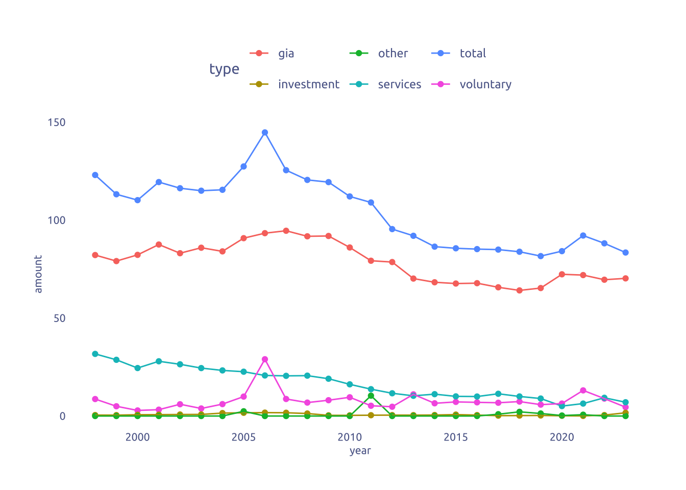
Nice spike o Voluntary funding in 2006.
bl_funding |>
  select(year, ends_with('y2000_gbp_millions')) |>
  pivot_longer(-year, names_to = 'type', values_to = 'amount') |>
  mutate(type = str_remove(type, '_y2000_gbp_millions')) |>
  filter(year %in% c(min(year), max(year))) |>
  ggplot(aes(x = as.character(year), y = amount)) +
  geom_point(aes(color = type)) +
  geom_line(aes(color = type, group = type))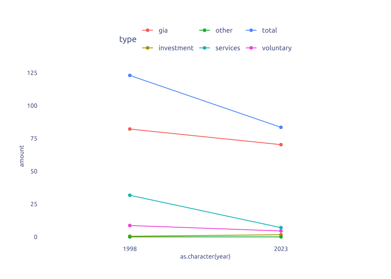
Well, not that interesting…
3 Transform Data for Plotting
data2plot <-
bl_funding |>
select(year, ends_with('y2000_gbp_millions')) |>
pivot_longer(-year, names_to = 'type', values_to = 'amount_end') |>
mutate(type = str_remove(type, '_y2000_gbp_millions'))
data2plot <-
left_join(
data2plot,
data2plot |> transmute(year = year - 1, type, amount_start = amount_end),
by = c('year', 'type'))
data2plot <-
data2plot |>
mutate(change = if_else(amount_start-amount_end > 0, 'Increase', 'Decrease')) |>
filter(type == 'total') |>
mutate(amount_start = if_else(year == max(year), 0, amount_start)) |>
mutate(amount_end = if_else(year == min(year), 0, amount_end)) |>
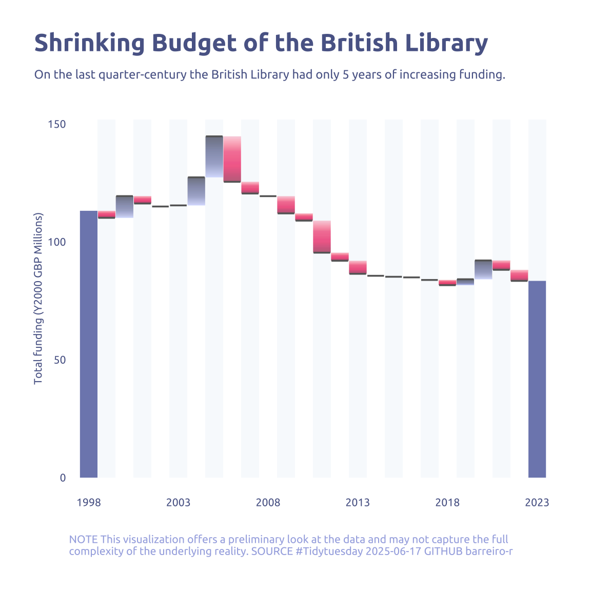
mutate(change = if_else(year %in% c(min(year), max(year)), "total", change))4 Time to plot!
4.1 Before
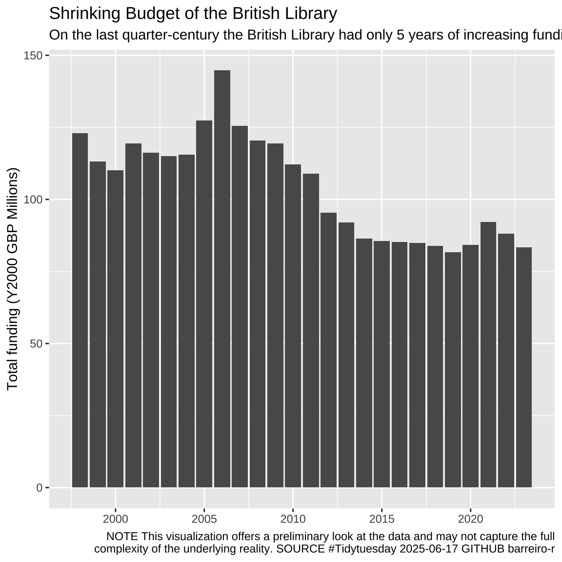
bl_funding |>
  select(year, ends_with('y2000_gbp_millions')) |>
  pivot_longer(-year, names_to = 'type', values_to = 'amount') |>
  mutate(type = str_remove(type, '_y2000_gbp_millions')) |>
  filter(type == 'total') |>
  ggplot(aes(x = year, y = amount)) +
  geom_col() +
  theme_grey() +
  labs(
    x = NULL,
    y = "Total funding (Y2000 GBP Millions)",
    title = "Shrinking Budget of the British Library",
    subtitle = "On the last quarter-century the British Library had only 5 years of increasing funding",
    caption = str_wrap(
      "NOTE This visualization offers a preliminary look at the data and may not capture the full complexity of the underlying reality. SOURCE #Tidytuesday 2025-06-17 GITHUB barreiro-r",
      width = 100,
    ) |>
      str_replace_all("@", "\n")
  )
library(ggforce)
library(ggh4x)

background <-
  tibble(
    year = seq(min(data2plot$year), max(data2plot$year), by = 1),
    y = max(data2plot$amount_end) * 1.05
  ) |>
  mutate(color = row_number() %% 2)

data2plot |>
  filter(type == 'total') |>
  ggplot(aes(x = year)) +
  geom_col(data = background, aes(y = y, bg = color), width = 1) +
  geom_link(
    data = subset(data2plot, change == 'Increase'),
    aes(
      xend = year,
      y = amount_start,
      yend = amount_end,
      increase = after_stat(index)
    ),
    n = 1000,
    linewidth = 6,
    show.legend = FALSE
  ) +
  geom_link(
    data = subset(data2plot, change == 'Decrease'),
    aes(
      xend = year,
      y = amount_start,
      yend = amount_end,
      decrease = after_stat(index)
    ),
    n = 1000,
    linewidth = 6,
    show.legend = FALSE
  ) +
  geom_segment(
    data = subset(data2plot, change == 'total'),
    aes(
      xend = year,
      y = amount_start,
      yend = amount_end
    ),
    color = cool_gray2,
    linewidth = 6,
    show.legend = FALSE
  ) +
  geom_point(
    data = subset(data2plot, change != 'total'),
    aes(y = amount_start),
    shape = "_",
    size = 7,
    color = 'grey40'
  ) +
  scale_colour_multi(
    aesthetics = c('increase', 'decrease'),
    name = list("Increase", "Decrease"),
    colours = list(
      c(cool_gray0, cool_gray1, cool_gray2, cool_gray4),
      c(cool_red0, cool_red1, cool_red2, cool_red4)
    )
  ) +
  scale_fill_multi(
    aesthetics = c('bg'),
    name = list("bg"),
    colours = list(
      c("#F8FAFD", "white")
    )
  ) +
  scale_colour_gradient(low = cool_gray1, high = cool_gray5) +
  scale_x_discrete(
    limits = seq(min(data2plot$year), max(data2plot$year), by = 5)
  ) +
  labs(
    x = NULL,
    y = "Total funding (Y2000 GBP Millions)",
    title = "Shrinking Budget of the British Library",
    subtitle = "On the last quarter-century the British Library had only 5 years of increasing funding.",
    caption = str_wrap(
      "NOTE This visualization offers a preliminary look at the data and may not capture the full complexity of the underlying reality. SOURCE #Tidytuesday 2025-06-17 GITHUB barreiro-r",
      width = 100,
    ) |>
      str_replace_all("@", "\n")
  )