library(tidyverse)
library(glue)
library(scales)
library(showtext)
library(ggtext)
library(shadowtext)
library(maps)
library(ggpattern)
library(ggrepel)
library(patchwork)
# library(tidylog)

# font_add_google("Ubuntu", "Ubuntu", regular.wt = 400, bold.wt = 700)
# showtext_auto()
# showtext_opts(dpi = 300)
Tip
About the Data
Note
This week we’re exploring the (New York) MTA Permanent Art Catalog! Thank you to Georgios Karamanis (GitHub | Bluesky | LinkedIn for suggesting this dataset. Submit your dataset ideas through our GitHub issue tracker!
The MTA has a dashboard to explore this dataset, but the dashboard is at least partially broken. Can you recreate it in Shiny for R or Python?
Through the Permanent Art Program, MTA Arts & Design (formerly Arts for Transit) commissions public art that is seen by millions of city-dwellers as well as national and international visitors who use the MTA’s subways and trains. Arts & Design works closely with the architects and engineers at MTA NYC Transit, Long Island Rail Road and Metro-North Railroad to determine the parameters and sites for the artwork that is to be incorporated into each station scheduled for renovation. A diversity of well-established, mid-career and emerging artists contribute to the growing collection of works created in the materials of the system -mosaic, ceramic, tile, bronze, steel and glass. Artists are chosen through a competitive process that uses selection panels comprised of visual arts professionals and community representatives which review and select artists. This data provides the branch or station and the artist and artwork information.
1 Initializing
1.1 Load libraries
1.2 Set theme
cool_gray0 <- "#323955"
cool_gray1 <- "#5a6695"
cool_gray2 <- "#7e89bb"
cool_gray3 <- "#a4aee2"
cool_gray4 <- "#cbd5ff"
cool_gray5 <- "#e7efff"

cool_red0 <- "#A31C44"
cool_red1 <- "#F01B5B"
cool_red2 <- "#F43E75"
cool_red3 <- "#E891AB"
cool_red4 <- "#FAC3D3"
cool_red5 <- "#FCE0E8"

theme_set(
  theme_minimal() +
    theme(
      # axis.line.x.bottom = element_line(color = '#474747', linewidth = .3),
      # axis.ticks.x= element_line(color = '#474747', linewidth = .3),
      # axis.line.y.left = element_line(color = '#474747', linewidth = .3),
      # axis.ticks.y= element_line(color = '#474747', linewidth = .3),
      # # panel.grid = element_line(linewidth = .3, color = 'grey90'),
      panel.grid.major = element_blank(),
      panel.grid.minor = element_blank(),
      axis.ticks.length = unit(-0.15, "cm"),
      plot.background = element_blank(),
      # plot.title.position = "plot",
      plot.title = element_text(family = "Helvetica Neue", size = 18, face = 'bold'),
      plot.caption = element_text(
        size = 8,
        color = cool_gray1,
        margin = margin(20, 0, 0, 0),
        hjust = 0
      ),
      plot.subtitle = element_text(
        size = 9,
        lineheight = 1.15,
        margin = margin(5, 0, 15, 0)
      ),
      axis.title.x = element_markdown(
        family = "Helvetica Neue",
        hjust = .5,
        size = 8,
        color = 'black'
      ),
      axis.title.y = element_markdown(
        family = "Helvetica Neue",
        hjust = .5,
        size = 8,
        color = 'black'
      ),
      axis.text = element_text(
        family = "Helvetica Neue",
        hjust = .5,
        size = 8,
        color = 'black'
      ),
      legend.position = "top",
      text = element_text(family = "Helvetica Neue", color = 'black'),
      plot.margin = margin(25, 25, 25, 25)
    )
)
1.3 Load this week’s data
path <- "https://raw.githubusercontent.com/rfordatascience/tidytuesday/main/data"

mta_art <- readr::read_csv(glue('{path}/2025/2025-07-22/mta_art.csv'))
station_lines <- readr::read_csv(glue('{path}/2025/2025-07-22/station_lines.csv'))
2 Data analysis
How many art each artist contributed to?
mta_art |>
  count(artist, sort = TRUE, name = 'artpieces') |>
  count(artpieces, sort = TRUE, name = 'artists')
# A tibble: 4 × 2
artpieces artists
<int> <int>
1 1 294
2 2 35
3 3 4
4 5 1Mostly did only one artpiece, 40 did more then 1.
# Thank you Gemini
art_categories <-
  read_csv('art_categories.csv') |>
  distinct(art_material, .keep_all = TRUE)

mta_art |>
  mutate(art_material = str_remove(art_material, ' - .*')) |>
  mutate(art_material = str_remove(art_material, ', .*')) |>
  mutate(art_material = str_replace(art_material, '\v', "")) |>
  left_join(art_categories, by = 'art_material') |>
  count(art_material_category, art_date, sort = TRUE, name = 'artpieces')
# A tibble: 123 × 3
art_material_category art_date artpieces
<chr> <dbl> <int>
1 Glass 2018 25
2 Glass 2007 14
3 Glass 2002 12
4 Glass 2006 11
5 Glass 2011 10
6 Glass 2012 10
7 Glass 2004 9
8 Glass 2008 9
9 Metal 1990 9
10 Ceramic/Mosaic (Non-Glass) 1994 8
# ℹ 113 more rowsWell, not that interesting…
3 Transform Data for Plotting
data2plot <-
mta_art |>
mutate(art_material = str_remove(art_material, ' - .*')) |>
mutate(art_material = str_remove(art_material, ', .*')) |>
mutate(art_material = str_replace(art_material, '\v', "")) |>
left_join(art_categories, by = 'art_material') |>
count(art_material_category, art_date, sort = TRUE, name = 'artpieces') |>
filter(art_date > 2000) |>
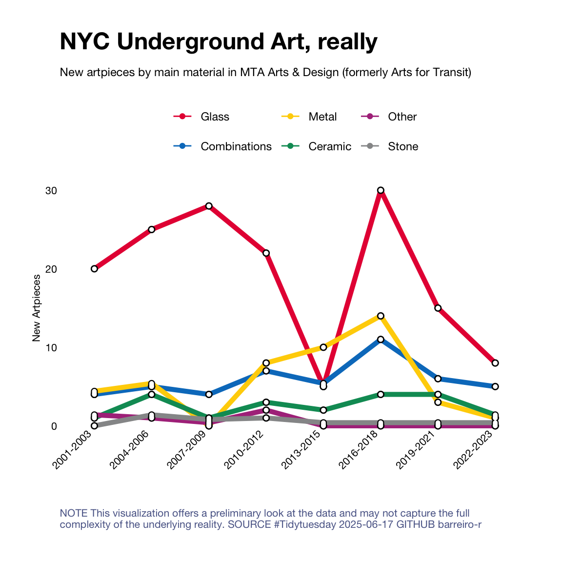
mutate(art_material_category = str_remove(art_material_category, '/.*'))4 Time to plot!
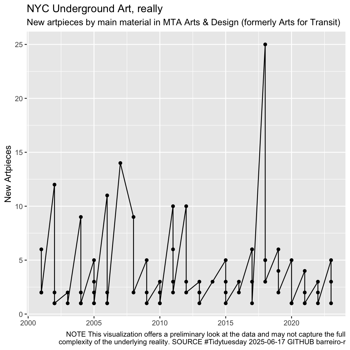
4.1 Before
data2plot |>
  ggplot(aes(x = art_date, y = artpieces)) +
  geom_point() + geom_line() +
  theme_grey() +
  labs(
    color = NULL,
    x = NULL,
    y = "New Artpieces",
    title = "NYC Underground Art, really",
    subtitle = "New artpieces by main material in MTA Arts & Design (formerly Arts for Transit)",
    caption = str_wrap(
      "NOTE This visualization offers a preliminary look at the data and may not capture the full complexity of the underlying reality. SOURCE #Tidytuesday 2025-06-17 GITHUB barreiro-r",
      width = 100
    ))
#' Add Vertical Spacing to Tied Values
#'
#' This function identifies ties within groups and adds a small vertical offset
#' to distinguish them. It's designed to be used within a dplyr pipeline.
#'
#' @param .data A tibble or data frame.
#' @param group_col The column that defines the main groups (e.g., a date range).
#' @param value_col The numeric column where ties should be detected (e.g., counts).
#' @param order_col The categorical column used to establish a consistent order for applying the offset during ties.
#' @param new_col_name The name of the new column that will store the spaced-out values.
#' @param residual The small numeric value to add for each subsequent tied item.
#'
#' @return A tibble with the new spaced-out value column added.
#'
#' @examples
#' # See example usage below the function definition.
add_vertical_spacing <- function(.data, group_col, value_col, order_col, new_col_name = "spaced_total", residual = 0.1) {
  .data %>%
    # First, arrange by the designated ordering column. This is crucial because
    # it ensures that when we find ties, the residuals are added in a consistent
    # order (based on the factor levels or alphabetical order of this column).
    arrange({{ order_col }}) %>%

    # Group by the main category (e.g., date range) AND the specific value.
    # This creates groups of rows that are tied. For example, all rows where
    # art_date_range is "2010-2012" AND total_artpieces is 10.
    # Rows with unique values will form a group of 1.
    group_by({{ group_col }}, {{ value_col }}) %>%

    # Create the new column.
    mutate(
      # `row_number()` gives the count (1, 2, 3...) for each row within the group.
      # For a unique point, the group size is 1, so row_number() is 1, and we add 0.
      # For two tied points, we get row numbers 1 and 2. We add (1-1)*residual and (2-1)*residual.
      {{new_col_name}} := {{ value_col }} + (row_number() - 1) * residual
    ) %>%

    # It's good practice to ungroup after the operation is complete.
    ungroup()
}
subway_color <- c(
"#E70D42",
"#017DC6",
"#FFD203",
"#019964",
"#AF378A",
"#969798"
)
library(ggstance)
data2plot <-
data2plot |>
complete(art_date, art_material_category, fill = list(artpieces = 0)) |>
mutate(year_group = floor((art_date - min(art_date)) / 3)) |>
group_by(art_material_category, year_group) |>
summarise(
art_date_range = if_else(
min(art_date) == max(art_date),
as.character(min(art_date)),
paste(min(art_date), max(art_date), sep = "-")
),
total_artpieces = sum(artpieces),
.groups = "drop" # Drop the grouping structure after summarizing
)
data2plot <-
data2plot |>
mutate(
art_material_category = factor(
art_material_category,
levels = data2plot |>
group_by(art_material_category) |>
summarise(all = sum(total_artpieces)) |>
arrange(desc(all)) |>
pull(art_material_category)
)
)
data2plot2 <-
data2plot |>
add_vertical_spacing(
group_col = art_date_range,
value_col = total_artpieces,
order_col = art_material_category,
residual = 0.4
)
data2plot2 |>
ggplot(aes(x = art_date_range, y = total_artpieces)) +
geom_point(aes(color = art_material_category)) +
geom_line(aes(color = art_material_category)) +
geom_line(
aes(
y = spaced_total,
color = art_material_category,
group = art_material_category
),
linewidth = 1.8,
show.legend = FALSE
) +
geom_point(color = 'black', size = 2) +
geom_point(color = 'white', size = 1.5) +
geom_segment(
aes(
x = art_date_range,
xend = art_date_range,
y = floor(spaced_total),
yend = spaced_total
),
linewidth = 2.5,
lineend = "round"
) +
geom_segment(
aes(
x = art_date_range,
xend = art_date_range,
y = floor(spaced_total),
yend = spaced_total
),
linewidth = 1.7,
lineend = "round",
color = 'white'
) +
labs(
color = NULL,
x = NULL,
y = "New Artpieces",
title = "NYC Underground Art, really",
subtitle = "New artpieces by main material in MTA Arts & Design (formerly Arts for Transit)",
caption = str_wrap(
"NOTE This visualization offers a preliminary look at the data and may not capture the full complexity of the underlying reality. SOURCE #Tidytuesday 2025-06-17 GITHUB barreiro-r",
width = 100,
) |>
str_replace_all("@", "\n")
) +
scale_color_manual(values = subway_color) +
theme(axis.text.x = element_text(angle = 45, hjust = 1.3, vjust = 1.6))