library(tidyverse)
library(glue)
library(scales)
library(showtext)
library(ggtext)
library(shadowtext)
library(maps)
library(ggpattern)
library(ggrepel)
library(patchwork)
library(tidylog)

font_add_google("Ubuntu", "Ubuntu", regular.wt = 400, bold.wt = 700)
showtext_auto()
showtext_opts(dpi = 300)
Tip
About the Data
Note
This week we are exploring TV show and movie viewing data from Netflix. Since 2023, Netflix has released regular Engagement Reports summarising the number of hours that users have spent watching each show and movie in the last 6 months.
This report, which captures ~99% of all viewing in the first half of 2025, shows that people watched a lot of Netflix — over 95B hours — spanning a wide range of genres and languages. It’s why we continue to invest in a variety of quality titles for various moods and tastes and work hard to make them great.
The dataset this week combines viewing data from late 2023 through the first half of 2025.
1 Initializing
1.1 Load libraries
1.2 Set theme
cool_gray0 <- "#323955"
cool_gray1 <- "#5a6695"
cool_gray2 <- "#7e89bb"
cool_gray3 <- "#a4aee2"
cool_gray4 <- "#cbd5ff"
cool_gray5 <- "#e7efff"

cool_red0 <- "#A31C44"
cool_red1 <- "#F01B5B"
cool_red2 <- "#F43E75"
cool_red3 <- "#E891AB"
cool_red4 <- "#FAC3D3"
cool_red5 <- "#FCE0E8"

theme_set(
  theme_minimal() +
    theme(
      # axis.line.x.bottom = element_line(color = '#474747', linewidth = .3),
      # axis.ticks.x= element_line(color = '#474747', linewidth = .3),
      # axis.line.y.left = element_line(color = '#474747', linewidth = .3),
      # axis.ticks.y= element_line(color = '#474747', linewidth = .3),
      # # panel.grid = element_line(linewidth = .3, color = 'grey90'),
      panel.grid.major = element_blank(),
      panel.grid.minor = element_blank(),
      axis.ticks.length = unit(-0.15, "cm"),
      plot.background = element_blank(),
      plot.title.position = "plot",
      plot.title = element_text(family = "Ubuntu", size = 18, face = 'bold'),
      plot.caption = element_text(
        size = 8,
        color = cool_gray3,
        margin = margin(20, 0, 0, 0),
        hjust = 0
      ),
      plot.subtitle = element_text(
        size = 9,
        lineheight = 1.15,
        margin = margin(5, 0, 15, 0)
      ),
      axis.title.x = element_markdown(
        family = "Ubuntu",
        hjust = .5,
        size = 8,
        color = cool_gray1
      ),
      axis.title.y = element_markdown(
        family = "Ubuntu",
        hjust = .5,
        size = 8,
        color = cool_gray1
      ),
      axis.text = element_text(
        family = "Ubuntu",
        hjust = .5,
        size = 8,
        color = cool_gray1
      ),
      legend.position = "top",
      text = element_text(family = "Ubuntu", color = cool_gray1),
      plot.margin = margin(25, 25, 25, 25)
    )
)
1.3 Load this week’s data
movies <- readr::read_csv('https://raw.githubusercontent.com/rfordatascience/tidytuesday/main/data/2025/2025-07-29/movies.csv')
shows <- readr::read_csv('https://raw.githubusercontent.com/rfordatascience/tidytuesday/main/data/2025/2025-07-29/shows.csv')

netflix <- bind_rows(movies |> mutate(type = 'movie'), shows |> mutate(type = 'show'))
2 Data analysis
Let see the release date distribution
netflix |>
  ggplot(aes(x = release_date)) +
geom_histogram(aes(fill = type)) 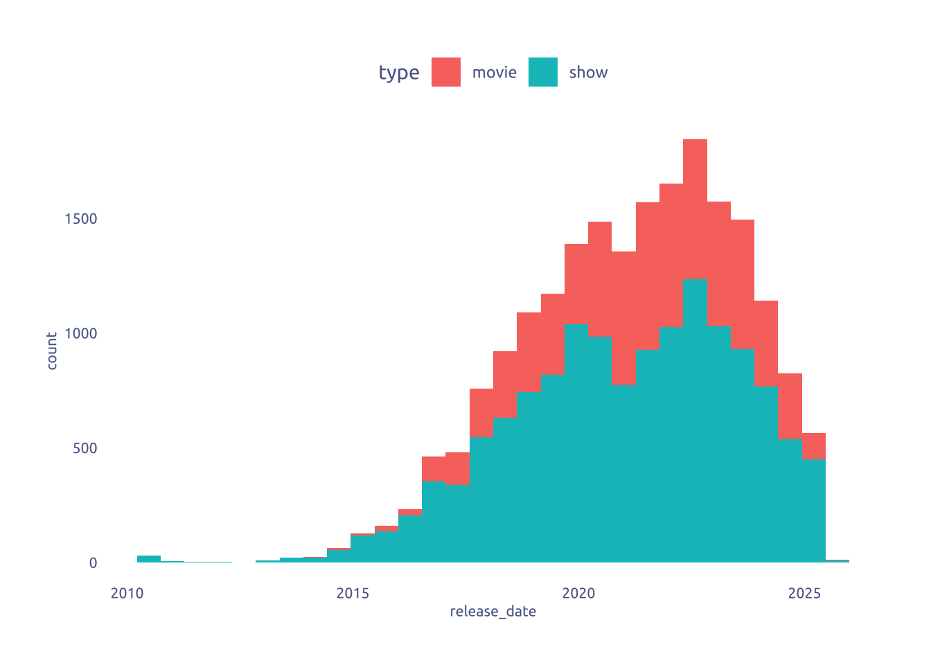
It is correlated to the number of views?
netflix |>
  ggplot(aes(x = release_date, y = views)) +
  geom_point(aes(color = type))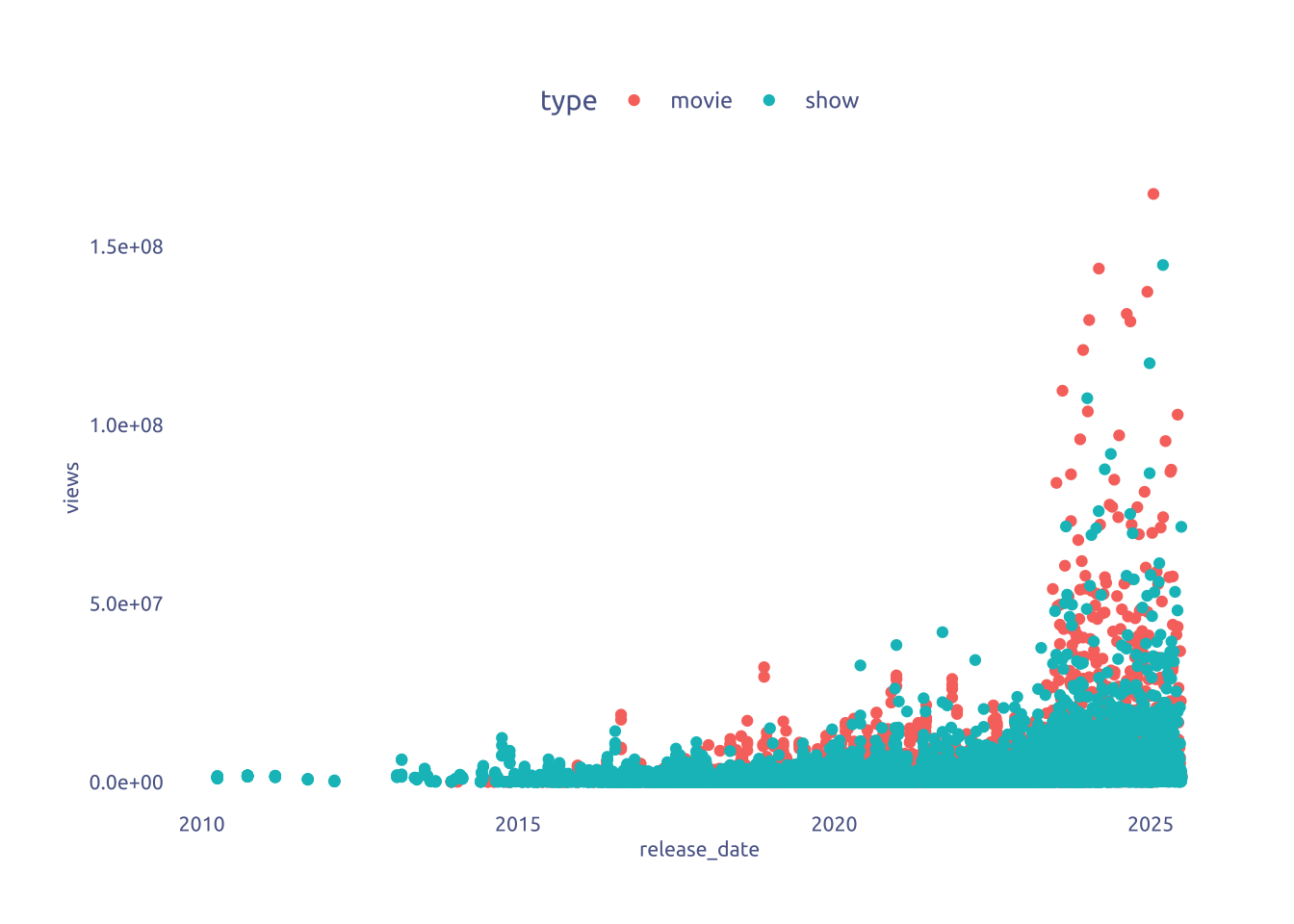
Is runtime related to the number of views?
library(lubridate)
netflix |>
  mutate(seconds = period_to_seconds(hms(runtime))) |>
  filter(seconds < 100000) |>
  ggplot(aes(x = seconds, y = views)) +
  geom_point(aes(color = type))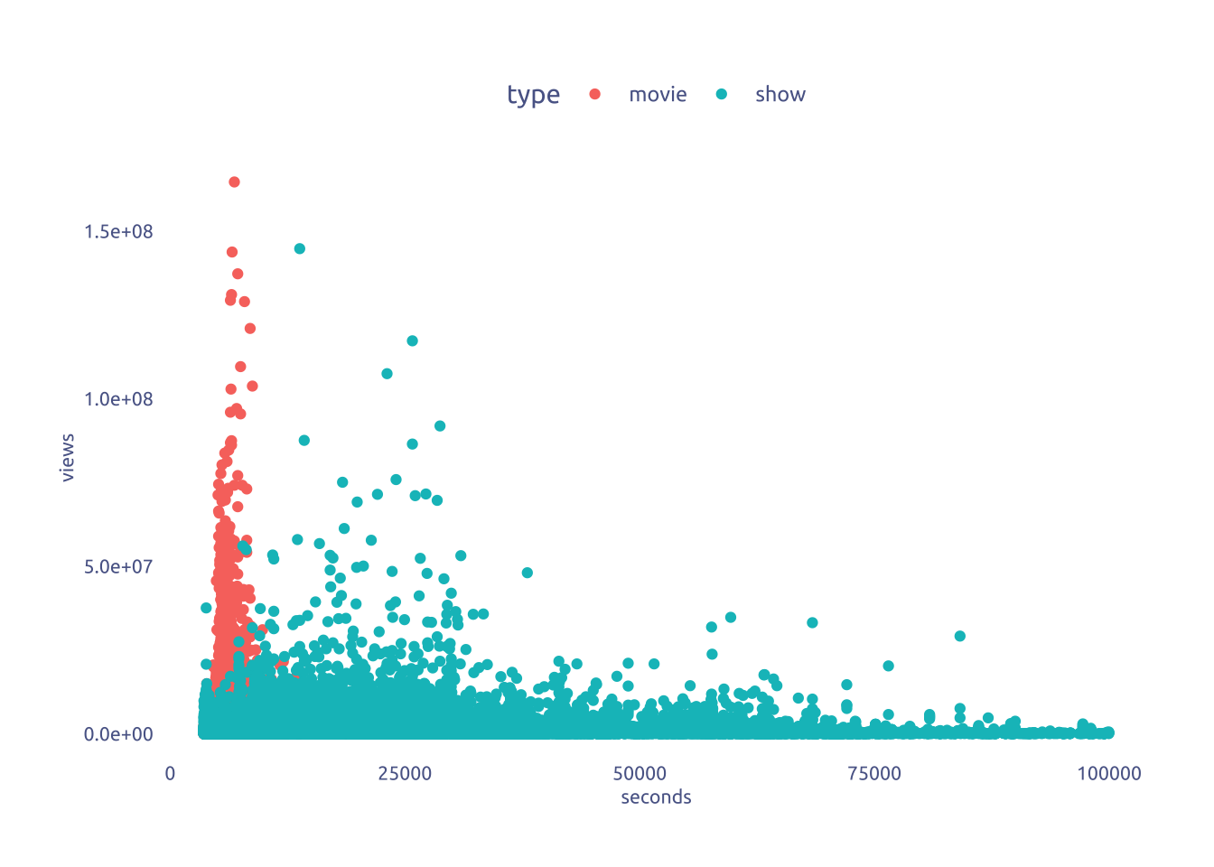
What about quantiles?
netflix |>
  mutate(seconds = period_to_seconds(hms(runtime))) |>
  group_by(type) |>
  mutate(seconds_quantile = ntile(seconds, 5)) |>
  ungroup() |>
  ggplot(aes(x = seconds_quantile, y = log(hours_viewed))) +
  ggbeeswarm::geom_quasirandom(
    aes(color = type),
    dodge.width = 0.5,
    size = .1,
    alpha = .01
  ) +
  stat_summary(
    fun = mean,
    geom = "point",
    size = 2,
    aes(color = type),
    position = position_dodge(width = .5)
  ) +
  stat_summary(
    aes(color = type),
    fun.data = 'mean_sdl',
    fun.args = list(mult = 1),
    geom = "errorbar",
    width = 0.15,
    position = position_dodge(width = .5)
) x views-1.png)
# facet_wrap(~type, ncol = 1)3 Transform Data for Plotting
library(igraph)

library(tidytext)
library(igraph)
library(ggraph)
library(widyr)
library(qdapDictionaries)

english_words <- tibble(word = GradyAugmented)
data("stop_words")

blocklist_words <- c(
  'season',
  'limited',
  'series',
  'movie',
  'trailer',
  'de',
  'la',
  'el',
  'los',
  'las',
  'les',
  'di'
)

data2plot <-
  netflix |>
  filter(report == "2025Jan-Jun") |>
  mutate(title = str_remove(title, " // .*")) |>
  distinct(title) |>
  mutate(id = row_number()) |>
  mutate(id = as.character(id)) |>
  unnest_tokens(word, title, drop = FALSE) |>
  anti_join(stop_words, by = "word") |>
  filter(!str_detect(word, "[0-9]")) |>
  filter(!str_detect(word, "[[:punct:]]")) |>
  semi_join(english_words, by = "word") |>
  filter(!word %in% blocklist_words)

word_pairs <- data2plot |>
  pairwise_count(word, id, sort = TRUE, upper = FALSE)

top_words <-
  data2plot |>
  count(word, sort = TRUE) |>
  head(15) |>
  mutate(rank = row_number())

# Filter for pairs that appear at least twice to reduce noise
filtered_pairs <- word_pairs |>
  filter(item1 %in% top_words$word | item2 %in% top_words$word) |>
  mutate(top_word = if_else(item1 %in% top_words$word, item1, item2)) |>
  group_by(top_word) |>
  slice_max(n, n = 5) |>
  ungroup() |>
  select(-top_word)

# --- Create Nodes
nodes <-
  filtered_pairs |>
  select(-n) |>
  mutate(id = row_number()) |>
  pivot_longer(names_to = 'names', values_to = 'word', -id) |>
  select(-id, -names) |>
  distinct(word) |>
  left_join(top_words, by = 'word') |>
  mutate(is_top = !is.na(rank)) |>
  mutate(rank = if_else(is.na(rank), 16, rank))

# -- Create Edges
edges <-
  filtered_pairs

# Create an igraph object from the filtered pairs
my_graph_df <- graph_from_data_frame(edges, vertices = nodes)
4 Time to plot!
4.1 Attempt 1
I was tring to create an eye…
library(lubridate)
data2plot <-
  netflix |>
  filter(!is.na(release_date)) |>
  filter(report == "2025Jan-Jun") |>
  group_by(type) |>
  slice_max(hours_viewed, n = 100) |>
  arrange(type, hours_viewed) |>
  mutate(order = -1 * row_number()) |>
  mutate(order = if_else(type == 'show', order * -1, order)) |>
  mutate(title = fct_reorder(title, order)) |>
  ungroup()


data2plot |>
  ggplot(aes(x = hours_viewed, y = title)) +
  geom_segment(
    aes(x = 0, xend = hours_viewed, color = type),
    show.legend = FALSE
  ) +
  coord_radial(theta = "y", inner.radius = .2, start = 90 * (pi / 180)) +
  scale_color_manual(values = c(cool_gray1, cool_red1)) +
  theme_void() +
  theme(margin = margin(0, 0, 0, 0))
4.2 Final
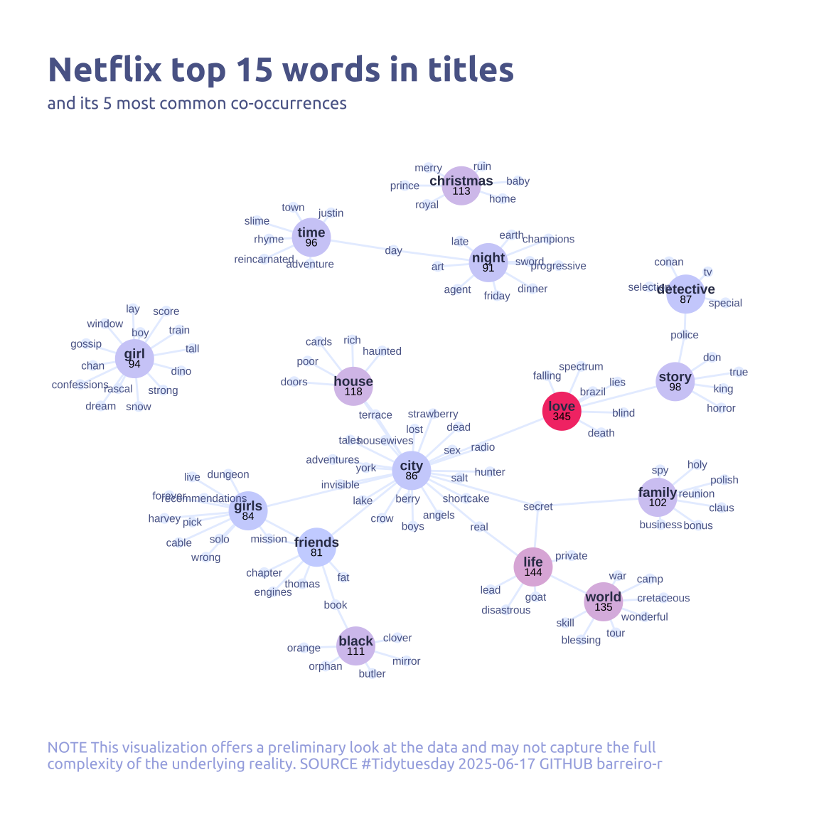
ggraph(my_graph_df, layout = "fr") +
  geom_edge_link(color = cool_gray5, show.legend = FALSE) +
  geom_node_point(aes(size = is_top, color = n)) +
  geom_node_text(
    aes(label = name, filter = is_top),
    repel = FALSE,
    size = 2.5,
    color = cool_gray0,
    nudge_y = .2,
    fontface = 'bold'
  ) +
  geom_node_text(
    aes(label = name, filter = !is_top),
    repel = FALSE,
    size = 2,
    color = cool_gray1
  ) +
  geom_node_text(aes(label = n), repel = FALSE, size = 2, , nudge_y = -.2) +
  labs(
    title = "Netflix top 15 words in titles",
    subtitle = "and its 5 most common co-occurrences",
    color = "Word Frequency",
    caption = str_wrap(
      "NOTE This visualization offers a preliminary look at the data and may not capture the full complexity of the underlying reality. SOURCE #Tidytuesday 2025-06-17 GITHUB barreiro-r",
      width = 100,
    )
  ) +
  theme_void() +
  scale_color_continuous(
    low = cool_gray4,
    high = cool_red2,
    na.value = cool_gray5,
    breaks = c(min(top_words$n), max(top_words$n))
  ) +
  scale_size_manual(values = c(2, 9)) +
  guides(
    size = 'none',
    color = 'none',
    # color = guide_colorbar(
    #   barwidth = 7,
    #   barheight = .3
    # )
  ) +
  theme(
    legend.position = 'top',
    legend.direction = 'horizontal',
    legend.title.position = 'top',
    legend.title = element_text(size = 8, hjust = .5),

    # the the update didint work
    panel.grid.major = element_blank(),
    panel.grid.minor = element_blank(),
    axis.ticks.length = unit(-0.15, "cm"),
    plot.background = element_blank(),
    plot.title.position = "plot",
    plot.title = element_text(family = "Ubuntu", size = 18, face = 'bold'),
    plot.caption = element_text(
      size = 8,
      color = cool_gray3,
      margin = margin(20, 0, 0, 0),
      hjust = 0
    ),
    plot.subtitle = element_text(
      size = 9,
      lineheight = 1.15,
      margin = margin(5, 0, 15, 0)
    ),
    text = element_text(family = "Ubuntu", color = cool_gray1),
    plot.margin = margin(25, 25, 25, 25)
  )