pacman::p_load(
  tidyverse,
  glue,
  scales,
  showtext,
  ggtext,
  shadowtext,
  maps,
  ggpattern,
  ggrepel,
  patchwork,
  tidylog
)

font_add_google("Ubuntu", "Ubuntu", regular.wt = 400, bold.wt = 700)
showtext_auto()
showtext_opts(dpi = 300)
Tip
About the Data
Note
This week we’re exploring extreme weather attribution studies. The dataset comes from Carbon Brief’s article Mapped: How climate change affects extreme weather around the world. An in-depth exploration of the evolution of extreme weather attribution science can be found in this Q & A article.
The data was last updated in November 2024 and single studies that cover multiple events or locations are separated out into individual entries when possible.
Attribution studies calculate whether, and by how much, climate change affected the intensity, frequency or impact of extremes - from wildfires in the US and drought in South Africa through to record-breaking rainfall in Pakistan and typhoons in Taiwan.
1 Initializing
1.1 Load libraries
1.2 Set theme
cool_gray0 <- "#323955"
cool_gray1 <- "#5a6695"
cool_gray2 <- "#7e89bb"
cool_gray3 <- "#a4aee2"
cool_gray4 <- "#cbd5ff"
cool_gray5 <- "#e7efff"

cool_red0 <- "#A31C44"
cool_red1 <- "#F01B5B"
cool_red2 <- "#F43E75"
cool_red3 <- "#E891AB"
cool_red4 <- "#FAC3D3"
cool_red5 <- "#FCE0E8"

theme_set(
  theme_minimal() +
    theme(
      # axis.line.x.bottom = element_line(color = 'cool_gray0', linewidth = .3),
      # axis.ticks.x= element_line(color = 'cool_gray0', linewidth = .3),
      # axis.line.y.left = element_line(color = 'cool_gray0', linewidth = .3),
      # axis.ticks.y= element_line(color = 'cool_gray0', linewidth = .3),
      # # panel.grid = element_line(linewidth = .3, color = 'grey90'),
      panel.grid.major = element_blank(),
      panel.grid.minor = element_blank(),
      axis.ticks.length = unit(-0.15, "cm"),
      plot.background = element_blank(),
      # plot.title.position = "plot",
      plot.title = element_text(family = "Ubuntu", size = 14, face = 'bold'),
      plot.caption = element_text(
        size = 8,
        color = cool_gray3,
        margin = margin(20, 0, 0, 0),
        hjust = 0
      ),
      plot.subtitle = element_text(
        size = 9,
        lineheight = 1.15,
        margin = margin(5, 0, 15, 0)
      ),
      axis.title.x = element_markdown(
        family = "Ubuntu",
        hjust = .5,
        size = 8,
        color = cool_gray1
      ),
      axis.title.y = element_markdown(
        family = "Ubuntu",
        hjust = .5,
        size = 8,
        color = cool_gray1
      ),
      axis.text = element_text(
        family = "Ubuntu",
        hjust = .5,
        size = 8,
        color = cool_gray1
      ),
      strip.text = element_text(
        family = "Ubuntu",
        size = 8,
        color = cool_gray0
      ),
      legend.position = "top",
      text = element_text(family = "Ubuntu", color = cool_gray1),
      # plot.margin = margin(25, 25, 25, 25)
    )
)
1.3 Load this week’s data
tuesdata <- tidytuesdayR::tt_load('2025-08-12')2 Quick Exploratory Data Analysis
2.1 Study focus analysis
tuesdata$attribution_studies |> count(study_focus, sort = TRUE)# A tibble: 2 × 2
study_focus n
<chr> <int>
1 Event 593
2 Trend 1512.2 Event period analysis
tuesdata$attribution_studies |>
  mutate(event_period_numeric = suppressWarnings(as.numeric(event_period))) |>
  count(event_period_numeric,study_focus, sort = TRUE)
# A tibble: 26 × 3
event_period_numeric study_focus n
<dbl> <chr> <int>
1 NA Event 266
2 NA Trend 151
3 2015 Event 31
4 2020 Event 31
5 2018 Event 30
6 2012 Event 27
7 2014 Event 26
8 2022 Event 23
9 2013 Event 20
10 2017 Event 20
# ℹ 16 more rowsGuess I’ll skip the trends?
2.3 What about the region
tuesdata$attribution_studies |>
  mutate(event_period_numeric = suppressWarnings(as.numeric(event_period))) |>
  count(event_period_numeric,study_focus,cb_region, sort = TRUE)
# A tibble: 126 × 4
event_period_numeric study_focus cb_region n
<dbl> <chr> <chr> <int>
1 NA Event Europe 73
2 NA Event Eastern and south-eastern Asia 52
3 NA Event Northern America 50
4 NA Trend Global 49
5 NA Trend Eastern and south-eastern Asia 30
6 NA Event Australia and New Zealand 27
7 NA Event Sub-Saharan Africa 19
8 NA Trend Northern America 19
9 2020 Event Eastern and south-eastern Asia 16
10 NA Trend Europe 16
# ℹ 116 more rows2.4 Classification
tuesdata$attribution_studies |>
  count(classification, sort = TRUE)
# A tibble: 4 × 2
classification n
<chr> <int>
1 More severe or more likely to occur 554
2 No discernible human influence 71
3 Decrease, less severe or less likely to occur 66
4 Insufficient data/inconclusive 53Maybe just keep “More severe or more likely to occur”
3 Transform Data for Plotting
event_type_heat_drought_wildfire <- c("Heat", "Drought", "Wildfire")
event_type_rain_flooding_storm <- c("Rain & flooding", "Storm")
data2plot_event <- tuesdata$attribution_studies |>
filter(study_focus == "Event") |>
filter(classification == "More severe or more likely to occur") |>
select(event_year, event_type, cb_region) |>
filter(!is.na(suppressWarnings(as.numeric(event_year)))) |>
mutate(event_year = as.numeric(event_year)) |>
mutate(
event_type = case_when(
event_type %in% event_type_heat_drought_wildfire ~
"Heath, Drought and Wildfire",
event_type %in% event_type_rain_flooding_storm ~ "Storm, Rain & Flooding",
TRUE ~ NA
)
) |>
filter(!is.na(event_type)) |>
filter(event_year > 2000) |>
count(event_type, cb_region, event_year, sort = TRUE) |>
group_by(cb_region) |>
filter(n() > 10) |>
ungroup() |>
mutate(
cb_region = factor(
cb_region,
levels = c(
"Northern America",
"Europe",
"Central and southern Asia",
"Latin America and the Caribbean",
"Sub-Saharan Africa",
"Eastern and south-eastern Asia"
)
)
)
# mutate(cb_region_label = str_wrap(cb_region, 15)) |>
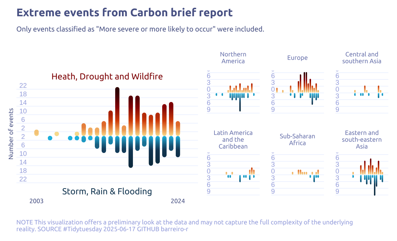
# mutate(cb_region_label = factor(cb_region_label, levels = as.numeric(cb_region)))4 Time to plot!
4.1 Raw chart
data2plot_event |>
  ggplot() +
  geom_segment(
    data = subset(data2plot_event, event_type == 'Heath, Drought and Wildfire'),
    aes(x = event_year, y = 0.4, yend = n),
    size = 1.5,
    lineend = "round"
  ) +
  geom_segment(
    data = subset(data2plot_event, event_type == 'Storm, Rain & Flooding'),
    aes(x = event_year, y = -0.4, yend = -n),
    size = 1.5,
    lineend = "round"
  ) +
facet_wrap(cb_region ~ .) 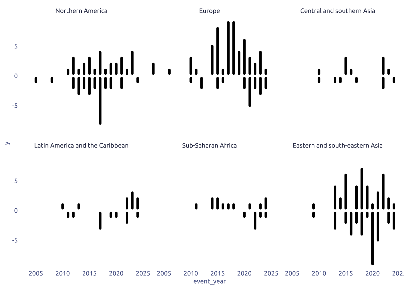
4.2 Final chart
custom_grid_data <- tibble(
  y = seq(
    -max(data2plot_event$n),
    max(data2plot_event$n),
    by = 3
  )
)

global_data <-
  data2plot_event |>
  group_by(event_type, event_year) |>
  summarise(n = sum(n)) |>
  ungroup()

custom_grid_data_global <- tibble(
  y = seq(
    -max(global_data$n),
    max(global_data$n),
    by = 4
  )
)

# Global plot
p1 <-
  global_data |>
  ggplot() +
  # Grid
  geom_segment(
    data = custom_grid_data_global,
    aes(
      x = -Inf,
      xend = Inf,
      y = y
    ),
    color = cool_gray5,
    size = 0.25
  ) +
  geom_text(
    data = custom_grid_data_global,
    x = min(data2plot_event$event_year) - 2,
    aes(y = y, label = abs(y)),
    vjust = -0.3,
    size = 3,
    color = cool_gray3
  ) +

  # Anotate labels
  annotate(
    geom = "text",
    label = "Heath, Drought and Wildfire",
    y = max(global_data$n) + 6,
    x = (min(global_data$event_year) + max(global_data$event_year)) / 2,
    hjust = 0.5,
    color = "#900001",
    family = "Ubuntu"
  ) +

  annotate(
    geom = "text",
    label = "Storm, Rain & Flooding",
    y = -1 * max(global_data$n) - 4,
    x = (min(global_data$event_year) + max(global_data$event_year)) / 2,
    hjust = 0.5,
    color = "#144563ff",
    family = "Ubuntu"
  ) +

  # Top lines
  suppressWarnings(ggforce::geom_link(
    data = subset(global_data, event_type == 'Heath, Drought and Wildfire'),
    aes(
      x = event_year,
      xend = event_year,
      y = 1,
      yend = n,
      warm = after_stat(y)
    ),
    size = 2.5,
    lineend = "round",
    show.legend = FALSE
  )) +
  # Bottom lines
  suppressWarnings(ggforce::geom_link(
    data = subset(global_data, event_type == 'Storm, Rain & Flooding'),
    aes(
      x = event_year,
      xend = event_year,
      y = -1,
      yend = -n,
      wet = after_stat(-y)
    ),
    size = 2.5,
    lineend = "round",
    show.legend = FALSE
  )) +

  ggh4x::scale_colour_multi(
    aesthetics = c("warm", "wet"),
    name = list("Warm", "Wet"),
    colours = list(
      c("#F8DF9D", "#D75004", "#900001", "#3c0602ff"),
      c("#18BDE2", "#144563ff", "#0D394F")
    )
  ) +
  theme(axis.text.y = element_blank()) +
  labs(
    x = NULL,
    y = "Number of events",
    title = "Extreme events from Carbon brief report",
    subtitle = "Only events classified as \"More severe or more likely to occur\" were included.",
    caption = str_wrap(
      "NOTE This visualization offers a preliminary look at the data and may not capture the full complexity of the underlying reality. SOURCE #Tidytuesday 2025-06-17 GITHUB barreiro-r",
      width = 120,
    )
  ) +
  scale_x_continuous(
    expand = c(0, 3, 0, 3),
    breaks = c(
      min(data2plot_event$event_year),
      max(data2plot_event$event_year)
    )
  ) +
  theme(
    strip.text = element_text(hjust = .5, color = cool_gray2),
    panel.spacing = unit(3, "lines")
  )

# Subplots
p2 <-
  data2plot_event |>
  ggplot() +
  # Grid
  geom_segment(
    data = custom_grid_data,
    aes(
      x = -Inf,
      xend = Inf,
      y = y
    ),
    color = cool_gray5,
    size = 0.25
  ) +
  geom_text(
    data = custom_grid_data,
    x = min(data2plot_event$event_year) - 2,
    aes(y = y, label = abs(y)),
    vjust = -0.3,
    size = 3,
    color = cool_gray3
  ) +
  # Top lines
  suppressWarnings(ggforce::geom_link(
    data = subset(data2plot_event, event_type == 'Heath, Drought and Wildfire'),
    aes(
      x = event_year,
      xend = event_year,
      y = 0.4,
      yend = n,
      warm = after_stat(y)
    ),
    size = 0.75,
    lineend = "round",
    show.legend = FALSE
  )) +
  # Bottom lines
  suppressWarnings(ggforce::geom_link(
    data = subset(data2plot_event, event_type == 'Storm, Rain & Flooding'),
    aes(
      x = event_year,
      xend = event_year,
      y = -0.4,
      yend = -n,
      wet = after_stat(-y)
    ),
    size = 0.75,
    lineend = "round",
    show.legend = FALSE
  )) +
  ggh4x::scale_colour_multi(
    aesthetics = c("warm", "wet"),
    name = list("Warm", "Wet"),
    colours = list(
      c("#F8DF9D", "#D75004", "#900001", "#3c0602ff"),
      c("#18BDE2", "#144563ff", "#0D394F")
    )
  ) +
  facet_wrap(cb_region ~ ., labeller = label_wrap_gen(width = 15)) +
  labs(
    x = NULL,
    y = NULL,
  ) +
  scale_x_continuous(
    expand = c(0, 3, 0, 3),
    breaks = c(
      min(data2plot_event$event_year),
      max(data2plot_event$event_year)
    )
  ) +
  theme(
    strip.text = element_text(hjust = .5, color = cool_gray2),
    panel.spacing = unit(1, "lines"),
    axis.text.y = element_blank(),
    axis.text.x = element_blank(),
  )

p1 + p2