pacman::p_load(
  tidyverse,
  glue,
  scales,
  showtext,
  ggtext,
  shadowtext,
  maps,
  ggpattern,
  ggrepel,
  patchwork,
  tidylog
)

font_add_google("DM Sans", "DM Sans", regular.wt = 400, bold.wt = 700)
showtext_auto()
showtext_opts(dpi = 300)
Tip
About the Data
Note
This week we are exploring the Billboard Hot 100 Number Ones Database. This workbook contains substantial data about every song to ever top the Billboard Hot 100 between August 4, 1958 and January 11, 2025. It was compiled by Chris Dalla Riva as he wrote the book Uncharted Territory: What Numbers Tell Us about the Biggest Hit Songs and Ourselves. It also often powers his newsletter Can’t Get Much Higher.
7 years ago, I decided that I was going to listen to every number one hit. Along the way, I tracked an absurd amount of information about each song. Using that information, I wrote a data-driven history of popular music covering 1958 through today.
1 Initializing
1.1 Load libraries
1.2 Set theme
cool_gray0 <- "#323955"
cool_gray1 <- "#5a6695"
cool_gray2 <- "#7e89bb"
cool_gray3 <- "#a4aee2"
cool_gray4 <- "#cbd5ff"
cool_gray5 <- "#e7efff"

cool_red0 <- "#A31C44"
cool_red1 <- "#F01B5B"
cool_red2 <- "#F43E75"
cool_red3 <- "#E891AB"
cool_red4 <- "#FAC3D3"
cool_red5 <- "#FCE0E8"

theme_set(
  theme_minimal() +
    theme(
      # axis.line.x.bottom = element_line(color = 'cool_gray0', linewidth = .3),
      # axis.ticks.x= element_line(color = 'cool_gray0', linewidth = .3),
      # axis.line.y.left = element_line(color = 'cool_gray0', linewidth = .3),
      # axis.ticks.y= element_line(color = 'cool_gray0', linewidth = .3),
      # # panel.grid = element_line(linewidth = .3, color = 'grey90'),
      panel.grid.major = element_blank(),
      panel.grid.minor = element_blank(),
      axis.ticks.length = unit(-0.15, "cm"),
      plot.background = element_blank(),
      # plot.title.position = "plot",
      plot.title = element_text(family = "DM Sans", size = 14, face = 'bold'),
      plot.caption = element_text(
        size = 8,
        color = cool_gray3,
        margin = margin(20, 0, 0, 0),
        hjust = 0
      ),
      plot.subtitle = element_text(
        size = 9,
        lineheight = 1.15,
        margin = margin(5, 0, 15, 0)
      ),
      axis.title.x = element_markdown(
        family = "DM Sans",
        hjust = .5,
        size = 8,
        color = cool_gray1
      ),
      axis.title.y = element_markdown(
        family = "DM Sans",
        hjust = .5,
        size = 8,
        color = cool_gray1
      ),
      axis.text = element_text(
        family = "DM Sans",
        hjust = .5,
        size = 8,
        color = cool_gray1
      ),
      legend.position = "top",
      text = element_text(family = "DM Sans", color = cool_gray1),
      # plot.margin = margin(25, 25, 25, 25)
    )
)
1.3 Load this week’s data
tuesdata <- tidytuesdayR::tt_load('2025-08-26')2 Quick Exploratory Data Analysis
2.1 Top 10 artists
11 actualy because ties
tuesdata$billboard |>
  count(artist) |>
  slice_max(n, n = 10) |>
  mutate(artist = fct_reorder(artist, n)) |>
  ggplot(aes(y = artist, x = n)) +
  geom_col(fill = cool_gray1) +
  labs(
    x = NULL,
    y = NULL,
    title = "Top 10 Artists")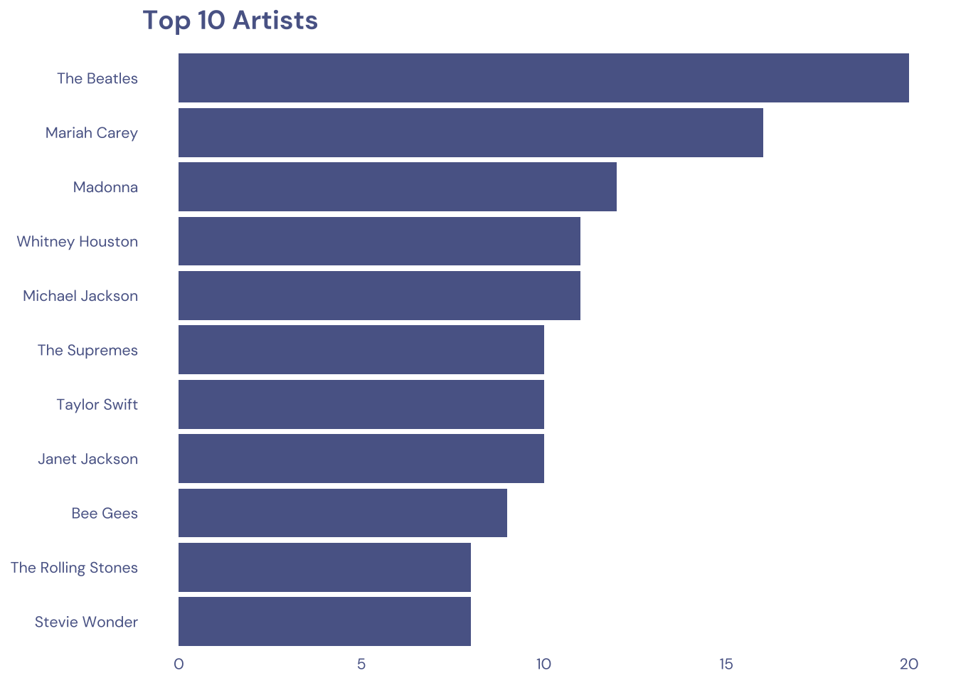
2.2 Top 10 topics
11 actualy because ties
tuesdata$billboard |>
  select(lyrical_topic) |>
  separate_rows(lyrical_topic, sep = ";") |>
  count(lyrical_topic) |>
  slice_max(n, n = 10) |>
  mutate(lyrical_topic = fct_reorder(lyrical_topic, n)) |>
  ggplot(aes(y = lyrical_topic, x = n)) +
  geom_col(fill = cool_gray1) +
  labs(
    x = NULL,
    y = NULL,
    title = "Top 10 Topics")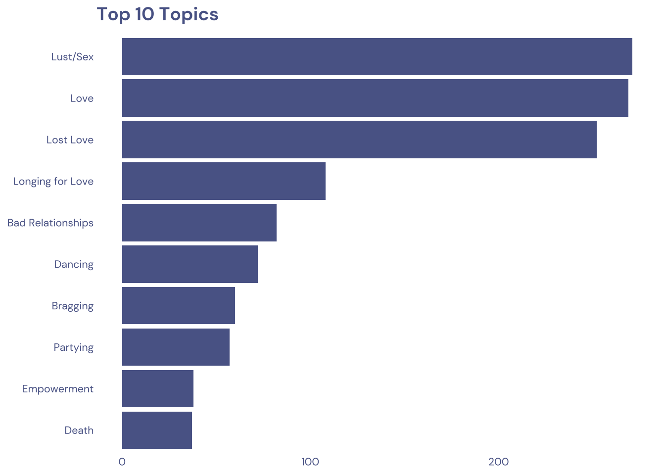
3 Transform Data for Plotting
top_lyrical_topic <-
  tuesdata$billboard |>
  separate_rows(lyrical_topic, sep = ";") |>
  count(lyrical_topic) |>
  filter(!is.na(lyrical_topic)) |>
  slice_max(n, n = 20) |>
  pull(lyrical_topic) |>
  unique()

data2plot <-
  tuesdata$billboard |>
  mutate(year = year(date)) |>
  select(lyrical_topic, year) |>
  separate_rows(lyrical_topic, sep = ";") |>
  filter(lyrical_topic %in% top_lyrical_topic)
4 Time to plot!
4.1 Raw chart
data2plot |>
  ggplot(aes(y = lyrical_topic, x = year)) +
  geom_count() +
  theme_gray()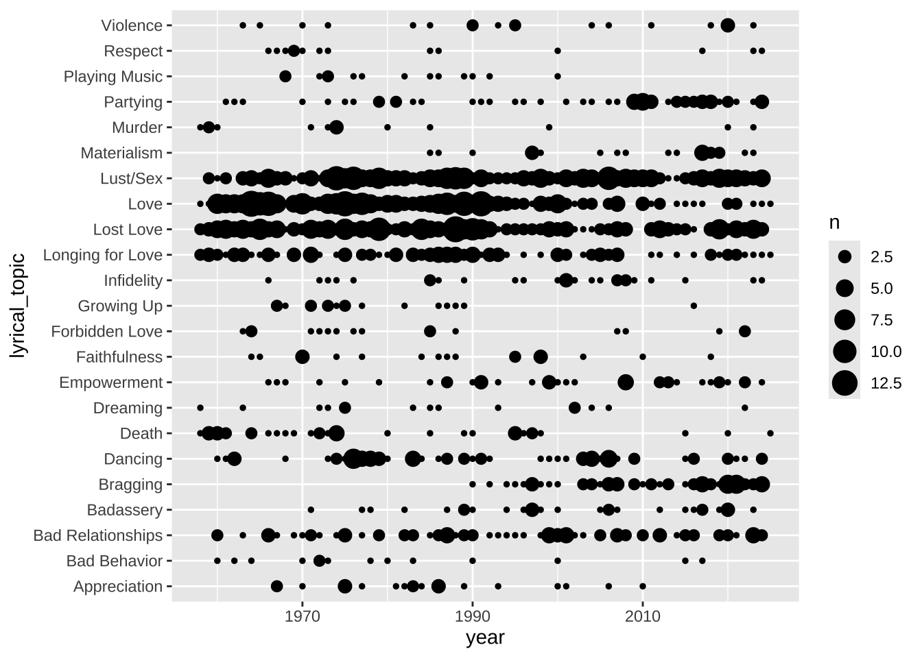
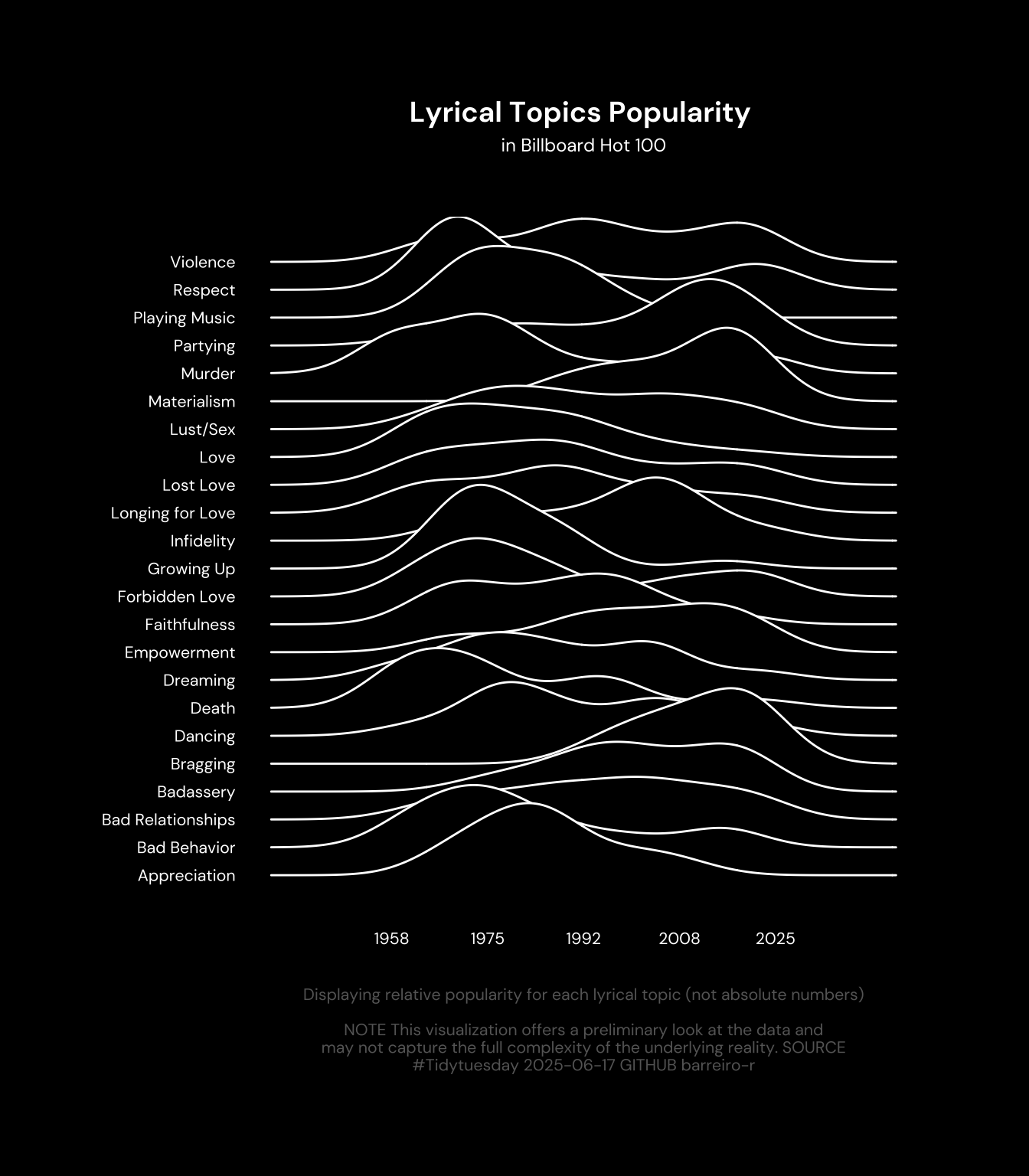
4.2 Final chart
library(ggridges)

data2plot |>
  ggplot(aes(y = lyrical_topic, x = year)) +
  ggridges::geom_density_ridges(color = 'white', fill = 'black', scale = 3) +
  labs(
    x = NULL,
    y = NULL,
    title = "Lyrical Topics Popularity ",
    subtitle = "in Billboard Hot 100",
    caption = paste0("Displaying relative popularity for each lyrical topic (not absolute numbers)\n\n", str_wrap("NOTE This visualization offers a preliminary look at the data and may not capture the full complexity of the underlying reality. SOURCE #Tidytuesday 2025-06-17 GITHUB barreiro-r", width = 70))
  ) +
  scale_x_continuous(
    breaks = seq(min(data2plot$year), max(data2plot$year), length.out = 5),
    label = round
  ) +
  theme(
    plot.background = element_rect(fill = 'black'),
    text = element_text(color = 'white'),
    axis.text = element_text(color = 'white'),
    axis.text.x = element_text(color = 'white', margin = margin(20, 0, 0, 0)),
    plot.margin = margin(50, 50, 50, 50),
    plot.title = element_text(
      hjust = .5,
      margin = margin(0, 0, 5, 0)
    ),
    plot.subtitle = element_text(
      hjust = .5,
      margin = margin(0, 0, 30, 0)
    ),
    plot.caption = element_text(
      color = 'grey40',
      hjust = .5,
      margin = margin(20, 0, 0, 0)
    )
  )