pacman::p_load(
  tidyverse,
  glue,
  scales,
  showtext,
  ggtext,
  shadowtext,
  maps,
  ggpattern,
  ggrepel,
  patchwork,
  tidylog
)

font_add_google("Ubuntu", "Ubuntu", regular.wt = 400, bold.wt = 700)
showtext_auto()
showtext_opts(dpi = 300)
Tip
About the Data
Note
This week we’re exploring a curated collection of recipes collected from Allrecipes.com! The data this week comes from the tastyR package (a dataset assembled from Allrecipes.com) and was prepared for analysis in R. Fields have been cleaned and standardized where possible to make comparisons and visual exploration straightforward.
A collection of recipe datasets scraped from https://www.allrecipes.com/, containing two complementary datasets:
allrecipeswith 14,426 general recipes, andcuisineswith 2,218 recipes categorized by country of origin. Both datasets include comprehensive recipe information such as ingredients, nutritional facts (calories, fat, carbs, protein), cooking times (preparation and cooking), ratings, and review metadata. All data has been cleaned and standardized, ready for analysis.
1 Initializing
1.1 Load libraries
1.2 Set theme
cool_gray0 <- "#323955"
cool_gray1 <- "#5a6695"
cool_gray2 <- "#7e89bb"
cool_gray3 <- "#a4aee2"
cool_gray4 <- "#cbd5ff"
cool_gray5 <- "#e7efff"

cool_red0 <- "#A31C44"
cool_red1 <- "#F01B5B"
cool_red2 <- "#F43E75"
cool_red3 <- "#E891AB"
cool_red4 <- "#FAC3D3"
cool_red5 <- "#FCE0E8"

theme_set(
  theme_minimal() +
    theme(
      # axis.line.x.bottom = element_line(color = 'cool_gray0', linewidth = .3),
      # axis.ticks.x= element_line(color = 'cool_gray0', linewidth = .3),
      # axis.line.y.left = element_line(color = 'cool_gray0', linewidth = .3),
      # axis.ticks.y= element_line(color = 'cool_gray0', linewidth = .3),
      # # panel.grid = element_line(linewidth = .3, color = 'grey90'),
      panel.grid.major = element_blank(),
      panel.grid.minor = element_blank(),
      axis.ticks.length = unit(-0.15, "cm"),
      plot.background = element_blank(),
      # plot.title.position = "plot",
      plot.title = element_text(family = "Ubuntu", size = 14, face = 'bold'),
      plot.caption = element_text(
        size = 8,
        color = cool_gray3,
        margin = margin(20, 0, 0, 0),
        hjust = 0
      ),
      plot.subtitle = element_text(
        size = 9,
        lineheight = 1.15,
        margin = margin(5, 0, 15, 0)
      ),
      axis.title.x = element_markdown(
        family = "Ubuntu",
        hjust = .5,
        size = 8,
        color = cool_gray1
      ),
      axis.title.y = element_markdown(
        family = "Ubuntu",
        hjust = .5,
        size = 8,
        color = cool_gray1
      ),
      axis.text = element_text(
        family = "Ubuntu",
        hjust = .5,
        size = 8,
        color = cool_gray1
      ),
      legend.position = "top",
      text = element_text(family = "Ubuntu", color = cool_gray1),
      # plot.margin = margin(25, 25, 25, 25)
    )
)
1.3 Load this week’s data
tuesdata <- tidytuesdayR::tt_load('2025-09-16')2 Quick Exploratory Data Analysis
2.1 Dishes by Country
tuesdata$cuisines |>
  count(country, sort = TRUE) |>
  mutate(country = fct_reorder(country, n)) |>
  ggplot(aes(x = n, y = country)) +
  geom_col()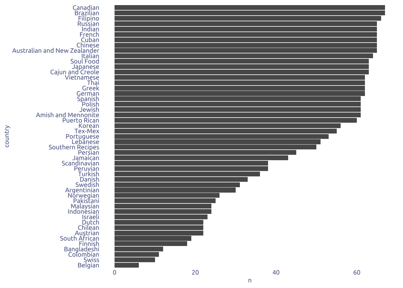
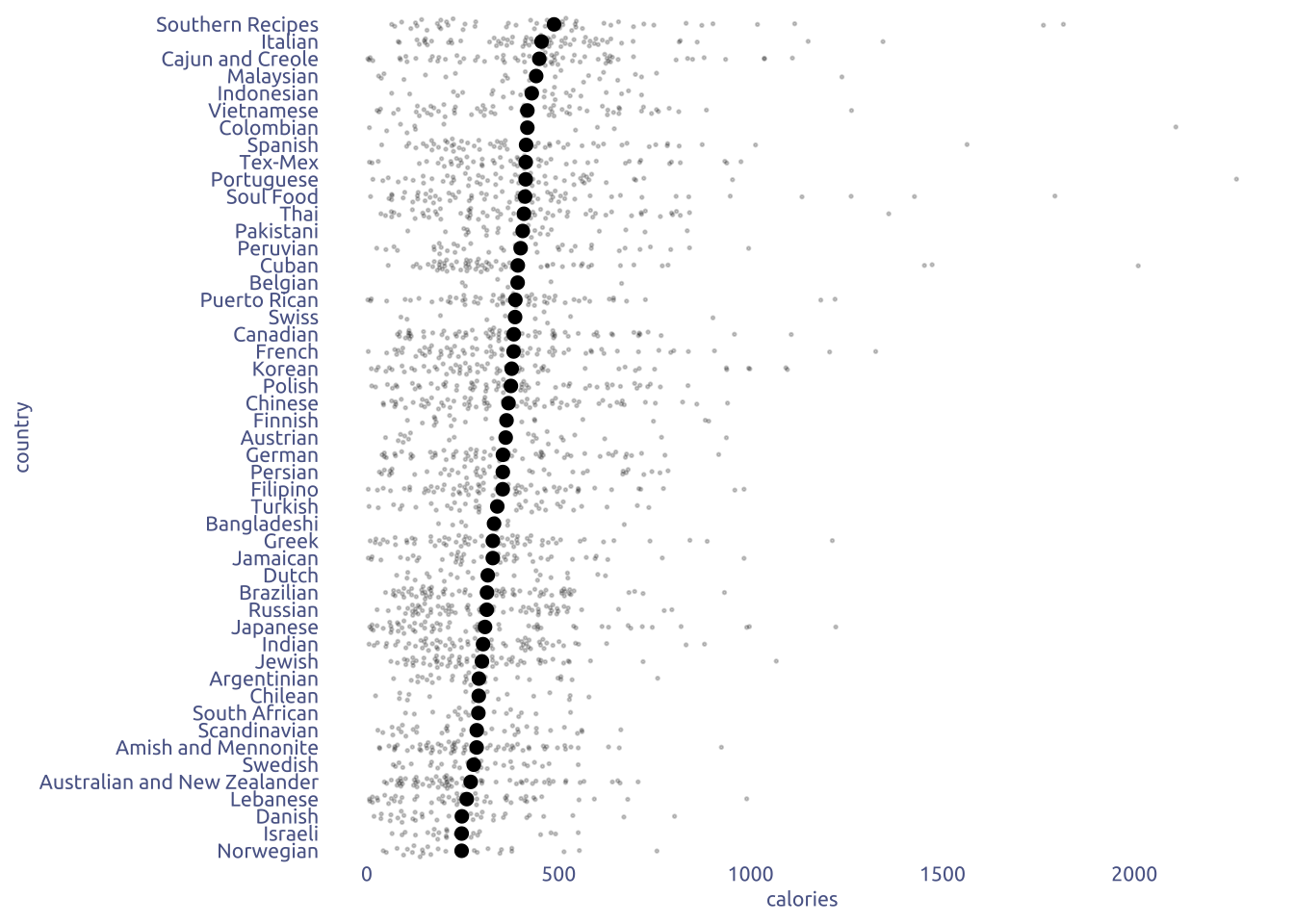
2.2 Calories by country
tuesdata$cuisines |>
  filter(!is.na(calories)) |>
  group_by(country) |>
  mutate(mean_calories = mean(calories)) |>
  ungroup() |>
  mutate(country = fct_reorder(country, mean_calories)) |>
  ggplot(aes(x = calories, y = country)) +
  ggbeeswarm::geom_quasirandom(size = .3, alpha = .2) +
  stat_summary(
    fun = mean,
    geom = "point",
    size = 2
  )
2.3 Dishes composition
tuesdata$cuisines |>
  select(country, fat, carbs, protein) |>
  pivot_longer(-country, names_to = 'macronutrient', values_to = 'value') |>
  group_by(country, macronutrient) |>
  summarise(mean_value = mean(value, na.rm = TRUE)) |>
  group_by(country) |>
  mutate(proportion = mean_value / sum(mean_value)) |>
  ungroup() |>
  left_join(
    tuesdata$cuisines |>
      select(country, calories) |>
      group_by(country) |>
      summarise(calories = mean(calories, na.rm = TRUE)) |>
      ungroup(),
    by = 'country'
  ) |>
  mutate(country = fct_reorder(country, calories)) |>
  ggplot(aes(x = proportion * calories, y = country, fill = macronutrient)) +
  geom_col()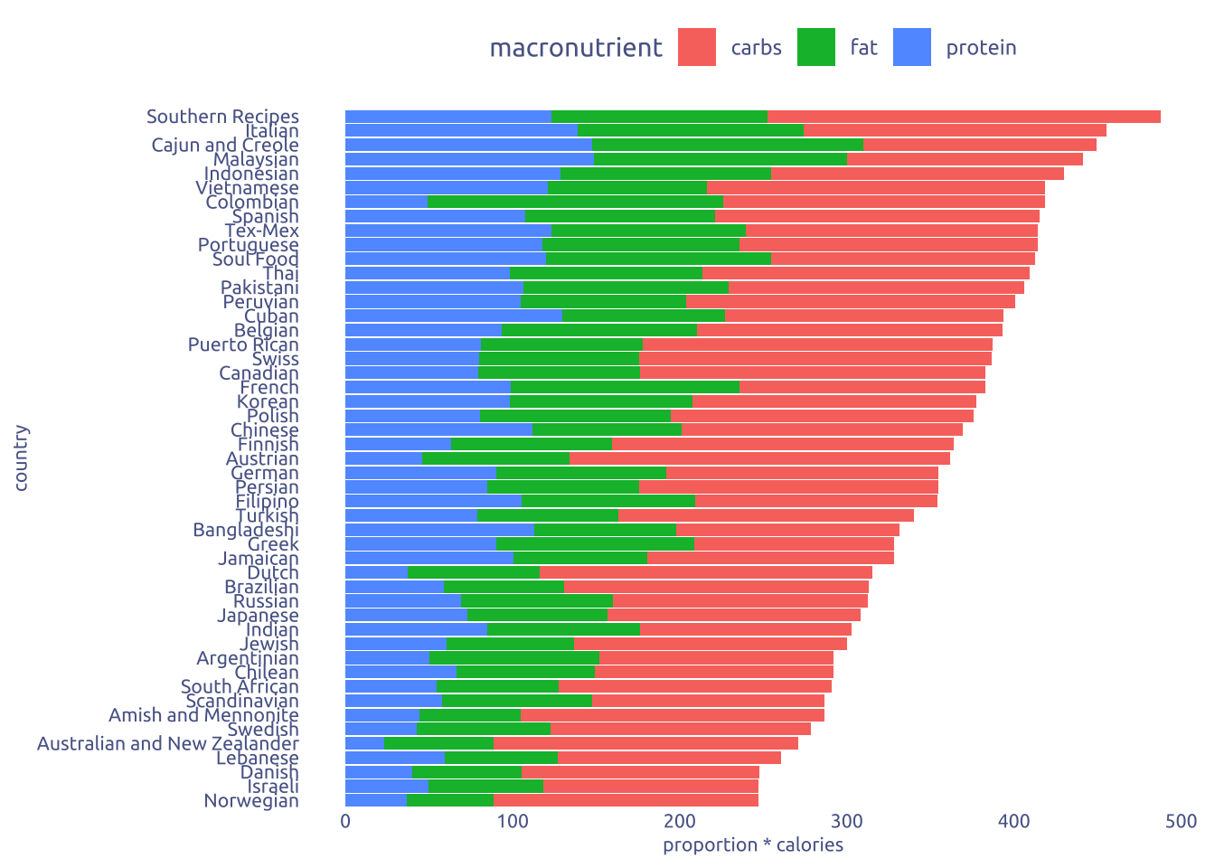
3 Transform Data for Plotting
mean_calories <-
  tuesdata$cuisines |>
  select(country, calories) |>
  group_by(country) |>
  filter(n() > 50) |>
  summarise(calories = mean(calories, na.rm = TRUE)) |>
  ungroup()

top5 <- mean_calories |>
  slice_max(calories, n = 5) |>
  pull(country)

bottom5 <- mean_calories |>
  slice_min(calories, n = 5) |>
  pull(country)

data2plot <-
  tuesdata$cuisines |>
  select(country, fat, carbs, protein) |>
  pivot_longer(c(-country), names_to = 'macronutrient', values_to = 'value') |>
  mutate(value = value) |>
  group_by(country, macronutrient) |>
  summarise(mean_value = mean(value, na.rm = TRUE)) |>
  group_by(country) |>
  mutate(proportion = mean_value / sum(mean_value)) |>
  ungroup() |>
  left_join(mean_calories, by = 'country') |>
  filter(country %in% c(top5, bottom5)) |>
  mutate(county_label = str_wrap(country, width = 10)) |>
  mutate(county_label = fct_reorder(county_label, -calories))
4 Time to plot!
4.1 Raw chart
data2plot |>
  ggplot(aes(x = proportion * calories, y = country, fill = macronutrient)) +
  geom_col()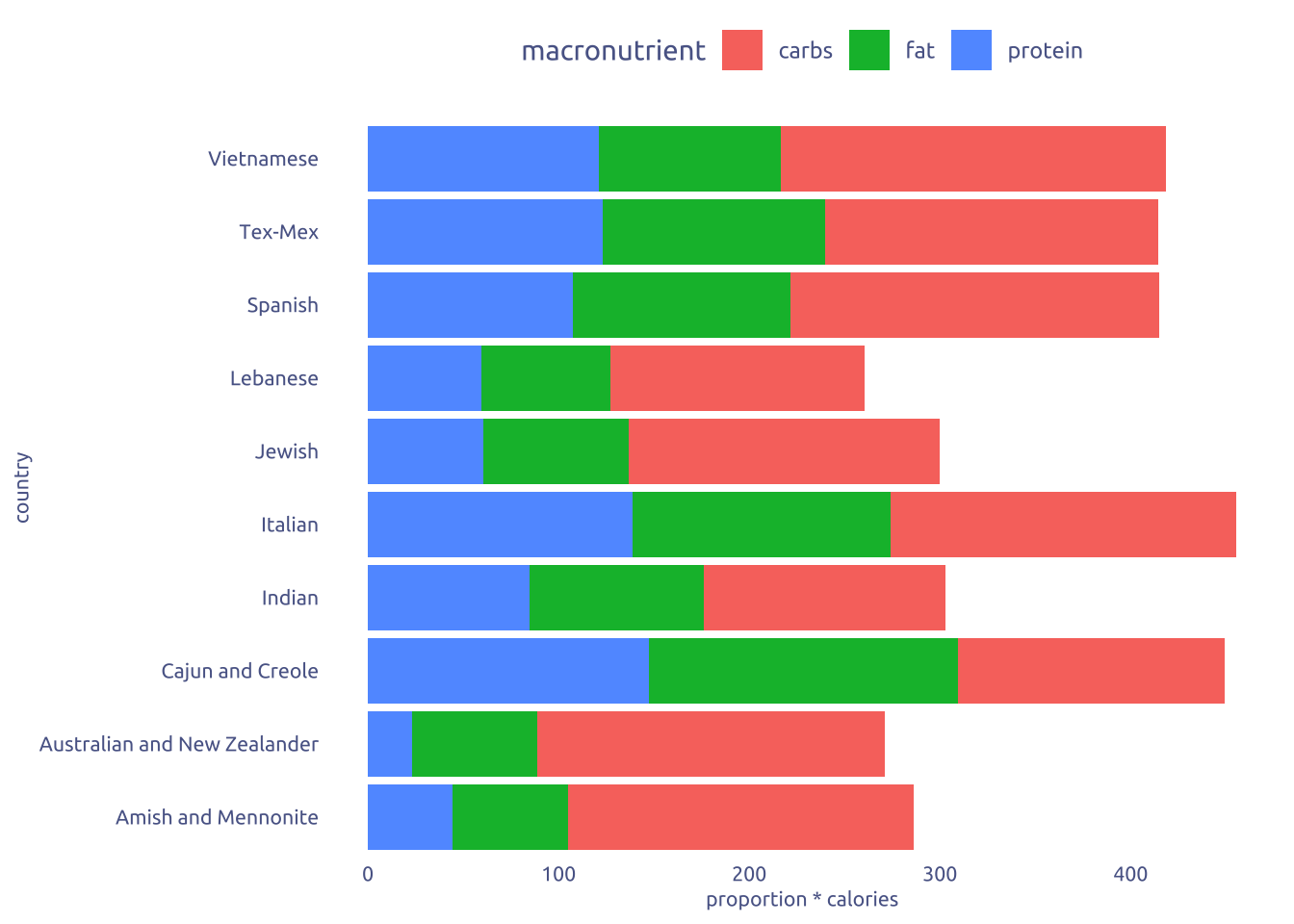
4.2 Final chart
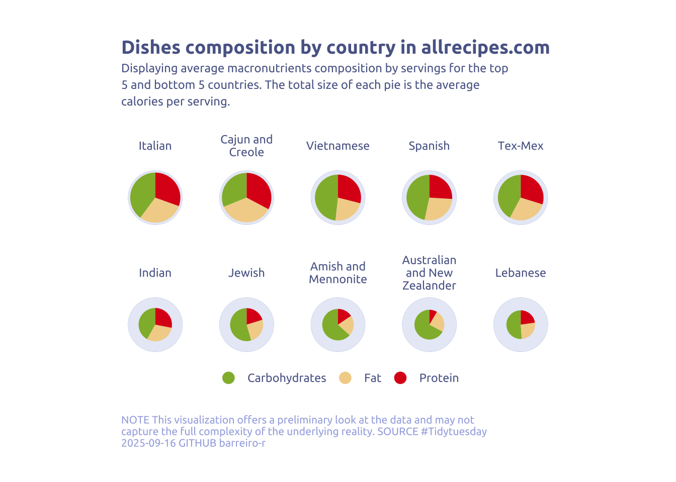
pretty_name_macronutrients <- c(
  "fat" = "Fat",
  "carbs" = "Carbohydrates",
  "protein" = "Protein"
)

data2plot |>
  ggplot(aes(
    x = calories / 2,
    y = proportion,
    fill = macronutrient,
    width = calories
  )) +
  geom_col(
    data = data2plot |>
      distinct(county_label) |>
      mutate(proportion = 1, calories = max(data2plot$calories) + 40),
    fill = '#ACBED8'
  ) +
  geom_col(
    data = data2plot |>
      distinct(county_label) |>
      mutate(proportion = 1, calories = max(data2plot$calories) + 38),
    fill = '#e8ebf7',
  ) +
  geom_col(key_glyph = "point") +
  guides(
    fill = guide_legend(override.aes = list(size = 4, alpha = 1, shape = 21))
  ) +
  coord_polar("y") +
  facet_wrap(~county_label, nrow = 2, ) +
  theme_void() +
  scale_fill_manual(
    values = c("fat" = "#F2D398", "carbs" = "#91b738ff", "protein" = "#DE1A1A"),
    labels = pretty_name_macronutrients
  ) +
  theme(legend.position = "bottom") +
  labs(
    x = NULL,
    y = NULL,
    fill = NULL,
    title = "Dishes composition by country in allrecipes.com",
    subtitle = str_wrap(
      "Displaying average macronutrients composition by servings for the top 5 and bottom 5 countries. The total size of each pie is the average calories per serving.",
      width = 70
    ),
    caption = str_wrap(
      "NOTE This visualization offers a preliminary look at the data and may not capture the full complexity of the underlying reality. SOURCE #Tidytuesday 2025-09-16 GITHUB barreiro-r",
      width = 80
    )
  ) +
  theme(
    plot.title = element_text(family = "Ubuntu", size = 14, face = 'bold'),
    plot.caption = element_text(
      size = 8,
      color = cool_gray3,
      margin = margin(20, 0, 0, 0),
      hjust = 0
    ),
    plot.subtitle = element_text(
      size = 9,
      lineheight = 1.15,
      margin = margin(5, 0, 15, 0)
    ),
    axis.title.x = element_markdown(
      family = "Ubuntu",
      hjust = .5,
      size = 8,
      color = cool_gray1
    ),
    axis.title.y = element_markdown(
      family = "Ubuntu",
      hjust = .5,
      size = 8,
      color = cool_gray1
    ),
    panel.spacing = unit(1.2, "lines"),
    legend.position = "bottom",
    text = element_text(family = "Ubuntu", color = cool_gray1),
    plot.margin = margin(25, 25, 25, 25)
  )