pacman::p_load(
  tidyverse,
  glue,
  scales,
  showtext,
  ggtext,
  shadowtext,
  maps,
  ggpattern,
  ggrepel,
  patchwork,
  tidylog
)

font_add_google("Ubuntu", "Ubuntu", regular.wt = 400, bold.wt = 700)
showtext_auto()
showtext_opts(dpi = 300)
Tip
About the Data
Note
This week we’re exploring August and September chess player rating data from FIDE (the International Chess Federation). Monthly data files are published on the FIDE website.
A chess rating (Elo) is an estimate of a player’s strength relative to other players. If a player performs better or worse than expected, their rating increases or decreases accordingly.
The September 2025 rating list was shaped primarily by results from the Sinquefield Cup, Quantbox Chennai Grand Masters, 61st International Akiba Rubinstein Chess Festival, and the Spanish League Honor Division 2025 – a Swiss team tournament held in Linares.
1 Initializing
1.1 Load libraries
1.2 Set theme
cool_gray0 <- "#323955"
cool_gray1 <- "#5a6695"
cool_gray2 <- "#7e89bb"
cool_gray3 <- "#a4aee2"
cool_gray4 <- "#cbd5ff"
cool_gray5 <- "#e7efff"

cool_red0 <- "#A31C44"
cool_red1 <- "#F01B5B"
cool_red2 <- "#F43E75"
cool_red3 <- "#E891AB"
cool_red4 <- "#FAC3D3"
cool_red5 <- "#FCE0E8"

theme_set(
  theme_minimal() +
    theme(
      # axis.line.x.bottom = element_line(color = 'cool_gray0', linewidth = .3),
      # axis.ticks.x= element_line(color = 'cool_gray0', linewidth = .3),
      # axis.line.y.left = element_line(color = 'cool_gray0', linewidth = .3),
      # axis.ticks.y= element_line(color = 'cool_gray0', linewidth = .3),
      # # panel.grid = element_line(linewidth = .3, color = 'grey90'),
      panel.grid.major = element_blank(),
      panel.grid.minor = element_blank(),
      axis.ticks.length = unit(-0.15, "cm"),
      plot.background = element_blank(),
      # plot.title.position = "plot",
      plot.title = element_text(family = "Ubuntu", size = 14, face = 'bold'),
      plot.caption = element_text(
        size = 8,
        color = cool_gray3,
        margin = margin(20, 0, 0, 0),
        hjust = 0
      ),
      plot.subtitle = element_text(
        size = 9,
        lineheight = 1.15,
        margin = margin(5, 0, 15, 0)
      ),
      axis.title.x = element_markdown(
        family = "Ubuntu",
        hjust = .5,
        size = 8,
        color = cool_gray1
      ),
      axis.title.y = element_markdown(
        family = "Ubuntu",
        hjust = .5,
        size = 8,
        color = cool_gray1
      ),
      axis.text = element_text(
        family = "Ubuntu",
        hjust = .5,
        size = 8,
        color = cool_gray1
      ),
      legend.position = "top",
      text = element_text(family = "Ubuntu", color = cool_gray1),
      # plot.margin = margin(25, 25, 25, 25)
    )
)
1.3 Load this week’s data
tuesdata <- tidytuesdayR::tt_load('2025-09-23')2 Quick Exploratory Data Analysis
2.1 Rating vs Age
get_density <- function(x, y, ...) {
# Calculate the 2D kernel density estimate
dens <- MASS::kde2d(x, y, ...)
# Find the intervals for each point in x and y
ix <- findInterval(x, dens$x)
iy <- findInterval(y, dens$y)
# Combine the indices
ii <- cbind(ix, iy)
# Return the density value for each point
return(dens$z[ii])
}
data2plot <-
tuesdata$fide_ratings_august |>
group_by(sex) |>
mutate(density = get_density(rating,2025-bday, n = 100)) |>
mutate(density = (density - mean(density)) / sd(density)) |>
mutate(density = (density - min(density)) / (max(density)- min(density)))
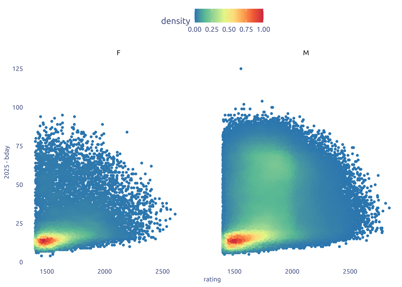
data2plot |>
ggplot(aes(x = rating, y = 2025-bday)) +
geom_point(aes(color = density), size = 1) +
facet_wrap(~sex) +
scale_color_gradientn(
colors = (RColorBrewer::brewer.pal(name = "Spectral", n = 8)) |> rev()
) 
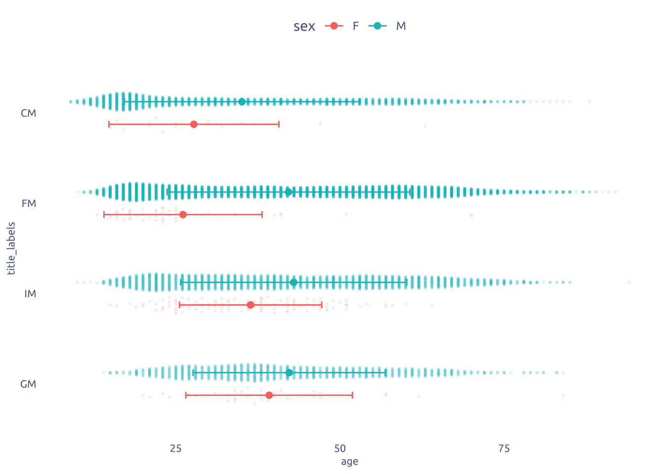
# Age by title

open_titles <- c(GM = "Grand Master",
                 IM = "International Master",
                 FM = "FIDE Master",
                 CM = "Candidate Master")

data2plot |>
  ungroup() |>
  mutate(age = 2025 - bday) |>
  select(title, rating, age, sex) |>
  filter(!is.na(title)) |>
  filter(!str_detect(title, '^W')) |>
  mutate(title_labels = factor(title, levels = names(open_titles))) |>
  ggplot(aes(x = age, y = title_labels)) +
  ggbeeswarm::geom_quasirandom(
    aes(color = sex, group = sex),
    dodge.width = .5,
    alpha = .1,
    size = .5
  ) +
  stat_summary(fun = mean, geom = "point", size = 2, aes(color = sex),
    position = position_dodge(width = .5)) +
  stat_summary(
    aes(color = sex),
    fun.data = 'mean_sdl',
    fun.args = list(mult = 1),
    geom = "errorbar",
    width = 0.15,
    position = position_dodge(width = .5)
  )
3 Transform Data for Plotting
open_titles <- c(
  GM = "Grand Master",
  IM = "International Master",
  FM = "FIDE Master",
  CM = "Candidate Master"
)

data2plot <-
  tuesdata$fide_ratings_august |>
  mutate(age = 2025 - bday) |>
  filter(!is.na(title)) |>
  filter(!str_detect(title, '^W')) |>
  group_by(sex, title) |>
  summarise(mean_age = mean(age), count = n()) |>
  mutate(title_labels = open_titles[title]) |>
  mutate(title_labels = factor(title_labels, levels = open_titles)) |>
  ungroup() |>
  group_by(title) |>
  mutate(per = count / sum(count)) |>
  ungroup() |>
  mutate(
    n_label = glue::glue("n = {scales::comma(count)}\n({scales::percent(per)})")
  )
# pivot_wider(names_from = sex, values_from = c(mean_age, count))
4 Time to plot!
4.1 Raw chart
data2plot |>
  ggplot(aes(x = mean_age, y = title_labels)) +
    geom_segment(
    data = data2plot |>
      pivot_wider(names_from = sex, values_from = c(mean_age, count)),
    aes(
      x = mean_age_F,
      xend = mean_age_M,
      y = title_labels,
      yend = title_labels
    )
  ) +
  geom_point(aes(color = sex)) +
  theme_gray()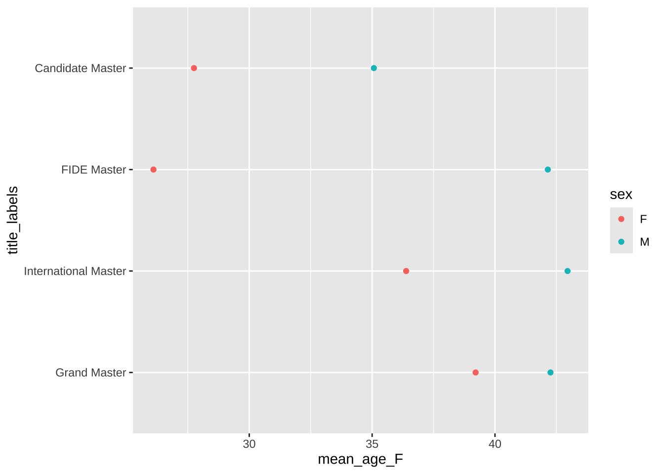
4.2 Final chart
library(ggh4x)
data2plot |>
ggplot(aes(x = mean_age, y = title_labels)) +
# ggforce::geom_link(
# data = data2plot |> select(-n_label, -per) |>
# pivot_wider(names_from = sex, values_from = c(mean_age, count)),
# aes(
# x = mean_age_F,
# xend = mean_age_M,
# y = title_labels,
# yend = title_labels,
# color = after_stat(x)
# ),
# linewidth = 12,
# lineend = 'round',
# ) +
geom_segment(
data = data2plot |>
select(-n_label, -per) |>
pivot_wider(names_from = sex, values_from = c(mean_age, count)),
aes(
x = mean_age_F,
xend = mean_age_M,
y = title_labels,
yend = title_labels,
),
color = "#f0f2f2ff",
linewidth = 12,
lineend = 'round',
) +
geom_point(
data = subset(data2plot, sex == 'M'),
color = cool_gray1,
size = 7
) +
geom_point(
data = subset(data2plot, sex == 'F'),
color = cool_red2,
size = 7
) +
geom_point(size = 6, color = "white") +
geom_text(
data = subset(data2plot, sex == 'M'),
aes(label = round(mean_age)),
color = cool_gray1,
size = 3,
fontface = "bold"
) +
geom_text(
data = subset(data2plot, sex == 'M'),
aes(label = n_label, x = mean_age + 3),
color = cool_gray2,
lineheight = .8,
size = 3,
) +
geom_text(
data = subset(data2plot, sex == 'F'),
aes(label = round(mean_age)),
color = cool_red2,
size = 3,
fontface = "bold"
) +
geom_text(
data = subset(data2plot, sex == 'F'),
aes(label = n_label, x = mean_age - 3),
color = cool_red2,
lineheight = .8,
size = 3,
) +
geom_text(
data = data2plot |>
select(-n_label, -per) |>
pivot_wider(names_from = sex, values_from = c(mean_age, count)) |>
mutate(diff = abs(mean_age_F - mean_age_M)) |>
mutate(mean = (mean_age_F + mean_age_M) / 2),
aes(x = mean, label = round(diff) |> str_c("y")),
color = cool_gray0,
size = 3,
) +
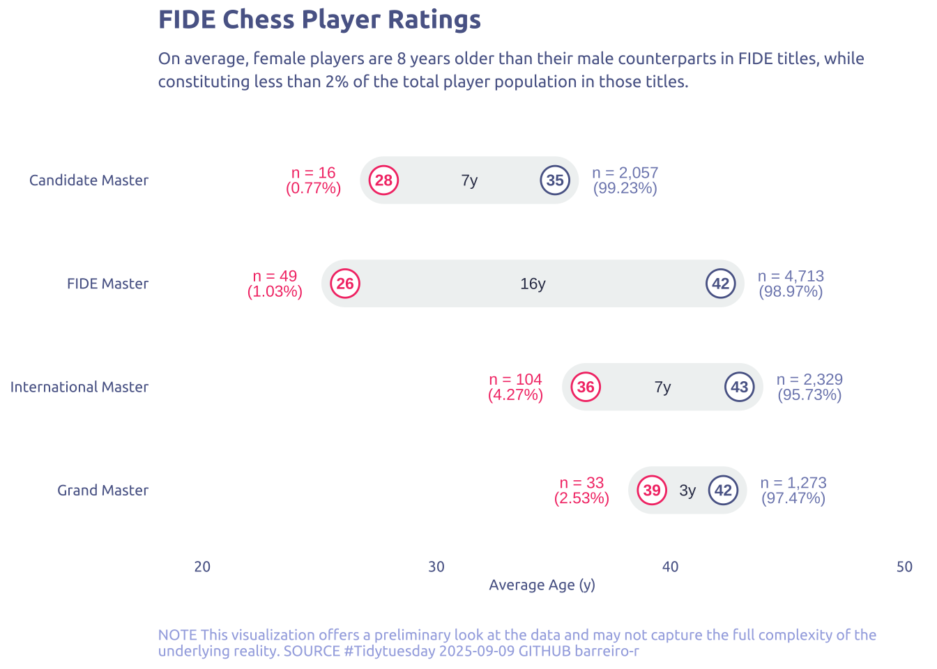
scale_x_continuous(expand = c(0, 5, 0, 5)) +
theme(legend.position = "none") +
labs(
x = "Average Age (y)",
y = NULL,
title = "FIDE Chess Player Ratings",
subtitle = str_wrap(
"On average, female players are 8 years older than their male counterparts in FIDE titles, while constituting less than 2% of the total player population in those titles.",
width = 100,
),
caption = str_wrap(
"NOTE This visualization offers a preliminary look at the data and may not capture the full complexity of the underlying reality. SOURCE #Tidytuesday 2025-09-09 GITHUB barreiro-r",
width = 110,
)
)