pacman::p_load(
  tidyverse,
  glue,
  scales,
  showtext,
  ggtext,
  shadowtext,
  maps,
  ggpattern,
  ggrepel,
  patchwork,
  tidylog
)

font_add_google("Ubuntu", "Ubuntu", regular.wt = 400, bold.wt = 700)
showtext_auto()
showtext_opts(dpi = 300)
Tip
About the Data
Note
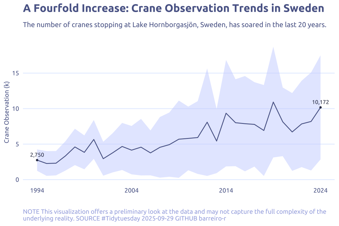
This week we are exploring crane observations at Lake Hornborgasjön in Sweden. For more than 30 years, cranes stopping at the Lake Hornborgasjön (‘Lake Hornborga’) in Västergötland, Sweden have been counted from the Hornborgasjön field station in the spring and the fall as they pass by during their yearly migration.
Thanks to crane counters from the Hornborgasjön field station, we know approximately how many cranes there are at Hornborgasjön during the spring. When there are the most cranes depends on whether spring is early or late. It also depends on when the winds from the south are suitable for crane flight.
1 Initializing
1.1 Load libraries
1.2 Set theme
cool_gray0 <- "#323955"
cool_gray1 <- "#5a6695"
cool_gray2 <- "#7e89bb"
cool_gray3 <- "#a4aee2"
cool_gray4 <- "#cbd5ff"
cool_gray5 <- "#e7efff"

cool_red0 <- "#A31C44"
cool_red1 <- "#F01B5B"
cool_red2 <- "#F43E75"
cool_red3 <- "#E891AB"
cool_red4 <- "#FAC3D3"
cool_red5 <- "#FCE0E8"

theme_set(
  theme_minimal() +
    theme(
      # axis.line.x.bottom = element_line(color = 'cool_gray0', linewidth = .3),
      # axis.ticks.x= element_line(color = 'cool_gray0', linewidth = .3),
      # axis.line.y.left = element_line(color = 'cool_gray0', linewidth = .3),
      # axis.ticks.y= element_line(color = 'cool_gray0', linewidth = .3),
      # # panel.grid = element_line(linewidth = .3, color = 'grey90'),
      panel.grid.major = element_blank(),
      panel.grid.minor = element_blank(),
      axis.ticks.length = unit(-0.15, "cm"),
      plot.background = element_blank(),
      # plot.title.position = "plot",
      plot.title = element_text(family = "Ubuntu", size = 14, face = 'bold'),
      plot.caption = element_text(
        size = 8,
        color = cool_gray3,
        margin = margin(20, 0, 0, 0),
        hjust = 0
      ),
      plot.subtitle = element_text(
        size = 9,
        lineheight = 1.15,
        margin = margin(5, 0, 15, 0)
      ),
      axis.title.x = element_markdown(
        family = "Ubuntu",
        hjust = .5,
        size = 8,
        color = cool_gray1
      ),
      axis.title.y = element_markdown(
        family = "Ubuntu",
        hjust = .5,
        size = 8,
        color = cool_gray1
      ),
      axis.text = element_text(
        family = "Ubuntu",
        hjust = .5,
        size = 8,
        color = cool_gray1
      ),
      legend.position = "top",
      text = element_text(family = "Ubuntu", color = cool_gray1),
      # plot.margin = margin(25, 25, 25, 25)
    )
)
1.3 Load this week’s data
tuesdata <- tidytuesdayR::tt_load('2025-09-30')2 Quick Exploratory Data Analysis
2.1 Day coverage
tuesdata$cranes |>
  filter(!is.na(observations)) |>
  mutate(year = year(date), month = month(date)) |>
  mutate(date_simple = date(str_c('2025-', month, '-', day(date)))) |>
  ggTimeSeries::ggplot_calendar_heatmap(
    'date',
    'observations',
    monthBorderSize = 0.5,
    dayBorderColour = 'white',
    monthBorderColour = 'white',
  ) +
  scale_fill_gradientn(
    colors = (RColorBrewer::brewer.pal(name = "Spectral", n = 11)) |> rev(),
    na.value = "grey80"
  )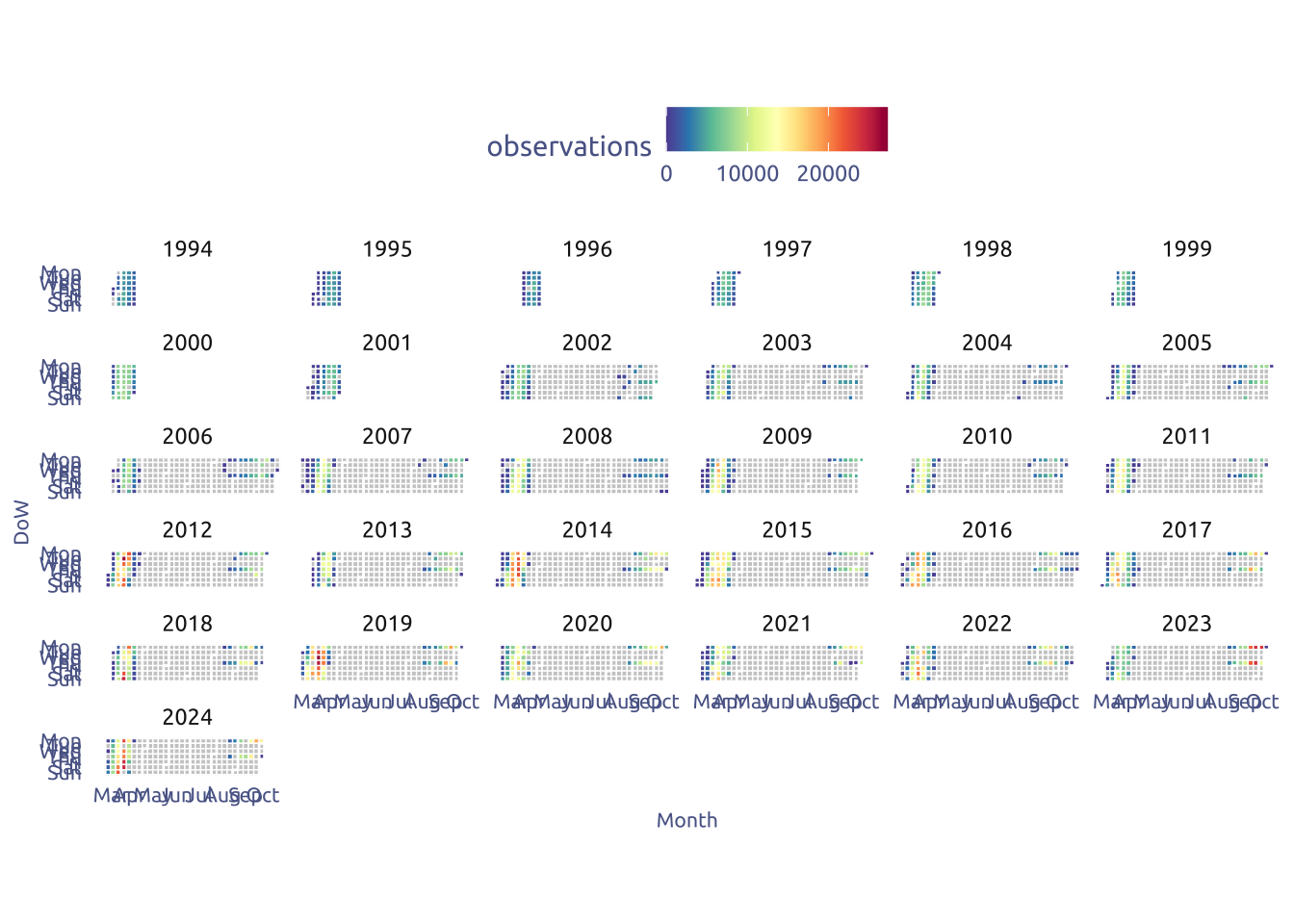
It’s a very sparce coverage…
tuesdata$cranes |>
  filter(!is.na(observations)) |>
  mutate(year = year(date), month = month(date)) |>
  group_by(year) |>
  summarize(mean_obs = mean(observations)) |>
  ungroup() |>
  ggplot(aes(x = year, y = mean_obs)) +
  # geom_segment(aes(y = 0, yend = mean_obs), color = cool_gray4) +
  geom_point(aes(color = mean_obs), show.legend = FALSE) +
  geom_smooth(color = cool_gray3, fill = cool_gray4) +
  scale_color_gradientn(
    colors = (RColorBrewer::brewer.pal(name = "Spectral", n = 11)) |> rev(),
    na.value = "grey80"
  )
3 Transform Data for Plotting
data_summary <-
  tuesdata$cranes |>
  filter(!is.na(observations)) |>
  mutate(year = year(date), month = month(date)) |>
  group_by(year) |>
  summarize(mean_obs = mean(observations), sd_obs = sd(observations)) |>
  ungroup()
4 Time to plot!
4.1 Final chart
tuesdata$cranes |>
  filter(!is.na(observations)) |>
  mutate(year = year(date), month = month(date)) |>
  ggplot(aes(x = year, y = observations)) +
  # ggbeeswarm::geom_quasirandom(
  #   show.legend = FALSE,
  #   size = .5,
  #   color = cool_gray4,
  #   alpha = .4
  # ) +
  geom_ribbon(
    data = data_summary,
    aes(y = 0, ymin = mean_obs - sd_obs, ymax = mean_obs + sd_obs),
    fill = cool_gray4,
    alpha = .5
  ) +
  geom_line(data = data_summary, aes(y = mean_obs), color = cool_gray1) +
  geom_text(
    data = data_summary |> filter(year %in% c(max(year), min(year))),
    aes(y = mean_obs, label = mean_obs |> round() |> scales::comma()),
    size = 2.5,
    nudge_y = 750,
    color = cool_gray0,
    family = "Ubuntu"
  ) +
  geom_point(
    data = data_summary |> filter(year %in% c(max(year), min(year))),
    aes(y = mean_obs),
    color = cool_gray0,
    size = .75
  ) +
  scale_x_continuous(
    breaks = seq(min(data_summary$year), max(data_summary$year), length.out = 4)
  ) +
  scale_y_continuous(
    label = ~ .x / 1000,
  ) +
  theme(
    panel.grid.major.y = element_line(linewidth = .5, color = cool_gray5)
  ) +
  labs(
    x = NULL,
    y = "Crane Observation (k)",
    title = "A Fourfold Increase: Crane Observation Trends in Sweden",
    subtitle = str_wrap(
      "The number of cranes stopping at Lake Hornborgasjön, Sweden, has soared in the last 20 years.",
      width = 100,
    ),
    caption = str_wrap(
      "NOTE This visualization offers a preliminary look at the data and may not capture the full complexity of the underlying reality. SOURCE #Tidytuesday 2025-09-29 GITHUB barreiro-r",
      width = 110,
    )
  )