pacman::p_load(
  tidyverse,
  glue,
  scales,
  showtext,
  ggtext,
  shadowtext,
  maps,
  ggpattern,
  ggrepel,
  patchwork,
  tidylog,
  countrycode
)

font_add_google("Ubuntu", "Ubuntu", regular.wt = 400, bold.wt = 700)
showtext_auto()
showtext_opts(dpi = 300)
Tip
About the Data
Note
This Thursday (2025-10-16) is World Food Day, which celebrates the foundation of The Food and Agriculture Organization of the United Nations (FAO), which turns 80 this week! To mark this occasion, this week we’re looking at the FAO’s Suite of Food Security Indicators.
Following the recommendation of experts gathered in the Committee on World Food Security (CFS) Round Table on hunger measurement, hosted at FAO headquarters in September 2011, an initial set of indicators aiming to capture various aspects of food insecurity is presented here. The choice of the indicators has been informed by expert judgment and the availability of data with sufficient coverage to enable comparisons across regions and over time.
1 Initializing
1.1 Load libraries
1.2 Set theme
cool_gray0 <- "#323955"
cool_gray1 <- "#5a6695"
cool_gray2 <- "#7e89bb"
cool_gray3 <- "#a4aee2"
cool_gray4 <- "#cbd5ff"
cool_gray5 <- "#e7efff"

cool_red0 <- "#A31C44"
cool_red1 <- "#F01B5B"
cool_red2 <- "#F43E75"
cool_red3 <- "#E891AB"
cool_red4 <- "#FAC3D3"
cool_red5 <- "#FCE0E8"

theme_set(
  theme_minimal() +
    theme(
      # axis.line.x.bottom = element_line(color = 'cool_gray0', linewidth = .3),
      # axis.ticks.x= element_line(color = 'cool_gray0', linewidth = .3),
      # axis.line.y.left = element_line(color = 'cool_gray0', linewidth = .3),
      # axis.ticks.y= element_line(color = 'cool_gray0', linewidth = .3),
      # # panel.grid = element_line(linewidth = .3, color = 'grey90'),
      panel.grid.major = element_blank(),
      panel.grid.minor = element_blank(),
      axis.ticks.length = unit(-0.15, "cm"),
      plot.background = element_blank(),
      # plot.title.position = "plot",
      plot.title = element_text(family = "Ubuntu", size = 14, face = 'bold'),
      plot.caption = element_text(
        size = 8,
        color = cool_gray3,
        margin = margin(20, 0, 0, 0),
        hjust = 0
      ),
      plot.subtitle = element_text(
        size = 9,
        lineheight = 1.15,
        margin = margin(5, 0, 15, 0)
      ),
      axis.title.x = element_markdown(
        family = "Ubuntu",
        hjust = .5,
        size = 8,
        color = cool_gray1
      ),
      axis.title.y = element_markdown(
        family = "Ubuntu",
        hjust = .5,
        size = 8,
        color = cool_gray1
      ),
      axis.text = element_text(
        family = "Ubuntu",
        hjust = .5,
        size = 8,
        color = cool_gray1
      ),
      legend.position = "top",
      text = element_text(family = "Ubuntu", color = cool_gray1),
      # plot.margin = margin(25, 25, 25, 25)
    )
)
1.3 Load this week’s data
tuesdata <- tidytuesdayR::tt_load('2025-10-14')2 Quick Exploratory Data Analysis
2.1 Completude
tuesdata$food_security |>
  count(Area, Item) |>
  ggplot(aes(x = Area, y = Item)) +
  geom_tile(aes(fill = n)) +
  theme(axis.text = element_blank()) +
  labs(
    title = 'Food security indicator by Country completude',
    fill = "Records"
  ) +
  scale_fill_continuous(palette = "Spectral")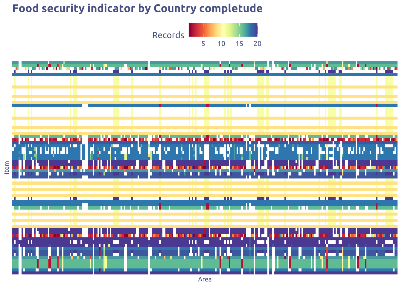
p1 <-
  tuesdata$food_security |>
  count(Area, Item) |>
  count(Item) |>
  mutate(Item = fct_reorder(Item, n)) |>
  ggplot(aes(y = Item, x = n)) +
  geom_col(aes(fill = n)) +
  scale_fill_continuous(palette = "Spectral") +
  scale_y_discrete(label = ~ str_wrap(.x, width = 20)) +
  theme(axis.text = element_blank()) +
  labs(fill = "Countries", x = "Countries")

p2 <-
  tuesdata$food_security |>
  count(Area, Item) |>
  count(Item) |>
  filter(n == max(n)) |>
  mutate(Item = fct_reorder(Item, n)) |>
  ggplot(aes(y = Item, x = n)) +
  geom_col() +
  scale_fill_continuous(palette = "Spectral") +
  scale_y_discrete(label = ~ str_replace(.x , "\\(.*\\)", "") |> str_wrap(width = 40) ) +
  labs(x = "Countries")

p3 <-
  tuesdata$food_security |>
  count(Area, Item) |>
  count(Item) |>
  filter(n == min(n)) |>
  mutate(Item = fct_reorder(Item, n)) |>
  ggplot(aes(y = Item, x = n)) +
  geom_col() +
  scale_fill_continuous(palette = "Spectral") +
  scale_y_discrete(label = ~ str_replace(.x , "\\(.*\\)", "") |> str_wrap(width = 40) ) +
  labs(x = "Countries")
There are so much indicators :l (59)
tuesdata$food_security |> distinct(Item)# A tibble: 69 × 1
Item
<chr>
1 Average dietary energy supply adequacy (percent) (3-year average)
2 Dietary energy supply used in the estimation of the prevalence of undernouri…
3 Dietary energy supply used in the estimation of the prevalence of undernouri…
4 Share of dietary energy supply derived from cereals, roots and tubers (perce…
5 Average protein supply (g/cap/day) (3-year average)
6 Average supply of protein of animal origin (g/cap/day) (3-year average)
7 Gross domestic product per capita, PPP, (constant 2021 international $)
8 Prevalence of undernourishment (percent) (3-year average)
9 Number of people undernourished (million) (3-year average)
10 Prevalence of severe food insecurity in the total population (percent) (3-ye…
# ℹ 59 more rowstuesdata$food_security |> distinct(Item) |>
filter(str_detect(Item |> tolower(), "prevalence")) |>
filter(!str_detect(Item |> tolower(), "male"))# A tibble: 18 × 1
Item
<chr>
1 Dietary energy supply used in the estimation of the prevalence of undernouri…
2 Dietary energy supply used in the estimation of the prevalence of undernouri…
3 Prevalence of undernourishment (percent) (3-year average)
4 Prevalence of severe food insecurity in the total population (percent) (3-ye…
5 Prevalence of moderate or severe food insecurity in the total population (pe…
6 Prevalence of obesity in the adult population (18 years and older) (percent)
7 Prevalence of anemia among women of reproductive age (15-49 years) (percent)
8 Prevalence of exclusive breastfeeding among infants 0-5 months of age (perce…
9 Prevalence of low birthweight (percent)
10 Prevalence of undernourishment (percent) (annual value)
11 Prevalence of severe food insecurity in the rural adult population (percent)…
12 Prevalence of severe food insecurity in the total population (percent) (annu…
13 Prevalence of severe food insecurity in the town and semi-dense area adult p…
14 Prevalence of severe food insecurity in the urban adult population (percent)…
15 Prevalence of moderate or severe food insecurity in the rural adult populati…
16 Prevalence of moderate or severe food insecurity in the total population (pe…
17 Prevalence of moderate or severe food insecurity in the town and semi-dense …
18 Prevalence of moderate or severe food insecurity in the urban adult populati…selected_indicators <-
c(
"Prevalence of severe food insecurity in the total population (percent) (3-year average)",
"Prevalence of moderate or severe food insecurity in the total population (percent) (3-year average)",
"Prevalence of obesity in the adult population (18 years and older) (percent)"
)
indicator_short_names <-
c(
"Severe food insecurity",
"Moderate or severe food insecurity",
"Obesity"
)
names(indicator_short_names) <- selected_indicators
tuesdata$food_security |>
filter(Item %in% selected_indicators) |>
mutate(year = (Year_Start + Year_End) / 2) |>
filter(year > 2015) |>
filter(year < 2023) |>
ggplot(aes(x = as.character(year), y = Value)) +
geom_boxplot(aes(color = Item)) +
scale_color_discrete(label = indicator_short_names)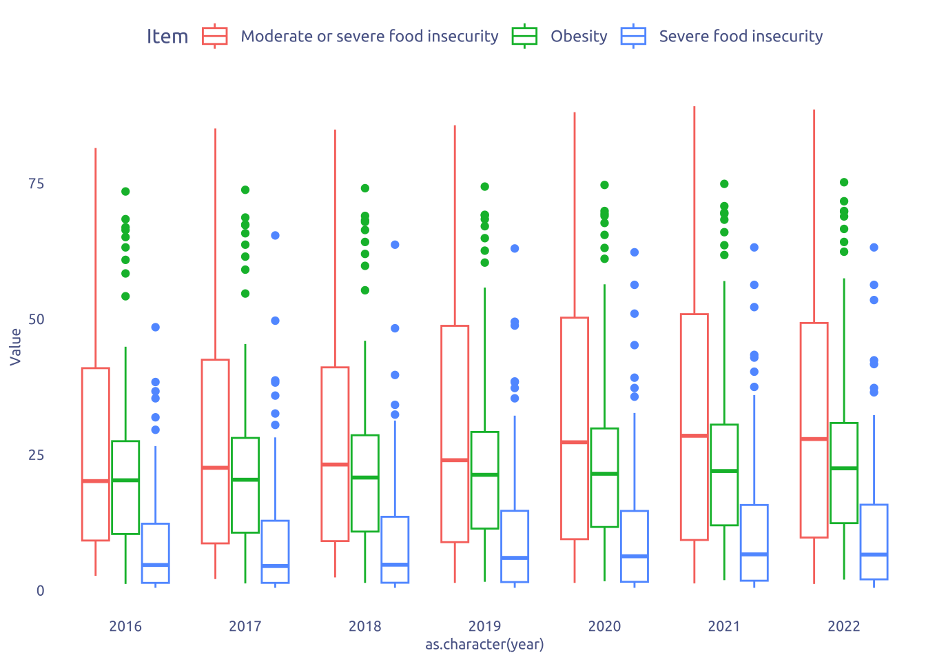
There are some not expected stuff, like a Area with Obesity > 75%
country_list <- countrycode::codelist$country.name.en

tuesdata$food_security |>
  filter(Item %in% selected_indicators) |>
  filter(Area %in% country_list) |>
  mutate(year = (Year_Start + Year_End) / 2) |>
  filter(year > 2015) |>
  filter(year < 2023) |>
  filter(Item != "Prevalence of severe food insecurity in the total population (percent) (3-year average)") |>
  mutate(item_short = if_else(Item == "Prevalence of obesity in the adult population (18 years and older) (percent)", "obesity", "food_insecutiry")) |>
  select(year, Area, item_short, Value) |>
  filter(year == max(year)) |>
  select(-year) |>
  pivot_wider(names_from = item_short, values_from = Value) |>
  na.omit() |>
  mutate(continent = countrycode(sourcevar = Area,
                                 origin = "country.name",
                                 destination = "continent")) |>
  ggplot(aes(x = obesity, y = food_insecutiry)) +
  # geom_point(aes(color = continent)) +
  # stat_density_2d(geom = "polygon", aes(alpha = ..level.., fill = continent), bins = 4) +
  ggdensity::geom_hdr(aes(fill = continent), xlim = c(0, 100), ylim = c(0, 100)) +
  geom_point(aes(fill = continent), shape = 21) +
  ggsci::scale_fill_jco() +
  facet_wrap(vars(continent))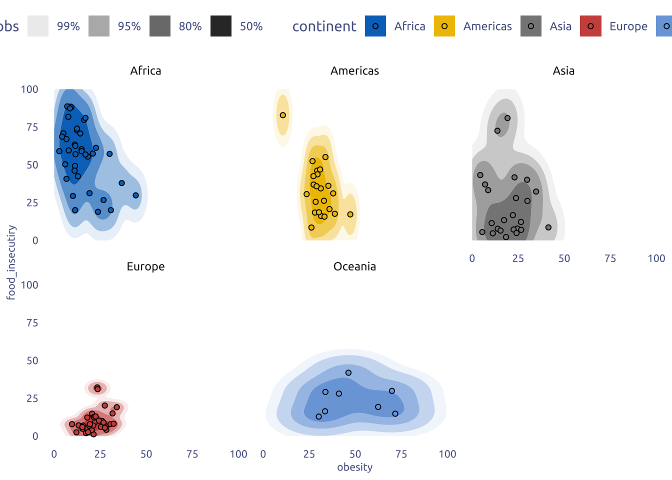
3 Transform Data for Plotting
selected_indicators <-
  c(
    "Prevalence of moderate or severe food insecurity in the total population (percent) (3-year average)",
    "Prevalence of obesity in the adult population (18 years and older) (percent)"
  )


indicator_short_names <-
  c(
    "Food insecurity",
    "Obesity"
  )

data2plot <-
  tuesdata$food_security |>
  # Select only the indicators I want (Food insecurity and Obesity)
  filter(Item %in% selected_indicators) |>
  # Filter only the countries regions
  filter(str_detect(Area, "except", negate = TRUE)) |>
  filter(str_detect(Area, "excluding", negate = TRUE)) |>
  mutate(country = countrycode::countryname(Area)) |>
  filter(country %in% country_list) |>
  # Create a "year" variable
  mutate(year = (Year_Start + Year_End) / 2) |>
  filter(year > 2015) |>
  filter(year < 2023) |>
  # Short name
  mutate(
    item_short = if_else(
      Item ==
        "Prevalence of obesity in the adult population (18 years and older) (percent)",
      "obesity",
      "food_insecutiry"
    )
  ) |>
  select(year, country, item_short, Value) |>
  distinct(country, year, item_short, .keep_all = TRUE) |>
  pivot_wider(names_from = item_short, values_from = Value) |>
  na.omit() |>
  mutate(
    continent = countrycode(
      sourcevar = country,
      origin = "country.name",
      destination = "continent"
    )
  )

data2plot_timechange <-
  data2plot |>
  group_by(country) |>
  mutate(
    year = case_when(
      year == max(year) ~ "max",
      year == min(year) ~ "min",
      TRUE ~ "intermediate"
    )
  ) |>
  ungroup() |>
  filter(year != "intermediate") |>
  select(-continent) |>
  pivot_wider(names_from = year, values_from = c(obesity, food_insecutiry)) |>
  mutate(
    obesity_change = if_else(
      (obesity_max - obesity_min) > 0,
      "More Obesity",
      "Less Obesity"
    ),
    food_insecutiry_change = if_else(
      (food_insecutiry_max - food_insecutiry_min) > 0,
      "Less Food Secutiry",
      "More Food Secutiry"
    )
  ) |>
  mutate(
    food_insecutiry_change = fct_relevel(
      food_insecutiry_change,
      "More Food Secutiry"
    )
  ) |>
  mutate(
    euclidian_distance = sqrt(
      (obesity_max - obesity_min)^2 +
        (food_insecutiry_max - food_insecutiry_min)^2
    )
  ) |>
  select(country, obesity_change, food_insecutiry_change, euclidian_distance)

data2plot2 <-
  data2plot |>
  inner_join(data2plot_timechange, by = "country") |>
  mutate(food_secutiry = 100 - food_insecutiry)
4 Time to plot!
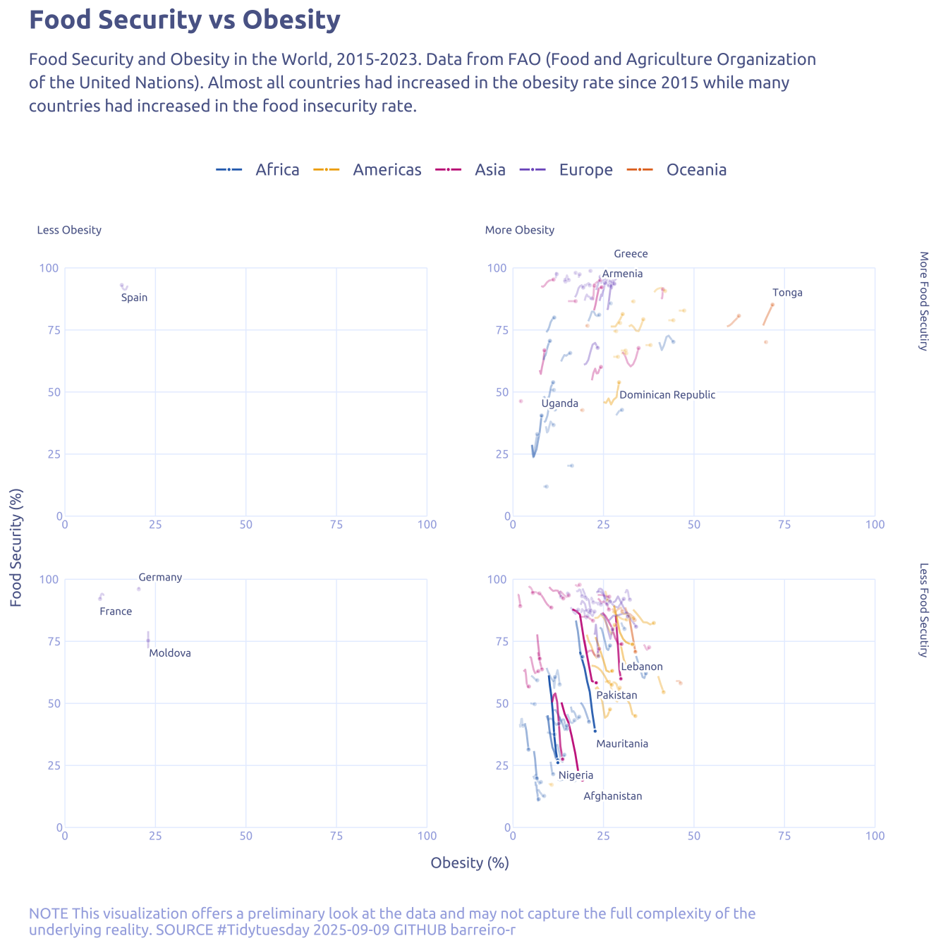
4.1 Raw chart
data2plot |>
  ggplot(aes(x = obesity, y = food_insecutiry)) +
  geom_line(aes(group = country, color = continent)) +
  geom_point(
    data = data2plot |> group_by(country) |> filter(year == max(year)),
    aes(color = continent)
  ) +
  theme_gray()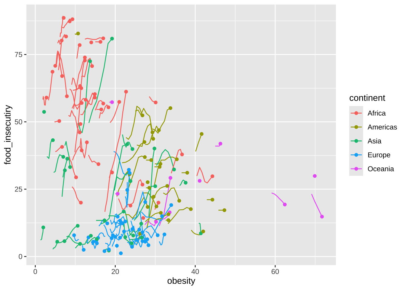
4.2 Final chart
manual_grid <- tibble(
  breaks = seq(0, 100, length.out = 5),
  labels = seq(0, 100, length.out = 5)
)

data2plot2 |>
  na.omit() |>
  ggplot(aes(x = obesity, y = food_secutiry)) +

  # manual grid
  geom_segment(
    data = manual_grid,
    aes(x = breaks, xend = breaks, y = 0, yend = 100),
    color = cool_gray5,
    linewidth = 0.25
  ) +
  geom_segment(
    data = manual_grid,
    aes(y = breaks, yend = breaks, x = 0, xend = 100),
    color = cool_gray5,
    linewidth = 0.25
  ) +
  geom_text_repel(
    data = manual_grid,
    aes(x = breaks, y = 0, label = labels),
    hjust = 0.5,
    vjust = 1.5,
    size = 2.2,
    family = "Ubuntu",
    color = cool_gray3,
    bg.color = 'white',
    segment.size = 0,
    bg.r = 0.3,
    force = 0,
    direction = 'x'
  ) +
  geom_text_repel(
    data = manual_grid,
    aes(y = breaks, x = 0, label = labels),
    hjust = 1.3,
    vjust = 0.5,
    size = 2.2,
    family = "Ubuntu",
    color = cool_gray3,
    bg.color = 'white',
    segment.size = 0,
    bg.r = 0.3,
    force = 0,
    direction = 'y'
  ) +

  # main plot
  geom_line(aes(
    group = country,
    color = continent,
    alpha = euclidian_distance
  )) +
  geom_point(
    data = data2plot2 |>
      na.omit() |>
      group_by(country) |>
      filter(year == max(year)),
    aes(fill = continent, alpha = euclidian_distance),
    size = .75,
    shape = 21,
    color = 'white'
  ) +
  facet_grid(food_insecutiry_change ~ obesity_change) +
  geom_text_repel(
    data = data2plot2 |>
      group_by(country) |>
      na.omit() |>
      filter(year == max(year)) |>
      ungroup() |>
      group_by(food_insecutiry_change, obesity_change) |>
      slice_max(euclidian_distance, n = 5) |>
      ungroup(),
    aes(label = country),
    family = "Ubuntu",
    color = cool_gray1,
    size = 2,
    direction = "y",
    hjust = "left",
    bg.color = 'white',
    segment.size = 0,
    bg.r = 0.3
  ) +
  labs(
    title = "Food Security vs Obesity",
    subtitle = str_wrap(
      "Food Security and Obesity in the World, 2015-2023. Data from FAO (Food and Agriculture Organization of the United Nations). Almost all countries had increased in the obesity rate since 2015 while many countries had increased in the food insecurity rate.",
      width = 100,
    ),
    caption = str_wrap(
      "NOTE This visualization offers a preliminary look at the data and may not capture the full complexity of the underlying reality. SOURCE #Tidytuesday 2025-09-09 GITHUB barreiro-r",
      width = 110,
    ),
    x = "Obesity (%)",
    y = "Food Security (%)",
    color = NULL,
    fill = NULL
  ) +
  scale_y_continuous(
    expand = c(0, 0, 0, 0),
    breaks = manual_grid$breaks,
    lim = c(-10, 110)
  ) +
  scale_x_continuous(
    expand = c(0, 0, 0, 0),
    breaks = manual_grid$breaks,
    lim = c(-10, 110)
  ) +
  theme(
    panel.spacing = unit(.5, 'lines'),
    # panel.background = element_rect(colour = cool_gray2, linewidth = 0.5),
    strip.text.x = element_text(
      hjust = 0,
      color = cool_gray1,
      size = 6
    ),
    strip.text.y = element_text(
      hjust = 0,
      color = cool_gray1,
      size = 6
    ),
    axis.text = element_blank()
  ) +
  ggsci::scale_color_bmj() +
  ggsci::scale_fill_bmj() +
  scale_alpha(range = c(0.2, 1)) +
  guides(alpha = 'none')