pacman::p_load(
  tidyverse,
  glue,
  scales,
  showtext,
  ggtext,
  shadowtext,
  maps,
  ggpattern,
  ggrepel,
  patchwork,
  tidylog
)

font_add_google("Ubuntu", "Ubuntu", regular.wt = 400, bold.wt = 700)
showtext_auto()
showtext_opts(dpi = 300)
Tip
About the Data
Note
This week we’re exploring historic meteorological data from the UK Met Office.
The UK Met Office is the United Kingdom’s national weather and climate service, providing forecasts, severe weather warnings, and climate science expertise. It helps people, businesses, and governments make informed decisions to stay safe and plan for the future. It was first established in 1854, making it one of the oldest weather services in the world.
Data has been scraped straight from the Met Office website and cleaned in a basic way. The few flags for “estimated” data and changing sunlight monitoring techniques have been removed for simplicity, but are available from the raw data. Also available is simple site metadata which includes the opening date and latitude and longitude of each station.
1 Initializing
1.1 Load libraries
1.2 Set theme
cool_gray0 <- "#323955"
cool_gray1 <- "#5a6695"
cool_gray2 <- "#7e89bb"
cool_gray3 <- "#a4aee2"
cool_gray4 <- "#cbd5ff"
cool_gray5 <- "#e7efff"

cool_red0 <- "#A31C44"
cool_red1 <- "#F01B5B"
cool_red2 <- "#F43E75"
cool_red3 <- "#E891AB"
cool_red4 <- "#FAC3D3"
cool_red5 <- "#FCE0E8"

theme_set(
  theme_minimal() +
    theme(
      # axis.line.x.bottom = element_line(color = 'cool_gray0', linewidth = .3),
      # axis.ticks.x= element_line(color = 'cool_gray0', linewidth = .3),
      # axis.line.y.left = element_line(color = 'cool_gray0', linewidth = .3),
      # axis.ticks.y= element_line(color = 'cool_gray0', linewidth = .3),
      # # panel.grid = element_line(linewidth = .3, color = 'grey90'),
      panel.grid.major = element_blank(),
      panel.grid.minor = element_blank(),
      axis.ticks.length = unit(-0.15, "cm"),
      plot.background = element_blank(),
      # plot.title.position = "plot",
      plot.title = element_text(family = "Ubuntu", size = 14, face = 'bold'),
      plot.caption = element_text(
        size = 8,
        color = cool_gray3,
        margin = margin(20, 0, 0, 0),
        hjust = 0
      ),
      plot.subtitle = element_markdown(
        size = 9,
        lineheight = 1.15,
        margin = margin(5, 0, 15, 0)
      ),
      axis.title.x = element_markdown(
        family = "Ubuntu",
        hjust = .5,
        size = 8,
        color = cool_gray1
      ),
      axis.title.y = element_markdown(
        family = "Ubuntu",
        hjust = .5,
        size = 8,
        color = cool_gray1
      ),
      axis.text = element_text(
        family = "Ubuntu",
        hjust = .5,
        size = 8,
        color = cool_gray1
      ),
      legend.position = "top",
      text = element_text(family = "Ubuntu", color = cool_gray1),
      # plot.margin = margin(25, 25, 25, 25)
    )
)
1.3 Load this week’s data
tuesdata <- tidytuesdayR::tt_load('2025-10-21')2 Quick Exploratory Data Analysis
2.1 Count station records
tuesdata$historic_station_met |>
  filter(!is.na(tmin)) |>
  count(station) |>
  mutate(station = fct_reorder(station, n)) |>
  ggplot(aes(x = n, y = station)) +
  geom_col()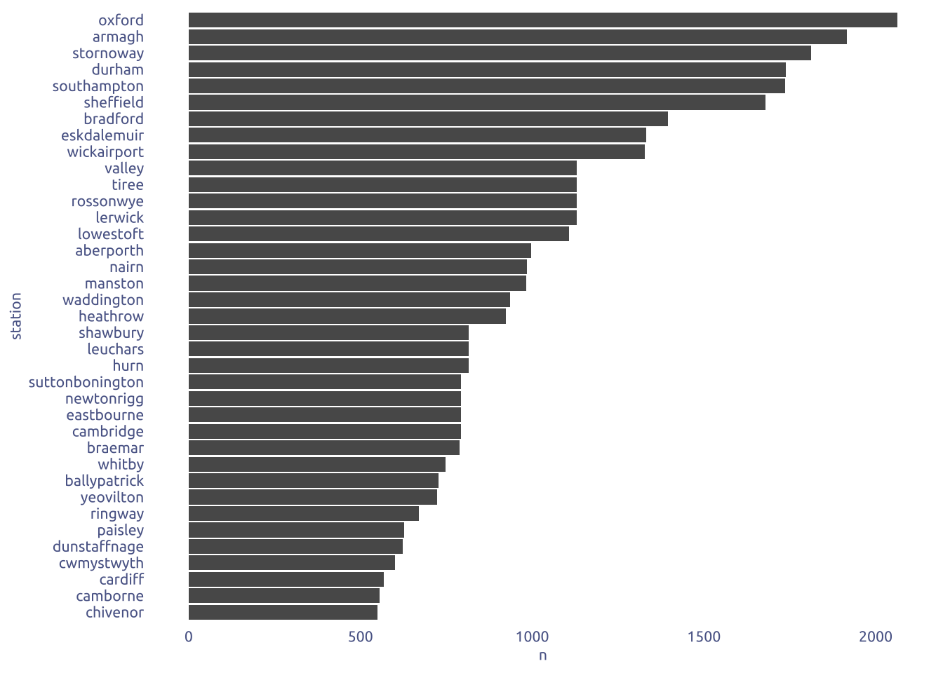
3 Transform Data for Plotting
data2plot <-
  tuesdata$historic_station_met |>
  filter(!is.na(tmin)) |>
  filter(station == 'oxford') |>
  select(year, month, tmin, tmax) |>
  pivot_longer(c(-year, -month), names_to = 'min_or_max', values_to = 'temperature') |>
  group_by(year, month) |>
  summarise(temperature_mean = mean(temperature, na.rm = TRUE)) |>
  # calculate 3 rolling average)
  ungroup()  |>
  arrange(year, month) |>
  mutate(
    temp_3 = zoo::rollmean(temperature_mean, k = 3, fill = NA),
    temp_6 = zoo::rollmean(temperature_mean, k = 6, fill = NA),
    temp_12 = zoo::rollmean(temperature_mean, k = 12, fill = NA)
  ) |>
  ungroup()
4 Time to plot!
4.1 Raw chart
data2plot |>
  ggplot(aes(x = month)) +
  geom_line(aes(y = temp_3, color = year, group = year), alpha = .2) +
  theme_gray()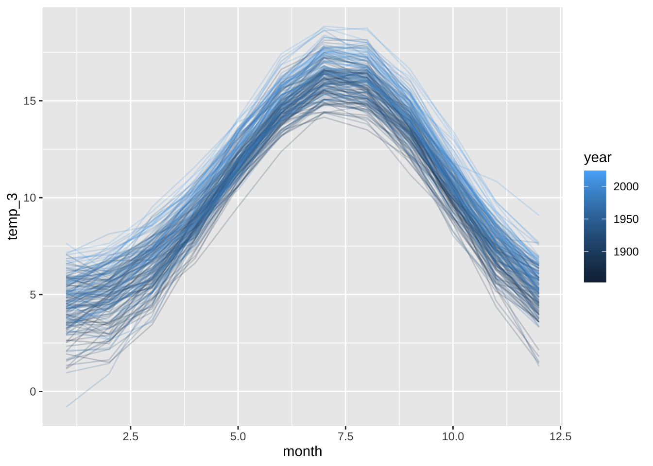
4.2 Final chart
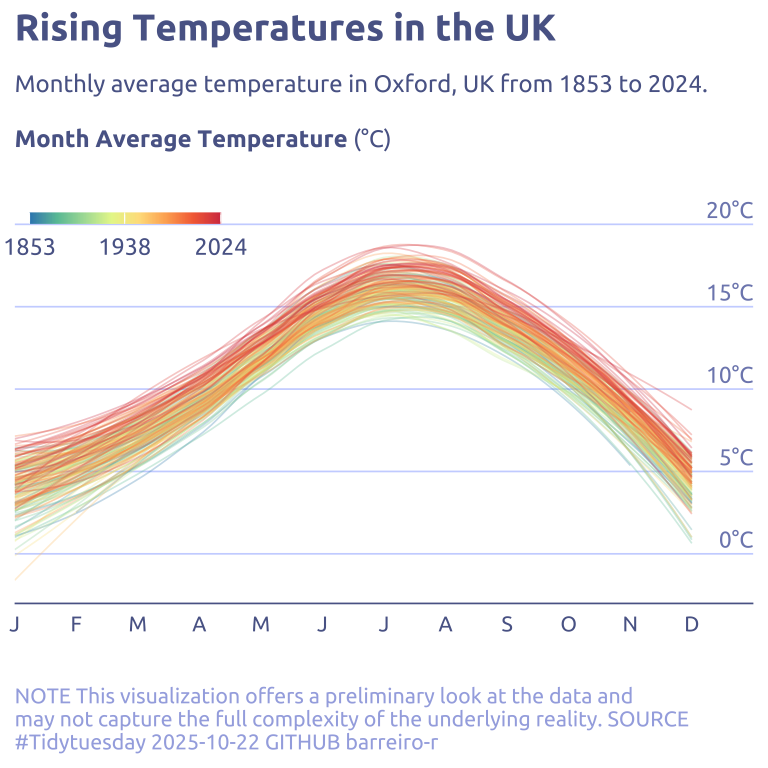
data2plot |>
  ggplot(aes(y = temp_3, x = month)) +
  geom_text(
    data = tibble(temp_3 = c(seq(0, 20, by = 5)), month = 13),
    aes(label = str_c(temp_3, '°C')),
    vjust = -0.4,
    hjust = 1,
    size = 3,
    color = cool_gray2,
    family = "Ubuntu"
  ) +
  geom_line(
    stat = "smooth",
    method = "loess",
    aes(color = year, group = year),
    alpha = .3,
    linewidth = .3
  ) +
  scale_y_continuous(
    expand = c(0, 0, 0, 2)
  ) +
  scale_x_continuous(
    label = ~ month.abb[.x] |> str_replace("(.).*", "\\1"),
    breaks = 1:12,
    expand = c(0, 0)
  ) +
  scale_color_gradientn(
    breaks = seq(min(data2plot$year), max(data2plot$year), length.out = 3) |>
      round(),
    # label = ~ str_replace(.x, '..', "'"),
    colors = (RColorBrewer::brewer.pal(name = "Spectral", n = 8)) |> rev()
  ) +
  theme(
    panel.grid.major.y = element_line(linewidth = .3, color = cool_gray4),
    axis.text.y = element_blank(),
    legend.position.inside = TRUE,
    legend.position = c(0, .80),
    legend.direction = 'horizontal',
    legend.title.position = 'top',
    legend.justification = c(0, 0),
    legend.title = element_text(size = 8, hjust = .5),
    axis.line.x.bottom = element_line(color = cool_gray1, linewidth = .3),
  ) +
  labs(
    x = NULL,
    y = NULL,
    title = "Rising Temperatures in the UK",
    subtitle = str_wrap(
      "Monthly average temperature in Oxford, UK from 1853 to 2024.<br><br>**Month Average Temperature** (°C)",
      width = 100,
    ),
    caption = str_wrap(
      "NOTE This visualization offers a preliminary look at the data and may not capture the full complexity of the underlying reality. SOURCE #Tidytuesday 2025-10-22 GITHUB barreiro-r",
      width = 70,
    ),
    color = NULL
  ) +
  guides(
    color = guide_colorbar(
      barwidth = 5,
      barheight = .3
    )
  )