pacman::p_load(
  tidyverse,
  glue,
  scales,
  showtext,
  ggtext,
  shadowtext,
  maps,
  ggpattern,
  ggrepel,
  patchwork,
  tidylog
)

font_add_google("Ubuntu", "Ubuntu", regular.wt = 400, bold.wt = 700)
showtext_auto()
showtext_opts(dpi = 300)
Tip
About the Data
Note
This week we are exploring data related to the Selected British Literary Prizes (1990-2022) dataset which comes from the Post45 Data Collective.
“This dataset contains primary categories of information on individual authors comprising gender, sexuality, UK residency, ethnicity, geography and details of educational background, including institutions where the authors acquired their degrees and their fields of study. Along with other similar projects, we aim to provide information to assess the cultural, social and political factors determining literary prestige. Our goal is to contribute to greater transparency in discussions around diversity and equity in literary prize cultures.” “All of the information in this dataset is publicly available. Information about a writer’s location, gender identity, race, ethnicity, or education from scholarly and public sources can be sensitive. The data provided here enables the study of broad patterns and is not intended as definitive.”
1 Initializing
1.1 Load libraries
1.2 Set theme
cool_gray0 <- "#323955"
cool_gray1 <- "#5a6695"
cool_gray2 <- "#7e89bb"
cool_gray3 <- "#a4aee2"
cool_gray4 <- "#cbd5ff"
cool_gray5 <- "#e7efff"

cool_red0 <- "#A31C44"
cool_red1 <- "#F01B5B"
cool_red2 <- "#F43E75"
cool_red3 <- "#E891AB"
cool_red4 <- "#FAC3D3"
cool_red5 <- "#FCE0E8"

theme_set(
  theme_minimal() +
    theme(
      # axis.line.x.bottom = element_line(color = 'cool_gray0', linewidth = .3),
      # axis.ticks.x= element_line(color = 'cool_gray0', linewidth = .3),
      # axis.line.y.left = element_line(color = 'cool_gray0', linewidth = .3),
      # axis.ticks.y= element_line(color = 'cool_gray0', linewidth = .3),
      # # panel.grid = element_line(linewidth = .3, color = 'grey90'),
      panel.grid.major = element_blank(),
      panel.grid.minor = element_blank(),
      axis.ticks.length = unit(-0.15, "cm"),
      plot.background = element_blank(),
      # plot.title.position = "plot",
      plot.title = element_text(family = "Ubuntu", size = 14, face = 'bold'),
      plot.caption = element_text(
        size = 8,
        color = cool_gray3,
        margin = margin(20, 0, 0, 0),
        hjust = 0
      ),
      plot.subtitle = element_markdown(
        size = 9,
        lineheight = 1.15,
        margin = margin(5, 0, 15, 0)
      ),
      axis.title.x = element_markdown(
        family = "Ubuntu",
        hjust = .5,
        size = 8,
        color = cool_gray1
      ),
      axis.title.y = element_markdown(
        family = "Ubuntu",
        hjust = .5,
        size = 8,
        color = cool_gray1
      ),
      axis.text = element_text(
        family = "Ubuntu",
        hjust = .5,
        size = 8,
        color = cool_gray1
      ),
      legend.position = "top",
      text = element_text(family = "Ubuntu", color = cool_gray1),
      # plot.margin = margin(25, 25, 25, 25)
    )
)
1.3 Load this week’s data
tuesdata <- tidytuesdayR::tt_load('2025-10-28')2 Quick Exploratory Data Analysis
2.1 Prize distribution by gender
tuesdata$prizes |>
  count(prize_year, gender, sort = TRUE) |>
  group_by(prize_year) |>
  mutate(per = n / sum(n)) |>
  ungroup() |>
  ggplot(aes(y = per, x = prize_year)) +
  geom_line(aes(color = gender)) +
  geom_point(aes(color = gender), size = 1)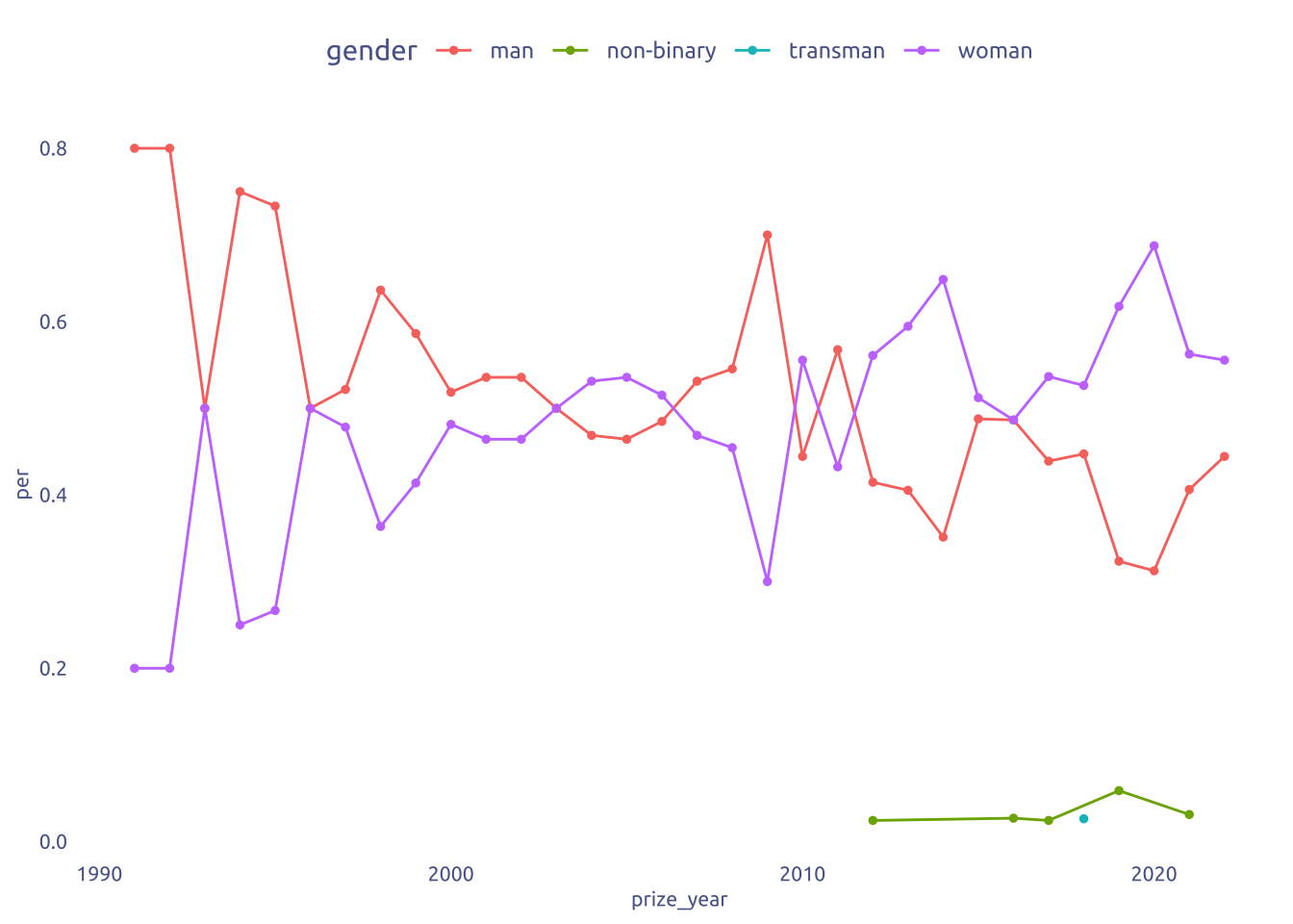
tuesdata$prizes |>
  count(prize_year, ethnicity_macro, sort = TRUE) |>
  group_by(prize_year) |>
  mutate(per = n / sum(n)) |>
  ungroup() |>
  group_by(ethnicity_macro) |>
  filter(n() > 10) |>
  ungroup() |>
  ggplot(aes(y = per, x = prize_year)) +
  geom_line(aes(color = ethnicity_macro)) +
  geom_point(aes(color = ethnicity_macro), size = 1) +
  facet_wrap(~ethnicity_macro)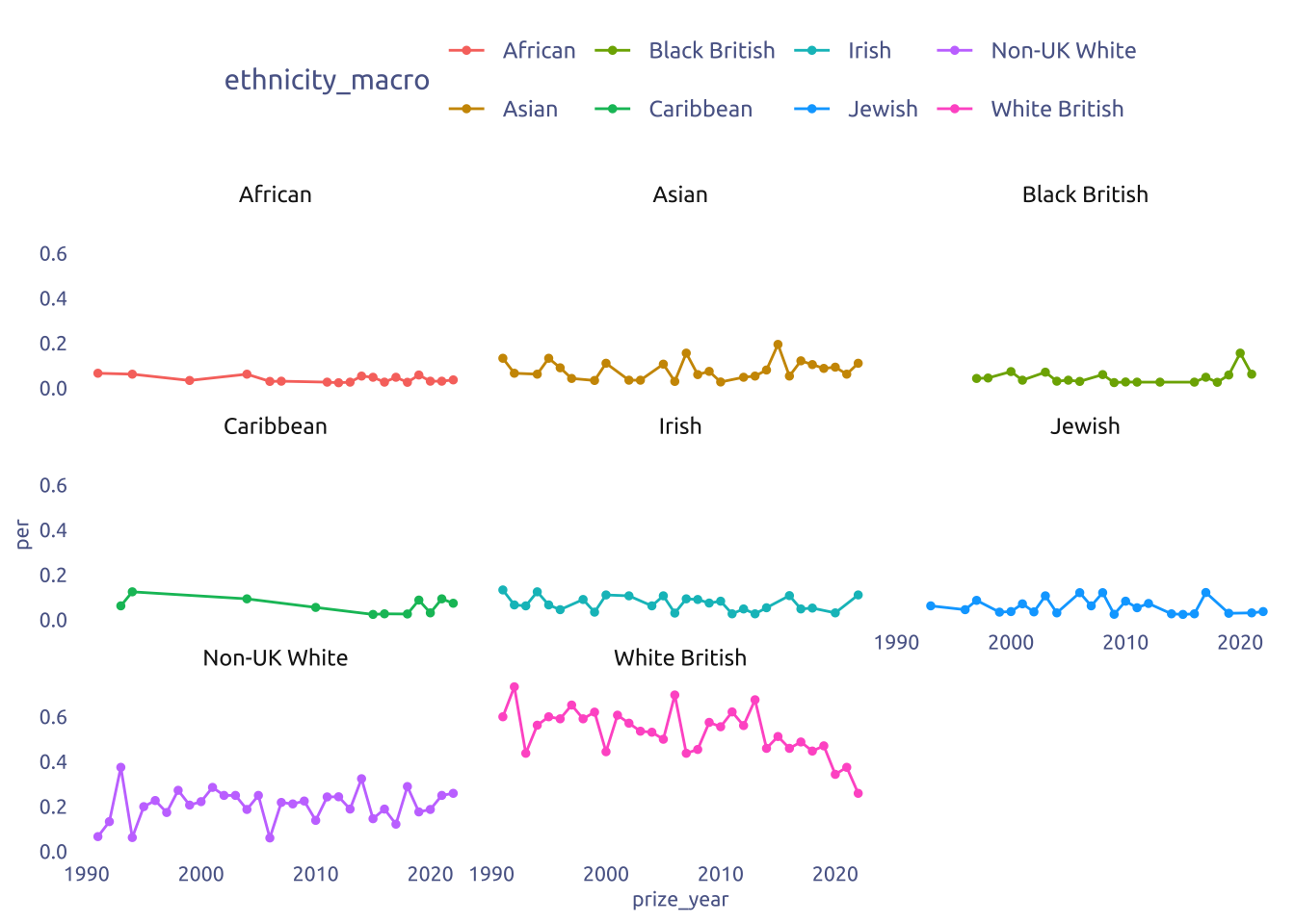
tuesdata$prizes |>
  count(prize_year, highest_degree, sort = TRUE) |>
  group_by(prize_year) |>
  mutate(per = n / sum(n)) |>
  ungroup() |>
  group_by(highest_degree) |>
  filter(n() > 10) |>
  ungroup() |>
  ggplot(aes(y = per, x = prize_year)) +
  geom_line(aes(color = highest_degree)) +
  geom_point(aes(color = highest_degree), size = 1) +
  facet_wrap(~highest_degree)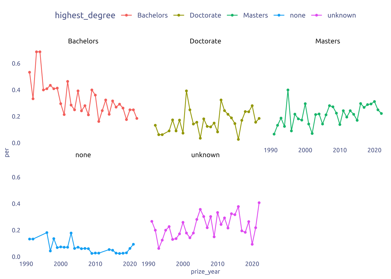
3 Transform Data for Plotting
data_gender <-
  tuesdata$prizes |>
  mutate(is_main = gender == "man") |>
  count(prize_year, is_main, sort = TRUE) |>
  group_by(prize_year) |>
  mutate(per = n / sum(n)) |>
  ungroup() |>
  group_by(is_main) |>
  mutate(per = if_else(is_main, per, -per)) |>
  group_by(prize_year) |>
  mutate(max_value = max(abs(per))) |>
  mutate(category = "Is man?")

data_ethnicity <-
  tuesdata$prizes |>
  mutate(is_main = ethnicity_macro == "White British") |>
  count(prize_year, is_main, sort = TRUE) |>
  group_by(prize_year) |>
  mutate(per = n / sum(n)) |>
  ungroup() |>
  group_by(is_main) |>
  mutate(per = if_else(is_main, per, -per)) |>
  group_by(prize_year) |>
  mutate(max_value = max(abs(per))) |>
  mutate(category = "Is White British?")

data_uk_residence <-
  tuesdata$prizes |>
  mutate(is_main = uk_residence) |>
  count(prize_year, is_main, sort = TRUE) |>
  group_by(prize_year) |>
  mutate(per = n / sum(n)) |>
  ungroup() |>
  group_by(is_main) |>
  mutate(per = if_else(is_main, per, -per)) |>
  group_by(prize_year) |>
  mutate(max_value = max(abs(per))) |>
  mutate(category = "Is UK resident?")

data2plot <-
  bind_rows(data_gender, data_ethnicity, data_uk_residence)
4 Time to plot!
4.1 Raw chart
data2plot |>
  ggplot(aes(x = prize_year, y = per)) +
  geom_col(aes(fill = is_main, alpha = abs(per) == max_value), width = 0.8) +
  facet_wrap(~category, ncol = 1) +
  theme_gray()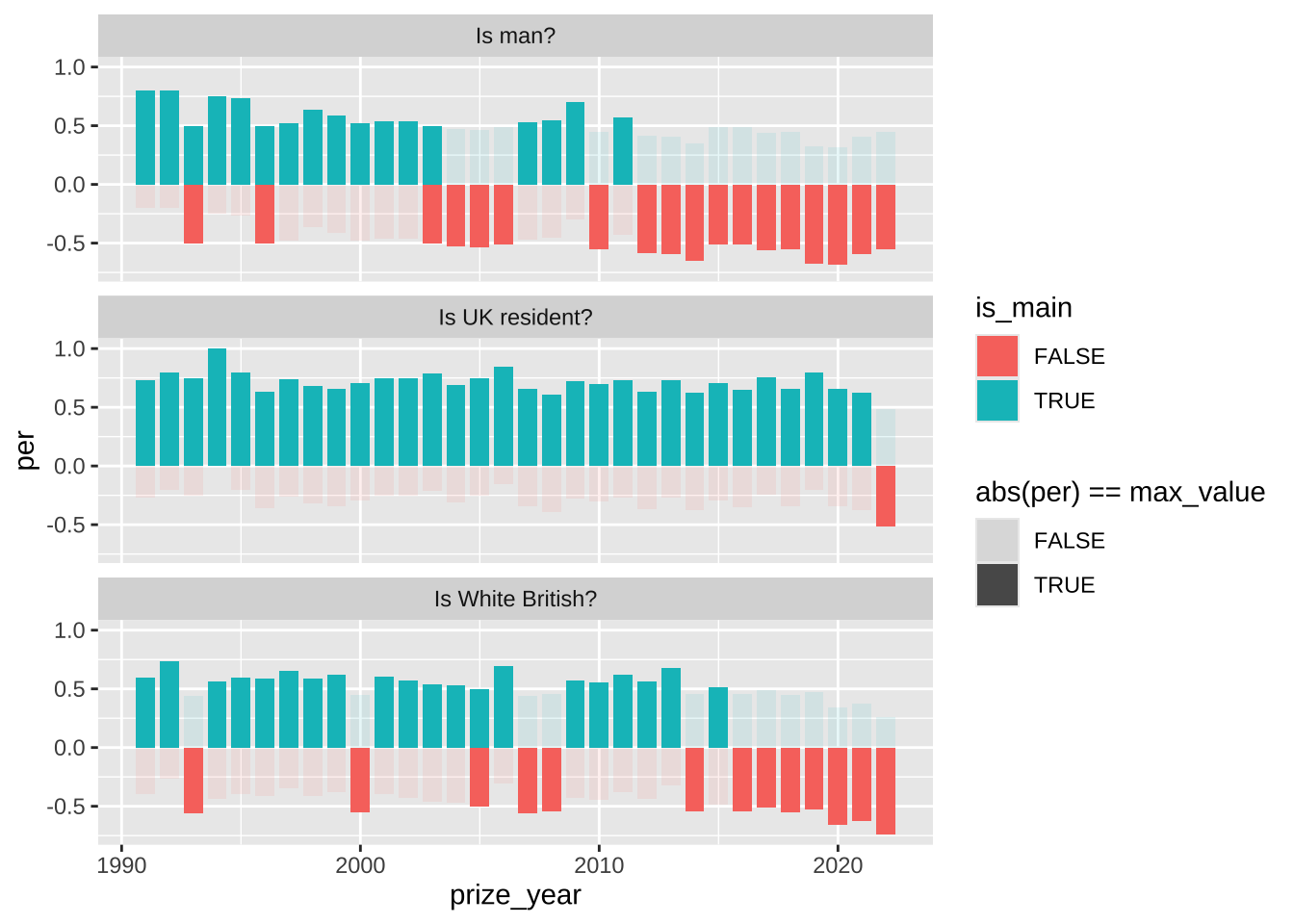
4.2 Final chart
data2plot |>
ggplot(aes(x = prize_year)) +
annotate(
geom = "text",
y = 0.50 + 0.2,
x = max(data2plot$prize_year) + 1,
hjust = .2,
label = "50%",
size = 2.5,
family = "Ubuntu",
color = cool_gray3
) +
annotate(
geom = "text",
y = -0.50 + 0.2,
x = max(data2plot$prize_year) + 1,
hjust = .2,
label = "50%",
size = 2.5,
family = "Ubuntu",
color = cool_gray3
) +
annotate(
geom = "segment",
y = 0.5,
x = -Inf,
xend = Inf,
linewidth = 0.25,
color = cool_gray4
) +
annotate(
geom = "segment",
y = 1,
x = -Inf,
xend = Inf,
linewidth = 0.25,
color = cool_gray4
) +
annotate(
geom = "segment",
y = -0.5,
x = -Inf,
xend = Inf,
linewidth = 0.25,
color = cool_gray4
) +
annotate(
geom = "segment",
y = -1,
x = -Inf,
xend = Inf,
linewidth = 0.25,
color = cool_gray4
) +
annotate(
geom = "segment",
y = 0,
x = -Inf,
xend = Inf,
linewidth = 0.25,
color = cool_gray2
) +
geom_segment(
aes(
y = .15 * sign(per),
yend = per - .15 * sign(per),
color = is_main,
alpha = abs(per) == max_value
),
linewidth = 3,
lineend = "round"
) +
facet_wrap(~category, ncol = 1) +
scale_y_continuous(
limits = c(-1,1),
expand = c(0, 0)
) +
scale_x_continuous(
expand = c(0.04, 0),
breaks = seq(min(data2plot$prize_year), max(data2plot$prize_year), length.out = 5) |> round()
) +
scale_alpha(range = c(0.3, 1)) +
scale_color_manual(values = c(cool_red2, cool_gray2)) +
theme(
axis.title.y = element_blank(),
axis.text.y = element_blank(),
strip.text.x = element_text(
hjust = 0,
color = cool_gray1,
size = 7
),
legend.position = "none"
) +
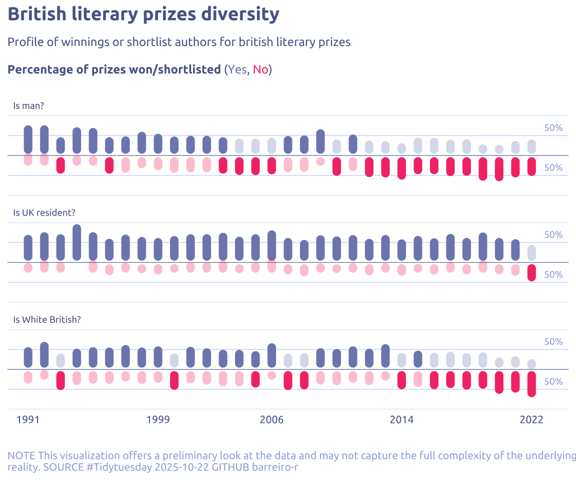
labs(
y = NULL,
x = NULL,
title = "British literary prizes diversity",
subtitle = str_wrap(
'Profile of winnings or shortlist authors for british literary prizes<br><br>**Percentage of prizes won/shortlisted** (<span style="color:#7e89bb">Yes</span>, <span style="color:#F43E75">No</span>)',
width = 100,
),
caption = str_wrap(
"NOTE This visualization offers a preliminary look at the data and may not capture the full complexity of the underlying reality. SOURCE #Tidytuesday 2025-10-22 GITHUB barreiro-r",
width = 120,
),
)