pacman::p_load(
  tidyverse,
  glue,
  scales,
  showtext,
  ggtext,
  shadowtext,
  maps,
  ggpattern,
  ggrepel,
  patchwork,
  tidylog
)

font_add_google("Ubuntu", "Ubuntu", regular.wt = 400, bold.wt = 700)
showtext_auto()
showtext_opts(dpi = 300)
Tip
About the Data
Note
Warning
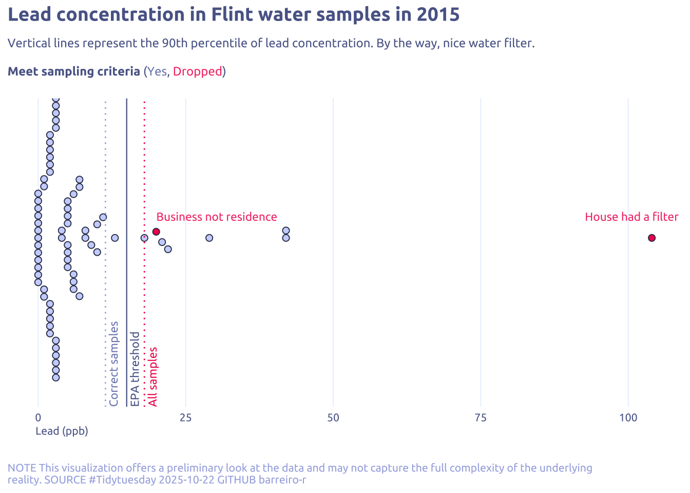
This dataset was removed from the TidyTuesday repository due to ethical reasons https://www.journals.uchicago.edu/doi/full/10.1086/693853
This week we are exploring lead levels in water samples collected in Flint, Michigan in 2015. The data comes from a paper by Loux and Gibson (2018) who advocate for using this data as a teaching example in introductory statistics courses.
The Flint lead data provide a compelling example for introducing students to simple univariate descriptive statistics. In addition, they provide examples for discussion
1 Initializing
1.1 Load libraries
1.2 Set theme
cool_gray0 <- "#323955"
cool_gray1 <- "#5a6695"
cool_gray2 <- "#7e89bb"
cool_gray3 <- "#a4aee2"
cool_gray4 <- "#cbd5ff"
cool_gray5 <- "#e7efff"

cool_red0 <- "#A31C44"
cool_red1 <- "#F01B5B"
cool_red2 <- "#F43E75"
cool_red3 <- "#E891AB"
cool_red4 <- "#FAC3D3"
cool_red5 <- "#FCE0E8"

theme_set(
  theme_minimal() +
    theme(
      # axis.line.x.bottom = element_line(color = 'cool_gray0', linewidth = .3),
      # axis.ticks.x= element_line(color = 'cool_gray0', linewidth = .3),
      # axis.line.y.left = element_line(color = 'cool_gray0', linewidth = .3),
      # axis.ticks.y= element_line(color = 'cool_gray0', linewidth = .3),
      # # panel.grid = element_line(linewidth = .3, color = 'grey90'),
      panel.grid.major = element_blank(),
      panel.grid.minor = element_blank(),
      axis.ticks.length = unit(-0.15, "cm"),
      plot.background = element_blank(),
      # plot.title.position = "plot",
      plot.title = element_text(family = "Ubuntu", size = 14, face = 'bold'),
      plot.caption = element_text(
        size = 8,
        color = cool_gray3,
        margin = margin(20, 0, 0, 0),
        hjust = 0
      ),
      plot.subtitle = element_markdown(
        size = 9,
        lineheight = 1.15,
        margin = margin(5, 0, 15, 0)
      ),
      axis.title.x = element_markdown(
        family = "Ubuntu",
        hjust = .5,
        size = 8,
        color = cool_gray1
      ),
      axis.title.y = element_markdown(
        family = "Ubuntu",
        hjust = .5,
        size = 8,
        color = cool_gray1
      ),
      axis.text = element_text(
        family = "Ubuntu",
        hjust = .5,
        size = 8,
        color = cool_gray1
      ),
      legend.position = "top",
      text = element_text(family = "Ubuntu", color = cool_gray1),
      # plot.margin = margin(25, 25, 25, 25)
    )
)
1.3 Load this week’s data
tuesdata <- tidytuesdayR::tt_load('2025-11-04')2 Quick Exploratory Data Analysis
2.1 Lead distribuition
tuesdata$flint_mdeq |>
  ggplot(aes(x = lead)) +
  geom_histogram(aes(fill = is.na(lead2)))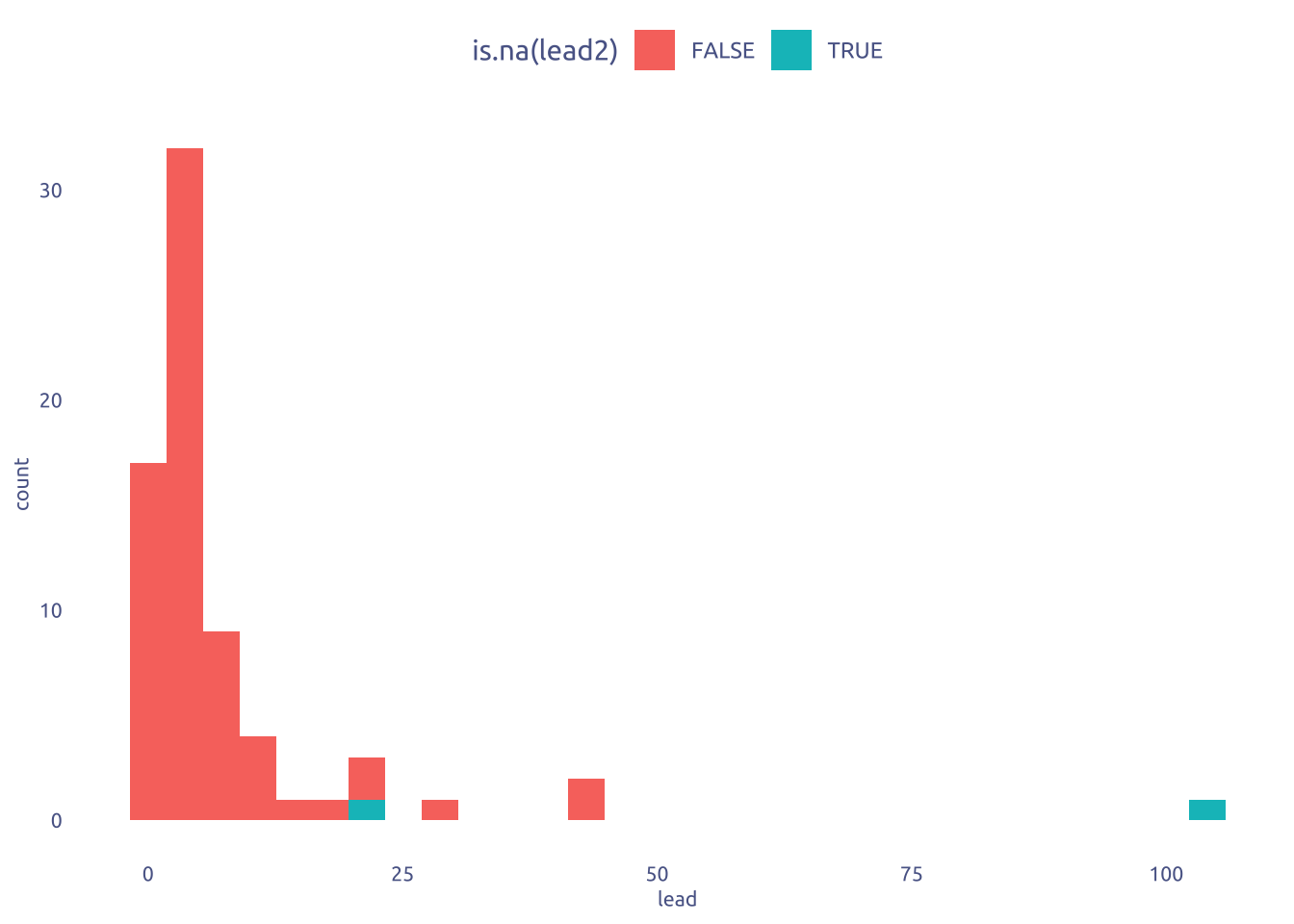
3 Transform Data for Plotting
data2plot <- tuesdata$flint_mdeq |>
  transmute(
    lead = lead,
    removed = is.na(lead2),
    notes = notes |> str_remove(".*: ") |> str_to_sentence()
  )
4 Time to plot!
4.1 Raw chart
data2plot |>
  ggplot(aes(x = lead)) +
  geom_histogram(aes(fill = removed)) +
  theme_gray()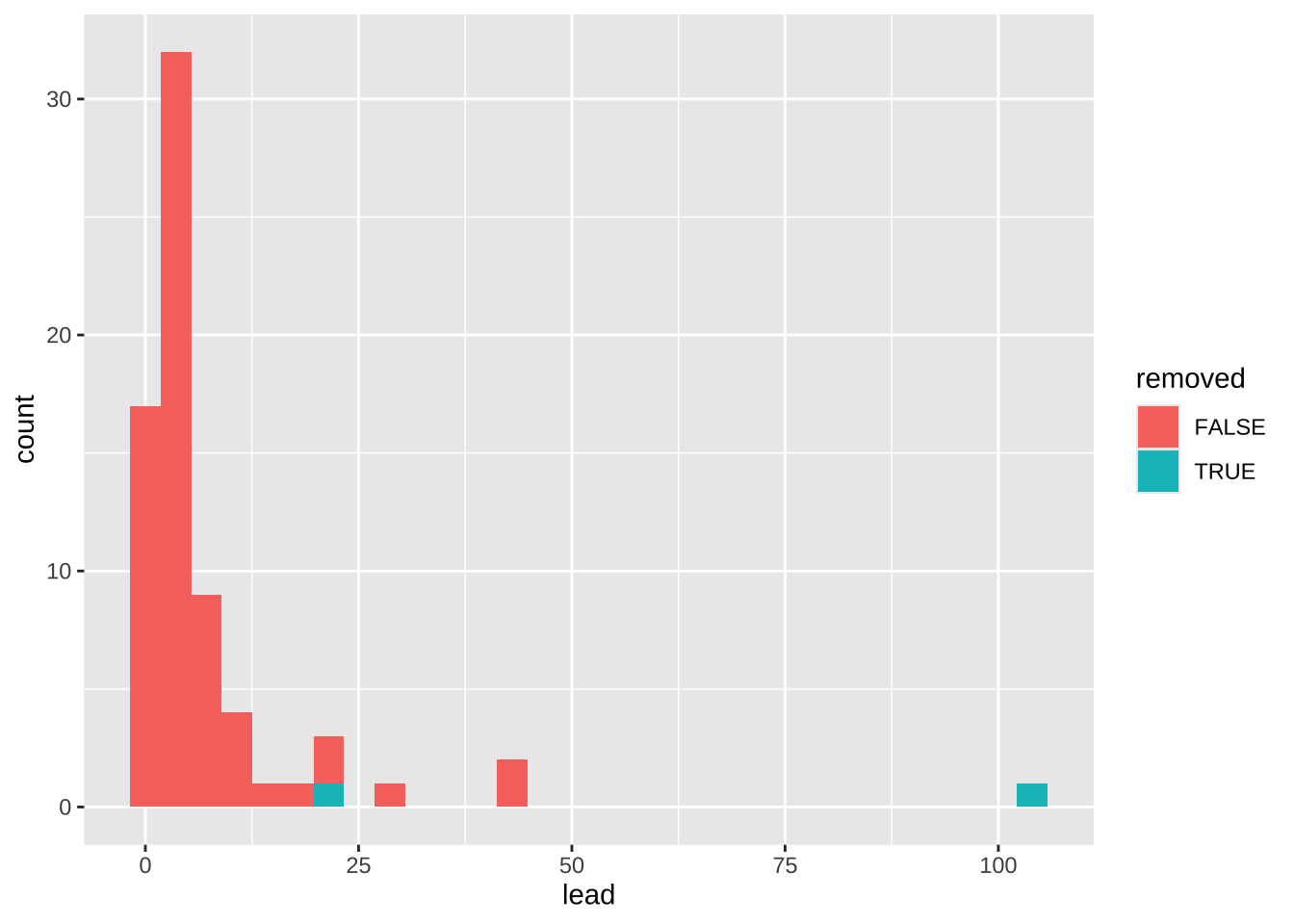
4.2 Final chart
quantile90_all <- data2plot |>
  pull(lead) |>
  quantile(0.9)

quantile90_correct <- data2plot |>
  filter(!removed) |>
  pull(lead) |>
  quantile(0.9)

quantile90_EPA <- 15

#pseudorandom, smiley, maxout, frowney, minout, tukey, tukeyDense)

data2plot |>
  ggplot(aes(x = lead)) +
  ggbeeswarm::geom_beeswarm(
    aes(fill = removed, y = "1"),
    shape = 21,
    color = cool_gray0,
    cex = 3.5,
    size = 2,
    show.legend = FALSE
  ) +
  annotate(
    geom = "segment",
    x = quantile90_all,
    xend = quantile90_all,
    y = -Inf,
    yend = Inf,
    linewidth = 0.5,
    linetype = "dotted",
    color = cool_red1
  ) +
  annotate(
    geom = "text",
    x = quantile90_all,
    y = 0.2,
    vjust = 1.5,
    hjust = 0,
    label = "All samples",
    angle = 90,
    size = 3,
    family = "Ubuntu",
    color = cool_red1
  ) +
  annotate(
    geom = "segment",
    x = quantile90_correct,
    xend = quantile90_correct,
    y = -Inf,
    yend = Inf,
    linewidth = 0.5,
    linetype = "dotted",
    color = cool_gray3
  ) +
  annotate(
    geom = "text",
    x = quantile90_correct,
    y = 0.2,
    vjust = 1.5,
    hjust = 0,
    label = "Correct samples",
    angle = 90,
    size = 3,
    family = "Ubuntu",
    color = cool_gray2
  ) +
  annotate(
    geom = "segment",
    x = quantile90_EPA,
    xend = quantile90_EPA,
    y = -Inf,
    yend = Inf,
    linewidth = 0.4,
    color = cool_gray1
  ) +
  annotate(
    geom = "text",
    x = quantile90_EPA,
    y = 0.2,
    vjust = 1.5,
    hjust = 0,
    label = "EPA threshold",
    angle = 90,
    size = 3,
    family = "Ubuntu",
    color = cool_gray1
  ) +
  ggrepel::geom_text_repel(
    data = data2plot |> filter(removed),
    aes(label = notes),
    hjust = 0,
    vjust = -2.1,
    size = 3,
    family = "Ubuntu",
    y = "1",
    color = cool_red2,
    min.segment.length = 99
  ) +
  scale_fill_manual(values = c(cool_gray4, cool_red1)) +
  theme(
    axis.title.y = element_blank(),
    axis.text.y = element_blank(),
    panel.grid.major.x = element_line(
      linewidth = .3,
      color = cool_gray5
    ),
    axis.title.x = element_markdown(
      hjust = 0.045,
    )
  ) +
  labs(
    y = NULL,
    title = "Lead concentration in Flint water samples in 2015",
    subtitle = str_wrap(
      'Vertical lines represent the 90th percentile of lead concentration. By the way, nice water filter.<br><br>**Meet sampling criteria** (<span style="color:#7e89bb">Yes</span>, <span style="color:#F43E75">Dropped</span>)',
      width = 100,
    ),
    caption = str_wrap(
      "NOTE This visualization offers a preliminary look at the data and may not capture the full complexity of the underlying reality. SOURCE #Tidytuesday 2025-10-22 GITHUB barreiro-r",
      width = 120,
    ),
    x = "Lead (ppb)", fill = NULL
  )