pacman::p_load(
  tidyverse,
  glue,
  scales,
  showtext,
  ggtext,
  shadowtext,
  maps,
  ggpattern,
  ggrepel,
  patchwork,
  tidylog
)

font_add_google("Ubuntu", "Ubuntu", regular.wt = 400, bold.wt = 700)
showtext_auto()
showtext_opts(dpi = 300)
Tip
About the Data
Note
This week, we explore global tuberculosis (TB) burden estimates from the World Health Organization, using data curated via the getTBinR R package by Sam Abbott. The dataset includes country-level indicators such as TB incidence, mortality, case detection rates, and population estimates across multiple years. These metrics help researchers, public health professionals, and learners understand the scale and distribution of TB worldwide.
Tuberculosis remains one of the world’s deadliest infectious diseases. WHO estimates that 10.6 million people fell ill with TB in 2021, and 1.6 million died from the disease. Monitoring TB burden is essential to guide national responses and global strategies.
1 Initializing
1.1 Load libraries
1.2 Set theme
cool_gray0 <- "#323955"
cool_gray1 <- "#5a6695"
cool_gray2 <- "#7e89bb"
cool_gray3 <- "#a4aee2"
cool_gray4 <- "#cbd5ff"
cool_gray5 <- "#e7efff"

cool_red0 <- "#A31C44"
cool_red1 <- "#F01B5B"
cool_red2 <- "#F43E75"
cool_red3 <- "#E891AB"
cool_red4 <- "#FAC3D3"
cool_red5 <- "#FCE0E8"

theme_set(
  theme_minimal() +
    theme(
      # axis.line.x.bottom = element_line(color = 'cool_gray0', linewidth = .3),
      # axis.ticks.x= element_line(color = 'cool_gray0', linewidth = .3),
      # axis.line.y.left = element_line(color = 'cool_gray0', linewidth = .3),
      # axis.ticks.y= element_line(color = 'cool_gray0', linewidth = .3),
      # # panel.grid = element_line(linewidth = .3, color = 'grey90'),
      panel.grid.major = element_blank(),
      panel.grid.minor = element_blank(),
      axis.ticks.length = unit(-0.15, "cm"),
      plot.background = element_blank(),
      # plot.title.position = "plot",
      plot.title = element_text(family = "Ubuntu", size = 14, face = 'bold'),
      plot.caption = element_text(
        size = 8,
        color = cool_gray3,
        margin = margin(20, 0, 0, 0),
        hjust = 0
      ),
      plot.subtitle = element_markdown(
        size = 9,
        lineheight = 1.15,
        margin = margin(5, 0, 15, 0)
      ),
      axis.title.x = element_markdown(
        family = "Ubuntu",
        hjust = .5,
        size = 8,
        color = cool_gray1
      ),
      axis.title.y = element_markdown(
        family = "Ubuntu",
        hjust = .5,
        size = 8,
        color = cool_gray1
      ),
      axis.text = element_text(
        family = "Ubuntu",
        hjust = .5,
        size = 8,
        color = cool_gray1
      ),
      legend.position = "top",
      text = element_text(family = "Ubuntu", color = cool_gray1),
      plot.margin = margin(25, 25, 25, 25)
    )
)
1.3 Load this week’s data
tuesdata <- tidytuesdayR::tt_load('2025-11-11')2 Quick Exploratory Data Analysis
2.1 Test Correlation
tuesdata$who_tb_data |>
  ggplot(aes(x = c_newinc_100k, y = e_mort_tbhiv_100k)) +
  geom_point()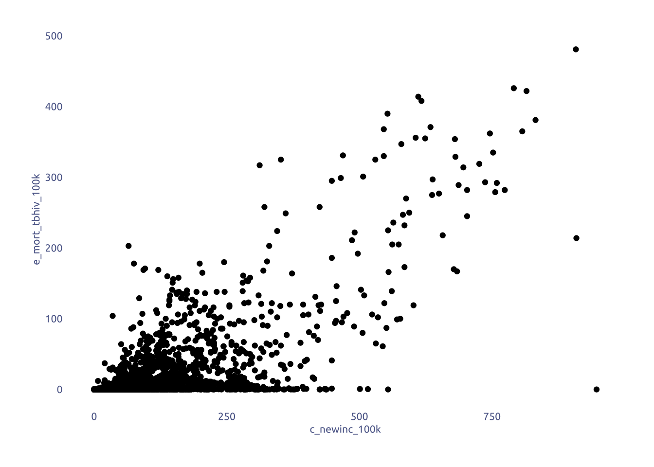
3 Transform Data for Plotting
data2plot <-
  tuesdata$who_tb_data |>
  group_by(year) |>
  summarise(mean_tbhiv_mort = mean(e_mort_tbhiv_100k, na.rm = T),
            mean_exc_tbhiv_mort = mean(e_mort_exc_tbhiv_100k, na.rm = T)) |>
  ungroup() |>
  pivot_longer(cols = c(mean_tbhiv_mort, mean_exc_tbhiv_mort))
4 Time to plot!
4.1 Raw chart
data2plot |>
  ggplot(aes(x = year, y = value, fill = name)) +
  geom_col(position = 'dodge') +
  theme_gray()
4.2 Final chart
grid_data <- tibble(
  breaks = seq(0, ceiling(max(data2plot$value) / 5) * 5, length.out = 5),
  labels = seq(0, ceiling(max(data2plot$value) / 5) * 5, length.out = 5),
)

plot <-
  data2plot |>
  ggplot(aes(x = year, y = value)) +
  ggpattern::geom_area_pattern(
    aes(pattern_fill = I("white"), pattern_fill2 = name, color = name),
    pattern = 'gradient',
    pattern_alpha = 0.01,
    fill = NA,
    pattern_density = 0.9,
    position = 'identity',
    show.legend = FALSE
  ) +

  # add names
  annotate(
    geom = "text",
    label = "HIV-negative",
    x = 2019,
    y = 13,
    color = cool_gray1,
    family = "Ubuntu"
  ) +
  annotate(
    geom = "text",
    label = "HIV-positive",
    x = 2019,
    y = 4,
    color = cool_red1,
    family = "Ubuntu"
  ) +

  # add grid
  geom_segment(
    data = grid_data,
    aes(x = -Inf, xend = Inf, y = breaks),
    color = cool_gray3,
    linewidth = 0.1
  ) +
  geom_text(
    data = grid_data,
    aes(x = 2024, y = breaks, label = labels),
    hjust = 1,
    size = 3.5,
    family = "Ubuntu",
    vjust = -0.35,
    color = cool_gray3,
  ) +

  ggpattern::scale_pattern_fill2_manual(
    values = c(
      'mean_tbhiv_mort' = cool_red4,
      'mean_exc_tbhiv_mort' = cool_gray4
    )
  ) +
  scale_color_manual(
    values = c(
      'mean_tbhiv_mort' = cool_red1,
      'mean_exc_tbhiv_mort' = cool_gray1
    )
  ) +
  theme(
    axis.line.x = element_line(color = cool_gray0, linewidth = .3),
    axis.text.y = element_blank(),
    axis.title.y = element_blank()
  ) +
  labs(
    x = NULL,
      title = "WHO tuberculosis Burden Data",
    subtitle = str_wrap(
      'Comparing TB mortality in HIV-positive and HIV-negative populations.<br><br>**Estimated mortality of TB cases per 100 000 population**',
      width = 100,
    ),
    caption = str_wrap(
      "NOTE This visualization offers a preliminary look at the data and may not capture the full complexity of the underlying reality. SOURCE #Tidytuesday 2025-11-11 GITHUB barreiro-r",
      width = 100,
    ),
  ) +
  scale_y_continuous(expand = expansion(mult = c(0, .1))) +
  scale_x_continuous(expand = c(0, 0))

plot
png("my_plot_file.png", width = 7, height = 5, units = "in", res = 300)
print(plot)
dev.off()
quartz_off_screen
2